
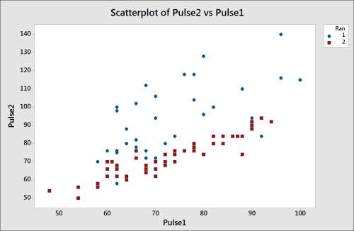
We will use a Scatterplot command to visualize the relationship between a resting pulse and the pulse after a group of students' activity.
The following instructions create a scatterplot of Pulse1—the resting pulse, Pulse2—the pulse after activity, and the Ran column. The Ran column indicates whether a student ran in his/her place or not:
- Go to the File menu and select Open Worksheet….
- Click on the button labeled Look in Minitab Sample Data folder.
- Open the
Pulse.MTWworksheet. - Go to the Graph menu and select Scatterplot….
- From the graph selection screen, select the With Groups scatterplot.
- Enter
Pulse2as the y variable andPulse1as the x variable. - Next, enter
Ranas Categorical variable for grouping (0-3):. Then click on OK.
In the graph, we have created our y variables that are placed on the vertical y axis, and the x variables along the horizontal x axis. The y axis most commonly plots outputs to our responses in the data. Predictors, which are our inputs, are entered on the x axis.
By entering the Ran column as a grouping variable, we change the style of points on the graph. Here, 1 under Ran is shown as circles, and 2 as squares. Our results in the scatterplot may lead us to believe that it was the first group that exercised.
Least squares regression lines can be added to the scatterplot by right-clicking on the chart and selecting Add | Regression Fit…. A regression line added this way will not report the coefficient tables or analysis of variance tables.
The fitted model can be viewed with a pop-up textbox when hovering the cursor over the line. For statistical information on the model, use fitted line plots in regression.
The Crosshairs feature can be found from the right-click menu and is very useful for finding coordinates on the graph. The brushing tool is also a powerful tool to use in scatterplots. This is available from the right-click menu and is used to highlight individual or groups of data points. By default, it will report row numbers and can also be used to display row information from the worksheet.
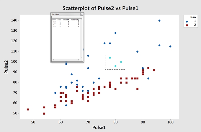
An example of brushing is shown in the previous screenshot. To brush the chart, right-click on the chart and select Brush. To add row information from the columns in the worksheet, right-click on the graph once more and select Set ID Variables… from the right-click menu. Then, double-click on the Sex, Smokes, and Activity columns in the Variables: section. Click on OK and highlight a few points on the chart to observe the values of the columns entered as variables in brushing.