
Exponentially weighted moving average charts are useful for finding small shifts in the mean in a process. Here, we will use the EWMA chart to study the temperature data from the Oxford weather station. We will look at the results for January to investigate whether we have a change in mean monthly maximum and minimum temperatures across the data from 1853.
Both EWMA and CUSUM charts are useful in scenarios where we cannot collect rational subgroups for an Xbar chart. As with the temperature data from the Oxford weather station, we have a mean maximum temperature for a month; there are no subgroups. We can use the EWMA to be more sensitive to smaller scale shifts than the I-MR chart.
We will start by splitting the worksheet into months, selecting the worksheet for January, and then plotting the EWMA for maximum and minimum temperatures.
The data for this example can be found on the MET office website at the following address:
http://www.metoffice.gov.uk/climate/uk/stationdata/oxforddata.txt
Copy the data into Minitab but do not copy the headers or column names. The text file uses two rows of headers: name and units. Minitab will only accept one column header; copying and pasting both headers will convert all columns to text.
Label the columns Year, Month, T Max, T Min, AirFrost(days), Rain (mm), and Sun(Hours).
This data is also available from the Oxford Weather.txt file or the Oxford Weather (Cleaned).mtw file.
- Go to the Data menu and select Split Worksheet.
- Enter
Monthin the By Variables: field. - Click on OK.
- Select the worksheet for
Month = 1for the January temperatures. - Navigate to Stat | control charts | Time weighted charts and select EWMA….
- Enter the columns for temperature into the dialog box, as shown in the following screenshot:
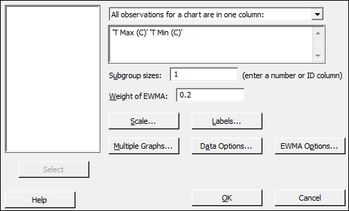
- Click on the Scale button and select the Stamp option.
- Enter
Yearin the section labeled Stamp Columns. - Click on OK in each dialog box.
EWMA charts plot the value of the EWMA of a subgroup at time i as ![]() , where w is the weight of the exponentially weighted moving average and
, where w is the weight of the exponentially weighted moving average and ![]() is the mean of the ith subgroup. A value of w can be selected to tune the graph to detect shifts of different sizes. Lower values of the weight place less emphasis on the current result and more emphasis on previous values; higher values will mean that the graph can react more quickly to changes in the data.
is the mean of the ith subgroup. A value of w can be selected to tune the graph to detect shifts of different sizes. Lower values of the weight place less emphasis on the current result and more emphasis on previous values; higher values will mean that the graph can react more quickly to changes in the data.
Subgroup sizes for this data are 1 as each value indicates the results for one year. We could, as an alternative, run the same chart for a study looking at mean yearly temperatures rather than the temperatures from a month. To run this, return to the complete data worksheet. Use the Year column to specify the subgroup. The chart will then plot the EWMA of mean yearly temperatures.
The data that we obtain from the MET office website may generate an error when using it. The following error indicates that data is missing in the worksheet and a subgroup has no data. The EWMA chart cannot be produced with a subgroup that has no values or consists only of missing values:
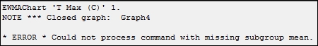
Some of the data from the MET office may be given as provisional or estimated. This is indicated by the use of * in the source document at the MET office website. When copying this data into Minitab, a value of 21.8* will be pasted into Minitab as a missing value, *. need to correct these figures manually. The latest results are indicated as provisional; when copied into Minitab, we will see that these are missing. Also notice that in 1860, there was no recorded mean minimum temperature for December.
The Oxford weather (cleaned).mtw worksheet provides a set of data with all the provisional figures entered.