
We will use simple correspondence analysis to investigate the associations in a two-way contingency table. This is a technique to investigate frequencies of observations within the table.
The example dataset that is used is from the data and stat library and looks at the characteristics that students find important in a good teacher for academic success.
Here, we will use simple correspondence analysis to investigate the relationship between the behaviors in the rows and the count of how often they are identified as important (IM), neither important nor unimportant (NU), and not important (NI).
The data is available at the following link:
http://lib.stat.cmu.edu/DASL/Datafiles/InstructorBehavior.html
First, copy the data into Minitab. This will copy and paste the data directly, but use the information window to check the number of rows of data. Pasting the results may result in an extra blank cell at the end of the behavior column. Delete this cell before continuing.
The instructor behaviour.MTW worksheet also contains this data.
- In the worksheet, create a new column in C5 and name this column
names. - In the new column, enter the values
IM,NU, andNIin rows 1 to 3. - Go to the Stat menu, click on Multivariate, and select Simple Correspondence Analysis….
- In the dialog box, select the Columns of a contingency table: option.
- Enter the columns of
IM,NU, andNIinto the Columns of a contingency table: section, as shown in the following screenshot: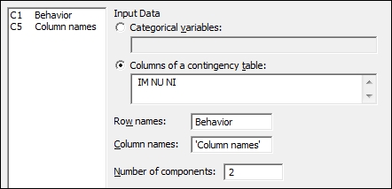
- Enter
Behaviorinto the Row names: section. - Enter
'Column names'into the Column names: section. - Click on the Results… button.
- Check the boxes for Row profiles.
- Click on OK.
- Click on the Graphs… button.
- Check the option for Symmetric plot showing rows only, Symmetric plot showing columns only and Symmetric plot showing rows and columns.
- Click on OK in each dialog box.
Using two components, we are attempting to plot a two-dimensional representation of our results. The output in the session window will give us Analysis of Contingency Table, which will show us the inertia and proportion of the inertia explained by the two components, as shown in the following screenshot:
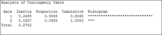
Inertia is the chi-squared statistic divided by n; it represents the amount of information retained in each dimension. Here, axis 1 accounts for over 90 percent of the inertia.
By checking the option for Row profiles in Results…, we will produce a table that indicates the proportion of each of the row categories by columns. We should see that the first questions have the highest proportions associated with IM and the last questions have increasing proportions associated with NU or NI.
The profiles, Expected, Observed-Expected and Chi Square column's values can also be generated from the Results… option.
Row contribution and column contribution tables are used to indicate how the rows and columns of the data are related to the components in the study.
Quality is a measure of the proportion of the inertia explained by the two components of that row. In this example, the total proportion of inertia explained by the two components was 1, hence all quality values are 1.
The Coordinate column is used to indicate the coordinates of component 1 and 2 for this row.
The Corr column is used to show the contribution to the inertia of that row or column. The example used here for quality is 1 for all rows; the total inertia explained by the two components is 1 for each row. The values of Corr for component 1 and 2 will, therefore, add to 1.
The Contribution column gives us the contribution to the inertia.
The Graph… option allows the use of symmetric or asymmetric plots. Here, we generated just the symmetric plots.
The column plot, which is shown in the following screenshot, shows NI as low in component 1 and IM as high in component 1. NU is shown as high in component 2.
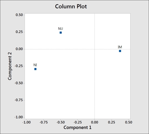
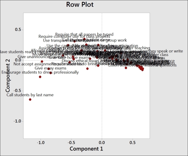
Comparing this to the row plot reveals the questions related to behaviors that are ranked as important and unimportant. We should also notice that with the behaviors labeled in longhand, the text on the charts, including the row, is difficult to read.
There are a few methods available to help tidy the results on charts such as the one shown in the previous screenshot. By leaving the Behavior column out of row names, the study will use the row numbers for the plot labels. Likewise, if we did not enter the column names as indicated in the fifth column, then Minitab would just report a number for each variable. Using row numbers instead of names can make the interpretation of this chart easier when we have a large number of variables.
We can also double-click on the labels on any of the charts to adjust the font size. Double-click on a label to go to the Font option and then type a value of 4 in the Size: section to reduce the fonts to a more manageable size.
Supplementary data allows us to add extra information from other studies. The supplementary data is scored using the results from the main dataset and can be added to the charts as a comparison.
Supplementary rows must be entered as columns. For example, if we had an additional behavior to evaluate, it would be entered in a new column with the number of rows in this column equal to the number of columns in the contingency table.
Let's say we have a new behavior of Dress Casually; this would be entered as a column with three rows for the responses, as shown in the following screenshot:
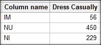
Here, a supplementary column would be required to have the same number of rows as the main data.
Axes on the charts can be changed by choosing the component that is plotted as y and x. In the Graph… option, this is initially set as 2 1. Here, 2 is our y axis and 1 is the x axis. If we have 3 2, then that would indicate that the component 3 is y and 2 is x. We can enter more components and they would be entered as y x pairs; all values are separated by a space.
We could also use more than two categories in a simple correspondence analysis. The Combine… option allows us to combine different categories into a single one to convert the results back into a two-way contingency table.