
Time series plots will generate a graph showing the values by their row number in the worksheet. As such, they will always generate a graph with an even distribution on the x axis.
In the following example, we will plot the mean maximum temperature that is recorded monthly at the Oxford weather station. As this data starts from 1853, we will subset this to all results from 2000 onwards.
We will use the data for the Oxford weather station in this example. This data is from the Met Office website and can be found at the following location:
http://www.metoffice.gov.uk/climate/uk/stationdata/
Select the Oxford station. The data is also made available in the Oxford data.txt file, which preserves the format from the website. Also, the Oxford weather (Cleaned).MTW Minitab file is correctly imported into Minitab for us.
When copying the data into Minitab, copy just the data starting at 1853. Then, paste it in the first row of the worksheet. After pasting the data, rename the columns.
For instructions on opening this data from a saved text file, see the Generating a paneled boxplot recipe.
The following instructions will create a time series plot of temperatures from the year 2000 to the end of the worksheet. We also stamp the year and month onto the x axis:
- Go to the Graph menu and select Time Series Plot….
- Choose the Simple time series plot.
- Enter the column for mean maximum temperature into the Series: section of the dialog box.
- Click on the Time/Scale… button.
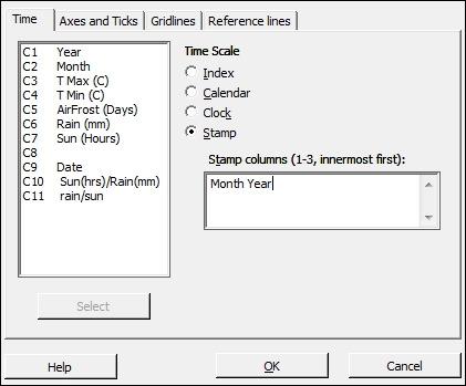
- From the options, select Stamp and complete the dialog as shown in the following screenshot:
- Click on OK and select the Data Options… button.
- Make sure that the Specify which rows to Include option under Include or Exclude is selected.
- Then, select the Rows that match option and click on the Condition… button.
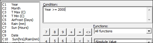
- In the Condition: section, enter the values as shown in the following screenshot:
- Click on OK thrice to create the chart.
Time series plots display the results by row number. We should ensure that the data is in its correct time order before using a time series plot.
By selecting the scale and stamp button, it allows us to change the default time scale from the row number to year and month. The first column entered is at the top of the x axis and subsequent columns in the stamp section are placed below the previous columns. This shows only the relevant value in the year and month columns; it does not display the results in the date order if they are sorted differently.
Data options allows us to filter the data displayed on a graph. This option is available for all graphs created from the Graph menu. By setting the condition for the year to be greater than or equal to 2000, we display only the temperatures from 2000 onwards.
When generating the time series plot for the data from the Met Office website or the saved text file, we notice that there are some missing points on the chart and in the worksheet. Check the data in the text that we copied; some of the results are indicated with *. These are provisional results. We would need to correct these manually in the worksheet or remove * from the original file.
The Oxford weather (cleaned).MTW worksheet provides this data with the missing data points corrected.