
Run charts are similar in application to control charts. We are interested in finding nonrandom patterns in data over time. These patterns are identified as either runs about the median, or runs up or down. These rules identify clusterings, mixtures, trends, or oscillations in our data.
In this example, we will plot the time in the office of all the US Presidents. For ease of use, this data is supplied in a Minitab worksheet. The data was gathered from Wikipedia and the White House website. More up-to-date results can also be found from a more recent visit to these sites.
We will use a run chart to plot the time in office to check for evidence of clusterings, mixtures, trends, or oscillations.
The following steps will generate a run chart for the days in office of each President of the United States of America:
- The data is saved in the worksheet
Presidents.mtw. Go to File and then go to Open Worksheet to open the dataset. - Navigate to Stat | Quality Tools and select Run Chart.
- Enter
Daysin the Single column field. - Enter the Subgroup size as
1. - Click on OK.
Run charts use the number of runs about the median and the number of runs up or down to identify patterns in the data. A run about the median refers to one or more consecutive points on one side of the median. A new run starts when the median line is crossed. The following diagram illustrates how runs are counted:
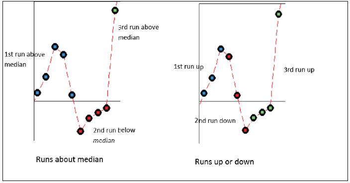
A run up or down refers to a number of points that continue in one direction. A new run begins when the data changes direction. More runs about the median than expected indicate clustering, less runs indicate mixtures.
Runs up or down that are more than expected suggest oscillations in the data; runs that are less than expected indicate trends.
The president data does have an interesting pattern to it that the run chart does not reveal. Other means of displaying the data can be used and it is worth looking at histograms of the data or using a graphical summary, as used in Chapter 3, Basic Statistical Tools.
- The Xbar-R charts and applying stages to a control chart recipe in Chapter 6, Understanding Process Variation with Control Charts
- The Using I-MR charts recipe in Chapter 6, Understanding Process Variation with Control Charts
- The Producing a graphical summary of data recipe in Chapter 3, Basic Statistical Tools