
When we observe no clear trend or seasonality in the data, we can use either moving average or single exponential smoothing tools for forecasting.
The data we will use in this example are the GDP figures for the UK from 2009 to 2013. The data is provided for us in the GDP figures all.mtw worksheet and is available in the code bundle; it contains data from 1955 to 2013. We will initially subset the data for results from 2009 onwards. Then, we will use quarterly growth percentage, comparing the results from both moving average and single exponential smoothing.
The data was originally obtained from the Guardian website and is available at
http://www.theguardian.com/news/datablog/2009/nov/25/gdp-uk-1948-growth-economy .
The following steps will generate a moving average chart and a single exponential smoothing chart:
- Open the
GDP figures all.mtwworksheet. - Go to the Data menu and select Subset Worksheet.
- Enter
2009 onwardsin the Name section. - Click on the Condition button.
- Enter
Year >= 2009in the Condition section. - Click on OK in each dialog box.
- Create the moving average chart first by going to the Stat menu, then to Time Series, and selecting Moving Average.
- Enter
GDP, Quarterly growthin the Variable section and2in the MA length section. - Check the button for Generate forecasts and enter
4for the Number of forecasts:. - Click on the Time button.
- For Time Scale, choose the Calendar option and select Quarter Year from the drop-down list.
- For the start value, type
1 2009, the dialog box for which should appear as follows: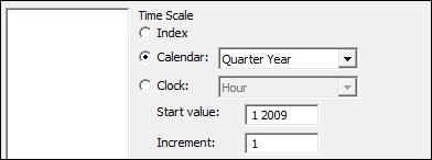
- Click on OK.
- Click on the Graphs button and select the option for the Four in one residual plots.
- Click on OK in each dialog box.
- For the single exponential smoothing, go back to the Time Series menu and select Single Exp Smoothing.
- For the Variable section, enter
GDP, Quarterly growth. - Follow steps 8 to 14 to select residual plots and enter the quarter and year on the x axis of the chart.
On the moving average chart, the fits are the average of the previous n data points, where n is the moving average length. The length of the moving average can be used to specify how smoothed or how responsive the fitted values are. The higher the moving average, the greater the smoothing on the fitted values. Here, we used a moving average length of 2, and the fitted values are then the mean of the previous two values.
Single exponential smoothing uses the level component to generate fitted values. As with the moving average, by using the weight, we control how responsive or smoothed the results are. The weight can be between 0 and 2. Low weights result in smoothed data; higher weights can react more quickly to changes in the series.
Forecasting for both the techniques takes the value of the fitted result at the origin of the time point and continues this value forward for the number of forecasts. The default origin for fitted values is the last time point of the data. It is possible to reset the origin for the forecasted results, and by resetting the origin to a specific time point within the series, we can compare how useful the forecasts would have been for our data.
We should note that forecasts are an extrapolation, and the further ahead the forecasts, the less reliable they are. Also, forecasting only sees the data in the period we have been studying; it does not know about any unusual events that may occur in the future.
The time options within both tools allow us to change the display on the time scale. Here, we used the calendar to set the scale to quarter and year. By indicating the start value at 1 2009, we tell the charts to start at quarter 1 in 2009. A space is all that is needed to separate the values. We could have also used the Year/Quarter column in C1 by using the Stamp option instead. The trend analysis example illustrates using a column to stamp the Time axis.