
With Principal Components Analysis (PCA), we can try to explain the variance-covariance structure of a set of variables. We will use PCA to investigate linear associations between a large number of variables; or rather, we will change the dimensionality of a large dataset to a reduced number of variables. This can help identify the relationships in a dataset that are not immediately apparent.
As such, PCA can be a useful exploratory tool in data analysis and can often lead to more in-depth analysis.
This example looks at the tax revenue in the UK from April 2008 to June 2013.
The following steps will generate the principal components of the input factors and also plots to evaluate the impact of the first two principal components:
- Open the
Tax Revenue.MTWworksheet. - Go to the Stat menu, click on Multivariate, and select Principal Components...
- For the Variables: section, select the numeric columns from
PAYE IncometoCustoms duty. - In the Number of components to compute: section, enter
5. - Click on the Graphs… button and select all the charts.
- Click on OK in each dialog box.
In our study, we have a set of variables that correlate with each other to varying degrees. Using PCA, we convert these variables into a new set of linearly uncorrelated variables. We identify the first principal component by seeking to explain the largest possible variance in our data. The second component then seeks to explain the highest amount of variability in the remaining data, under the constraint that the second component is orthogonal to the first. Each successive component then must be orthogonal to the preceding components.
Ideally, this can help reduce many variables to fewer components, thereby reducing the dimensionality of the data down to a few principle components. The next step is the interpretation of the components that are then generated.
The results of the principal components, as shown in the following screenshot, give us an indication of the correlations between the variables. Next, we should study the principal components and their construction from the variables. Ideally, we would be able to identify a theme for the components.
The output in the session window will list an eigenanalysis of the correlation matrix plus the variables and their coefficients in the principal components.
In the following screenshot, we should observe that PC1 accounts for a proportion of 0.233 of the overall variation and PC2, 0.426:
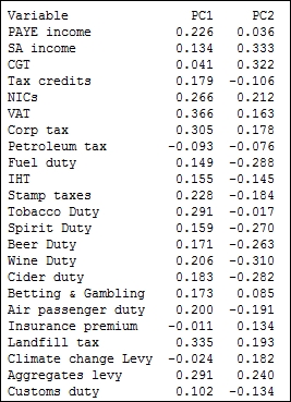
The coefficients for PC1 reveal a negative value for Petroleum tax with positive coefficients for tobacco, alcohol duties, income tax, corporation taxes, and others. A low score in PC1 indicates a high petroleum tax revenue with low income-tax-based revenues; high scores for PC1 would indicate higher employment-based taxes and social taxes such as alcohol duties and tobacco duties. PC1 may be representing an overall income-based tax.
PC2 shows us the positive values of the revenues of climate change levy (CCL), insurance premium taxes, Self Assessment (SA) income, and Capital Gains Tax (CGT). SA income and CGT are not collected automatically via wages paid to employees, but are taxes that have to be declared by an individual at specific times of the year.
The option for PCA allows us to choose between using a correlation matrix or a covariance matrix to analyze the data. A correlation matrix will standardize the variables while the covariance matrix will not. A covariance matrix is often best applied when we know that the data has similar scales. When the covariance matrix is used with variables of differing scales or variation, PC1 tends to get associated with the variable that has the highest variation. Using descriptive statistics from the Basic Statistics menu in Stat, we will observe that corporation tax has the highest standard deviation. If we were to run the PCA again with a covariance matrix, then we would observe the first principal component that is aligned strongly with corporation tax.
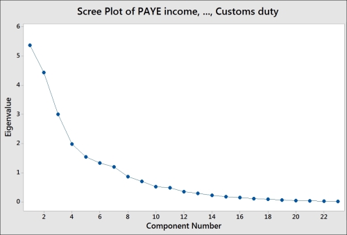
The following screenshot shows us the Scree Plot of eigenvalues of each component, where the highest eigenvalues are associated with components 1 and 2:
The following screenshot displays the Score Plot of the first two principal components; the graph is divided into quadrants for the positive and negative values of PC1 and PC2.
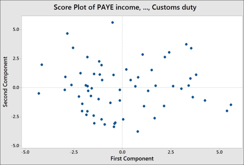
To help with the interpretation of the score plot, it would be useful to either apply a grouping variable by editing the points or brush the chart. The following steps can be used to turn the brush tool on and identify the country behind each point on the chart:
- Right-click on the score plot and select Brush from the menu.
- Right-click on the chart once again and select Set ID variables….
- Double-click on the columns for
YearsandMonthinto the Variables: section. - Click on OK.
- Use the cursor to highlight points on the chart.
Another option is to add data labels to the score plot. The following steps show us how to label each point with the country's name:
- Right-click on the chart and go to the Add menu and select Data Labels….
- Select the Use labels from column: option.
- Enter
Monthinto the section for labels. - Click on OK.
Comparing the score plot to the loading plot helps us understand the effect of the variables on the first two components. In the following screenshot, we can see the negative association between agricultural employment and PC1. Countries with negative PC1 will tend to have a high percentage of their population employed in agriculture.
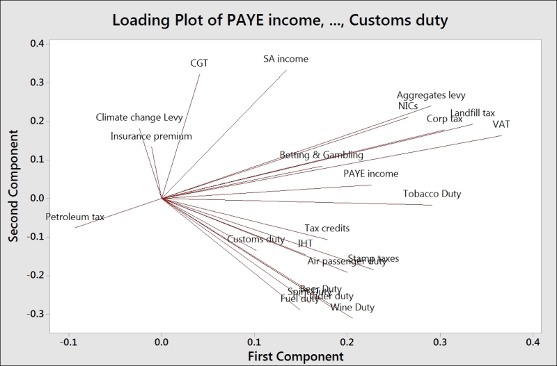
The upper-right corner of the loading and score plots are associated with higher taxes from self-declared income. The lower-right corner is associated with taxes from alcohol, stamp duty, and air passenger duties.
The biplot is useful in that it combines the loading and the score plots. The downside to the biplot is that the brushing tool does not work with it and we can't add data labels as well.
The graphs generated for loading as well as the biplots from the dialog box use only PC1 and PC2. We can use the Storage option to store the scores for other components. If we wanted to store the scores for the first four principal components, we would enter four columns into the section for scores.
This can allow us to create scatterplots for the other components.