
In this recipe, we will use a proportion chart to track events or defective items out of a total.
This data looks at the number of breaches within an accident and emergency department. The hospital has a target, according to which patients arriving at the accident and emergency ward must be seen by a doctor within four hours. A breach is classified as a patient who has not been attended to within this time. The dataset that we are using is organized into columns for ease of entry. Total attendance at accident and emergency is listed in row 1 and breaches are listed in row 2.
We will need to transpose the data into a new worksheet to put it back into a column format, before generating the P chart.
Enter the data in the following screenshot into a worksheet in Minitab. Label the columns of the data as 1 through to 9.
The following steps will transpose the data into a new worksheet before generating a P chart:
- Go to the Data menu and click on Transpose columns….
- Highlight the columns
1to13and click on the Select button to move them into the top section and enterC1into the space for creating variable names, as shown in the following screenshot: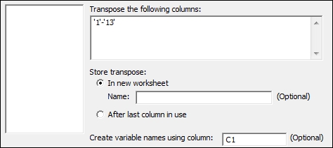
- Click on OK.
- Navigate to Stat | Control charts | Attributes Charts and then select the P… chart.
- Enter
Breachesin the Variables: field. - Enter
'A&E attendance'in the Subgroup sizes: field. - Click on the P Chart Options… button.
- Select the tab labeled Tests.
- Select Perform all tests for special causes in the drop down.
- Click on OK in each dialog box.
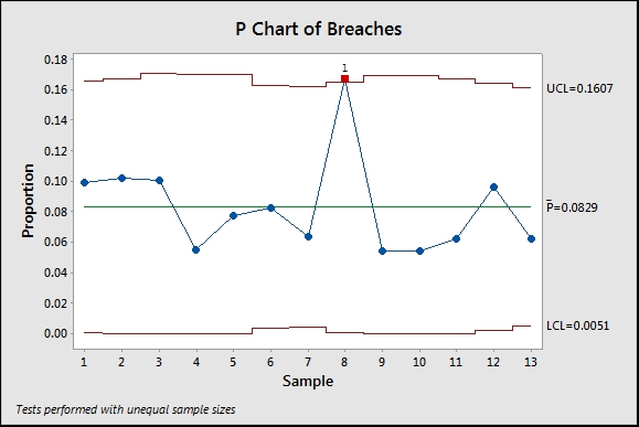
The proportion chart plots the mean proportion of all of the data data and the proportion for each subgroup. The control limits are set based on the binomial distribution at +/- 3 standard deviations.
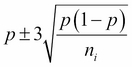
Lower control limits that are calculated as negative are fixed at 0 and by the same token, limits that exceed one are fixed at 1. As the control limits depend on the subgroup sample size, ![]() , we will observe control limits that vary in width for this result as the number of occupied beds differs per month. For the data plotted here, they appear as shown in the following screenshot:
, we will observe control limits that vary in width for this result as the number of occupied beds differs per month. For the data plotted here, they appear as shown in the following screenshot:
We can set the control limits for the P chart to a constant value using the S Limits tab within the P Chart options…. The following screenshot shows where to fix the control limits to use an assumed subgroup size:
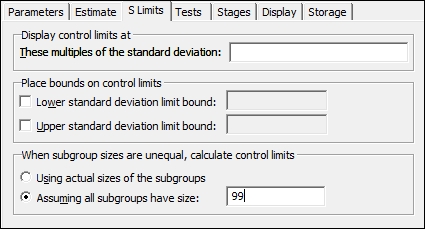
AIAG suggests that the mean subgroup size can be used for the control limits as long as the minimum subgroup size is no more than 0.75 of the maximum subgroup size.
The P chart sets control limits based on the data following a binomial distribution. This can be a problem as subgroup sizes increase. When subgroups become larger, it is possible that group variation can be seen as different from the binomial variation. This is known as overdispersion. See Laney P' charts for correcting group variation in the P chart.
When selecting multiple columns for dialog boxes, we can drag down the list of available columns and click on the Select button. All selected columns are entered into the dialog box. A range of columns is indicated by a hyphen between them. C1-C10 would indicate all columns from 1 to 10.