
As with all control charts, the Xbar-R charts are used to monitor process stability. Apart from generating the basic control chart, we will look at how we can control the output with a few options within the dialog boxes. Xbar-R stands for means and ranges; we use the means chart to estimate the population mean of a process and the range chart to observe how the population variation changes.
For more information on control charts, see Understanding Statistical Process Control by Donald J. Wheeler and David S. Chambers.
As an example, we will study the fill volumes of syringes. Five syringes are sampled from the process at hourly intervals; these are used to represent the mean and variation of that process over time.
We will plot the means and ranges of the fill volumes across 50 subgroups. The data also includes a process change. This will be displayed on the chart by dividing the data into two stages.
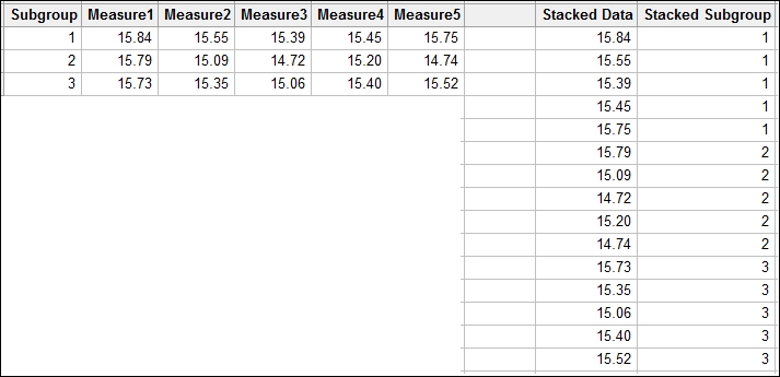
The charts for subgrouped data can use a worksheet set up in two formats. Here the data is recorded such that each row represents a subgroup. The columns are the sample points. The Xbar-S chart will use data in the other format where all the results are recorded in one column.
The following screenshot shows the data with subgroups across the rows on the left, and the same data with subgroups stacked on the right:
The following steps will create an Xbar-R chart staged by the Adjustment column with all eight of the tests for special causes:
- Use the Open Worksheet command from the File menu to open the
Volume.mtwworksheet. - Navigate to Stat | Control Charts | Variables charts for subgroups. Then click on Xbar-R….
- Change the drop down at the top of the dialog to Observations for a subgroup are in one row of columns:.
- Enter the columns
Measure1toMeasure5into the dialog box by highlighting all the measure columns in the left selection box and clicking on Select.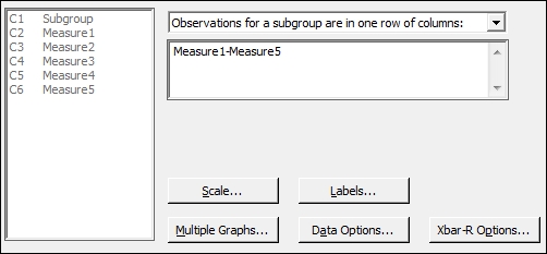
- Click on Xbar-R Options and navigate to the tab for Tests.
- Select all the tests for special causes.
- Select the Stages tab.
- Enter
Adjustmentin the Define Stages section. - Click on OK in each dialog box.
The R or range chart displays the variation over time in the data by plotting the range of measurements in a subgroup. The Xbar chart plots the means of the subgroups.
The choice of layout of the worksheet is picked from the drop-down box in the main dialog box. The All observations for a chart are in one column: field is used for data stacked into columns. Means of subgroups and ranges are found from subgroups indicated in the worksheet. The Observations for a subgroup are in one row of columns: field will find means and ranges from the worksheet rows.
The Xbar-S chart example shows us how to use the dialog box when the data is in a single column. The dialog boxes for both Xbar-R and Xbar-S work the same way.
Tests for special causes are used to check the data for nonrandom events. The Xbar-R chart options give us control over the tests that will be used. The values of the tests can be changed from these options as well. The options from the Tools menu of Minitab can be used to set the default values and tests to use in any control chart.
By using the option under Stages, we are able to recalculate the means and standard deviations for the pre and post change groups in the worksheet. Stages can be used to recalculate the control chart parameters on each change in a column or on specific values. A date column can be used to define stages by entering the date at which a stage should be started.
Xbar-R charts are also available under the Assistant menu. For more on how to use the Assistant menu to generate a control chart, see the Using the Assistant tool to create control charts recipe.
The default display option for a staged control chart is to show only the mean and control limits for the final stage. Should we want to see the values for all stages, we would use the Xbar-R Options and Display tab. To place these values on the chart for all stages, check the Display control limit / center line labels for all stages box. See Xbar-S charts for a description of all the tabs within the Control Charts options.
For more information on changing the values of the tests for special causes, see the Using I-MR charts recipe.