
I-MR charts are used to plot single values over time. Individuals charts are typically used when we have single measurements at a point of time or at every result. Examples might include be related to the production of smaller volumes such as aircraft or perhaps aircraft engines. Other scenarios might include situations where data collection is automated and all results are captured. The individual values are plotted against the overall mean and the moving range tracks variation by looking at differences between the results. Unlike Xbar-R or Xbar-S, which use a sample or subgroup to estimate the mean and variation, an I-MR chart estimates the short term variation from the average moving range. This is based on the successive differences between the individual values.
Here, we will use the values of temperature from the Oxford weather station to check the stability of temperature. Temperature is a seasonal value and we will look at the measurements separately by month. As the temperature data has been given to us in the form of the mean maximum daily temperature for each month, there are no logical subgroups into which to divide the data. We will therefore plot the temperature as individual values.
As temperatures show a high degree of seasonality across the year, it would not be sensible to plot all of the original temperature data as a control chart. Therefore, we will plot the temperature for a single month instead. In this recipe, we will plot the temperature for January from every year from the start of record keeping to the present day.
We will first split the worksheet by month, before running the I-MR chart on the results for January.
The data for this example can be found on the MET office website at the following address:
http://www.metoffice.gov.uk/climate/uk/stationdata/oxforddata.txt
Copy the data into Minitab and label the columns Year, Month, T Max, T Min, AirFrost(days), Rain(mm), and Sun(Hours).
This data is also available from the Oxford weather.txt file or the Oxford Weather (Cleaned).mtw file.
The following steps will create a new worksheet for each month and then generate an I-MR chart for mean maximum and minimum January temperatures:
- Go to the Data menu and click on Split Worksheet.
- Enter the
Monthcolumn as By variables:. - Click on OK.
- Select the worksheet for Month = 1 for the January temperatures.
- Navigate to Stat | Control Charts | Variables Charts for Individuals and click on I-MR.
- Enter the columns for
'T Max'and'T Min'as Variables. - Click on the Scale button and enter
Yearin the Stamp columns field by selecting the options as shown in the following screenshot: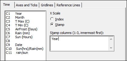
- Click on OK.
- Select the I-MR options button, then choose the tab labeled Tests, and select Perform all tests for Special causes.
- Click on OK in each dialog box.
Each column entered into the variables section for I-MR charts will create a separate control chart. We have created charts for both the mean maximum temperatures and the mean minimum temperatures for January from the start of the data in 1853.
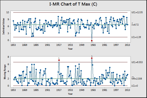
Results that break the rules for identifying special causes or unusual variation are flagged in red with the test that has been broken. In the results shown in the preceding screenshot, Test 1 is flagged up for years 1917 and 1963 on the moving range chart. This seems to indicate a large change in temperatures from 1916 to 1917 and 1962 to 1963. Notice the result in the individuals' chart for 1963. This corresponds to one of the coldest winters in the UK since records began.
Some care should be taken with the interpretation of the previous results as adjacent points are one year apart.
The use of the Scale option, Stamp, allows us to use a column in the worksheet for the x axis labels. By displaying the year instead of the row number as the index, we can identify the years which contain unusual results. If the graph is the active window pop up, text highlighting the year will be displayed when we hover the cursor over a point.
I-MR charts, like most control charts, are an updating graph within Minitab. We can right-click on the chart and click on Update Graph Now when new data is entered or click on Update Graph Automatically.
Time-weighted charts are more appropriate than I-MR charts if we are interested in observing small changes. Advanced charts such as CUSUM or EWMA can be used to pick up on these smaller shifts in the process. See the example of the EWMA chart later as a comparison.
As the dialog boxes in Minitab remember previous settings, we can easily generate the charts for the other months by selecting one of the other worksheets. Go back to the previous dialog box using Ctrl + E, and all we need to do is click on OK to run the same settings on the new worksheet. This can be automated by the use of macros. The macro command Worksheet can be used to specify a worksheet to make it active.
Defaults for the tests used in control charts can be specified from Tools and Options, as shown in the following screenshot
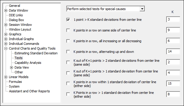
The preceding screenshot shows the location of the options. Here it is possible to pick the tests to be used by default and the values of those tests. While Minitab uses the most common values of these tests, often test 2 is set at 7 or 8 points in a row rather than 9. This would make the test more sensitive to a process shift at the cost of increasing the risk of a false alarm.
An alternative method of selecting the results of January for the I-MR chart would be to use the Data Options button from the dialog box.
Here we can specify which rows to include or exclude from the study in the same manner as in the Subset Worksheet option.