
Rare event charts are used to plot intervals between events. Time between events tends to follow a Weibull distribution. The T chart is used to track whether the intervals between events are changing or remain stable.
If we were to plot the number of events in a day or week, it may be possible to use this data as a c-chart that displays a count of events. The problem with this technique is that rare events tend to have a rate that is very close to zero. Any event that occurs will be flagged up as unusually high.
Here we use the T chart to plot the time between eruptions of Vesuvius. Vesuvius is historically a very active and dangerous volcano, which was responsible for the destruction of Pompeii and Herculaneum in 79 AD. The dataset that we are using tracks the start dates of the eruptions from the year 1000 onwards.
The following steps open the dataset for the eruptions of Vesuvius and then produce the T chart of days between eruptions:
- The data is in the
Vesuvius eruptions.mtwworksheet. Use File and Open Worksheet… to navigate to thevesuvius eruptions.mtwfile. - Navigate to Stat | Control Charts | Rare Event Charts and click on T….
- Enter
Yearin the Variables: field. - Click on T Chart Options… and navigate to the tab labeled Tests.
- Select Perform all the tests for special causes.
- Click on OK.
- Click on the Scale… button.
- Select the Stamp option and enter
Yearin the Stamp columns field. - Click on OK in each dialog box.
The T chart plots the number of days between events and uses a Weibull distribution for the time between events. The plotted data points are the time between events or in this case, eruptions. High values equate to more time between events, and in the case of Vesuvius, a long quiet time between eruptions. Lower values indicate shorter times between events. See the following chart where we get long intervals around 1500 AD.
Tests 1, 5, 6, 7, and 8 use probability zones on the Weibull distribution instead of the usual rules for an Xbar-R or individuals chart.
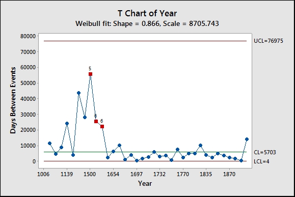
The results of the T chart should reveal a larger interval between eruptions flagged up at 1500. This interval has a value of 55882 days or roughly 153 years between the eruption in 1347 and the eruption in 1500.
The data was plotted only for the years in which an eruption occurred. This could also be constructed as a number of intervals, days, or hours between events. For this option, we would record the number of days between eruptions in the worksheet and then set the form of data in the dialog box as the number of intervals between events. See the example for G charts for data in this format.
T charts are very similar to G charts. The G chart in the next recipe uses a geometric distribution. The choice between T and G charts is made on whether the data represents the time between occurrence of events or the number of opportunities between events.
The T Chart Options will also allow us to choose between using the Weibull or the exponential distribution.