
The bar chart tools in Minitab offer some of the most flexible graphs for use. Many different styles of bar charts are available. The choices here allow us to use categorical data with the Counts of unique values selection. We could create bars of mean values, totals, medians of a set of numeric data from the Function of a variable option, or plot the values from a table.
Here, we will create a bar chart of the data in the Pulse.MTW worksheet. We will display the number of smokers and nonsmokers by gender for a group of students. As the columns are categorical, we will use the Counts of unique values bar charts.
The following instructions will create a stacked bar chart showing the number of smokers and nonsmokers among a group of male and female students.
- Go to the File menu and select Open Worksheet….
- Click on the button labeled Look in Minitab Sample Data folder.
- Open the
Pulse.MTWworksheet. - Go the to Graph folder and select Bar Chart….
- From the displayed charts, select the Stack style of the bar chart.
- Enter
Sexfirst andSmokessecond; the dialog should appear as follows. - Click on OK.
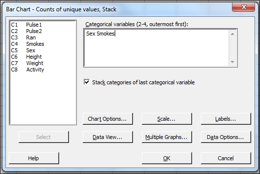
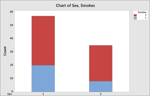
The first column is used as the outermost or the lowest category on the x axis. Here this is the Gender column. The final column is used as the stacked column. In the following graph, we will see the value of smokes being stacked inside the results for gender. The values of Sex are 1 for male and 2 for female; the values of Smokes are 1 for regular smokers and 2 for nonregular smokers. Up to four categorical columns can be used in stacked or unstacked bar charts
The results can also be displayed as a percentage of all the data or as a percentage within each gender.
The option to show the results as a percentage can be found by right-clicking on the chart and then selecting Graph Options… from the right-click menu.
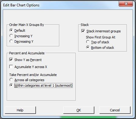
Across all categories will display each level as a percentage of the total result. For example, female smokers represent 8.7 percent of the students.
Within categories at level 1 (outermost) displays the levels of smokers as a percentage within that of gender. For example, 22.86 percent of females part of this study smoke.
You can use the example of coding data to convert numeric values to text present in Chapter 1, Worksheet, Data Management, and the Calculator, to display text instead of numbers on this chart.
- The Coding a numeric column to text values recipe in Chapter 1, Worksheet, Data Management, and the Calculator
- The Creating a bar chart with a numeric response recipe
- The Creating Pareto charts recipe