
Bar charts can also be used with numeric responses. Using the graphs with the selected function of a variable, we can find the mean of a numeric column. Here, we will use the pulse data to see the difference in the mean pulse rate for the previous and next activity columns. We will also split the bars into those who ran on the spot and those who didn't.
The following instructions will create a bar chart of Pulse1 and Pulse2 clustered together within the Ran column:
- Go to the File menu and select Open Worksheet….
- Click on the button labeled Look in Minitab Sample Data folder.
- Open the
Pulse.MTWworksheet. - Go to the Graph menu and select Bar Chart….
- Change the selection for Bars represent: to A function of a variable.
- Select the Cluster bar chart under Multiple Y's and select OK.
- Make sure the Function: section is set to Mean and then select the Graph variables: section. Enter
Pulse1andPulse2into the graph variables. - Select the Categorical variables for grouping (1-3, outermost first): section, enter
Ran. - Choose the option under Scale Level for Graph Variables to Graph Variables displayed innermost on scale.
- Click on OK.
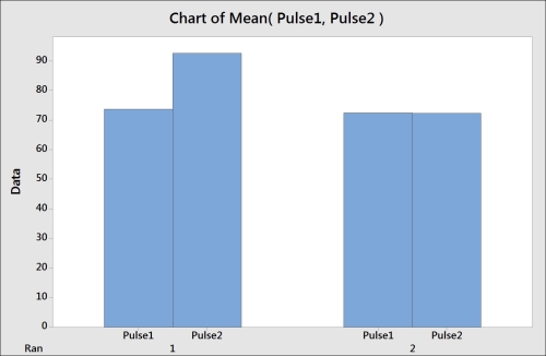
The graph that is created will appear as shown in the previous screenshot. We chose the Multiple Y's option when selecting the graph so that we could use both the Pulse1 and Pulse2 columns on the same chart. The Ran column is used as the categorical scale. Numeric columns used with this type of bar chart can be displayed as means, totals (sum), count, medians, and more.
The position of the categories on the x axis can be selected from the options of the scale level for graph variables. Graph variables refer to the numeric columns, outermost refers to the lowest category on the x axis, and innermost refers to the highest category on the x axis. By putting graph variables innermost, we tell Minitab to place the columns of Pulse1 and Pulse2 within each category of Ran.
The following instructions can be used to color the bars of Pulse1 and Pulse2 separately and tidy up the graph by removing extra labels on the x axis:
- Double-click on the bars on the chart.
- Select the tab labeled Groups.
- Choose the Assign attributes by graph variables option (graph variables refers to columns and attribute refers to the bar color).
- Click on OK.
- Double-click on the y axis.
- Select the tab labeled Show.
- Uncheck the selection for Graph variables under Show labels by Scale Level.