
Boxplots can offer a very clear way to observe location and spread of data. When comparing different groups of results, they are often more intuitive than histograms.
We will use a boxplot to investigate the average values for a set of data and see the range of values. In this recipe, we will create a boxplot of the mean maximum and minimum temperatures by month.
This example will also use the paneling options within Minitab to generate two separate graphs on one page.
We will use the data for the Oxford weather station in this example. This data is from the Met Office and is found at the following location:
http://www.metoffice.gov.uk/climate/uk/stationdata/
Select the Oxford station. The data is also made available in the Oxford data.txt file, which preserves the format from the website. Also, the Oxford weather (Cleaned).mtw Minitab file is correctly imported into Minitab for us.
The following instructions will copy the data from the website before generating boxplots of the mean maximum and minimum temperatures by month.
- Follow the previous link to the Met Office weather station site.
- Choose the Oxford 1853- station.
- In your web browser, save the file as a text file.
- In Minitab, go to File and select Open Worksheet….
- Change Files of type: to Text (*.txt).
- Select the file that we have just saved, or the provided
Oxford Data.txtfile. - Click on the Preview… button to see how the data will be imported. Notice that the data starts on line
8, and the variable names on row6. All the data appears in one column. - Click on OK and select the Options… button.
- In the Variable Names, select Use row: and enter
6. - For the First Row of Data, select Use row: and enter
8. - Set Field Definition to Free format.
- Click on OK in each dialog.
- Go to the Graph menu and select Boxplot….
- From the graph selection, choose the With Groups chart under One Y.
- Enter the mean maximum temperature,
Tmax, and the mean minimum temperature,Tmin, in Graph Variables:. - Enter the month column,
mm, in Categorical Variables for grouping (1-4, outermost first):. - Select the Multiple Graphs… button and choose the In separate panels of the same graph option in Show Graph Variables. Then tick the button for Same Y under Same Scales for Graphs.
Steps 1 to 12 help us bring the text data into Minitab correctly. They can be skipped if we open the provided Minitab worksheet with the results in it. This is useful to show how we can use the Open Worksheet… command to bring text data in and ensure that the format is correct before opening. The use of Variable Names and First Row of Data helps us define where the data starts. We also used the Free format option to identify how to split out columns, but we could also use Tab, Comma, and other options to separate out columns.
Copy and paste will work as a method to import data. To copy and paste the weather data, we should select just the data without column headers. Copy this block into Minitab and then rename the columns. This is done because the text file has two column headers. These include the line for the column names and the line for units. We have only one column header in Minitab.
By default, the One Y selection for a graph creates a new graph page for each variable. The Multiple Graphs… options can be used to place separate graphs on the same page. In this scenario, it was also useful to set the y axis scales to remain fixed. The default option is independent scaling.
The maximum temperature graph is then displayed next to the minimum temperatures.
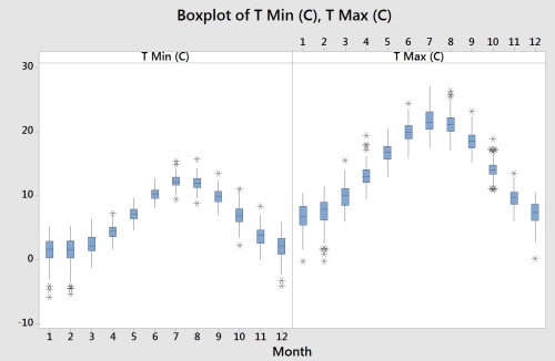
We created a paneled graph page of maximum and minimum monthly mean temperatures. The previous graph shows the result of this side-by-side view. The same results can be displayed in a very different format by changing column orders or using a different boxplot style.
Try using the With Groups chart under Multiple Y's. This will place both variable columns within the same chart. Changing the option for graph variables that are displayed outermost on the scale to innermost will change the style of the chart from the side-by-side temperature columns to the maximum and minimum temperatures together within the month.
Edit the colors of the boxplot by double-clicking on one of the boxes. Within the Edit box tab, select the Groups section. Check the Assign attributes by graph variables option to color the boxes that are by the two separate columns.