
- Minitab Cookbook
- Table of Contents
- Minitab Cookbook
- Credits
- About the Author
- About the Reviewers
- www.PacktPub.com
- Preface
- 1. Worksheet, Data Management, and the Calculator
- Introduction
- Opening an Excel file in Minitab
- Opening data from Access using ODBC
- Stacking several columns together
- Stacking blocks of columns at the same time
- Transposing the columns of a worksheet
- Splitting a worksheet by categorical column
- Creating a subset of data in a new worksheet
- Extracting values from a date/time column
- Calculator – basic functions
- Calculator – using an if statement
- Coding a numeric column to text values
- Cleaning up a text column with the calculator
- 2. Tables and Graphs
- Introduction
- Finding the Tally of a categorical column
- Building a table of descriptive statistics
- Creating Pareto charts
- Creating bar charts of categorical data
- Creating a bar chart with a numeric response
- Creating a scatterplot of two variables
- Generating a paneled boxplot
- Finding the mean to a 95 percent confidence on interval plots
- Using probability plots to check the distribution of two sets of data
- Creating a layout of graphs
- Creating a time series plot
- Adding a secondary axis to a time series plot
- 3. Basic Statistical Tools
- Introduction
- Producing a graphical summary of data
- Checking if data follows a normal distribution
- Comparing the population mean to a target with a 1-Sample t-test
- Using the Power and Sample Size tool for a 1-Sample t-test
- Using the Assistant menu for a 1-Sample t-test
- Looking for differences in the population means between two samples with a 2-Sample t-test
- Using the Power and Sample Size tool for a 2-Sample t-test
- Using the Assistant menu to run the 2-Sample t-test
- Finding critical t-statistics using the probability distribution plot
- Finding correlation between multiple variables
- Using the 1 Proportion test
- Graphically presenting the 1 Proportion test
- Using the Power and Sample Size tool for a 1 Proportion test
- Testing two population proportions with the 2 Proportions test
- Using the Power and Sample Size tool for a 2 Proportions test
- Using the Assistant menu to run a 2 Proportions test
- Finding the sample size to estimate a mean to a given margin of error
- Using Cross tabulation and Chi-Square
- Using equivalence tests to prove zero difference between the mean and a target
- Calculating the sample size for a 1-Sample equivalence test
- 4. Using Analysis of Variance
- Introduction
- Using a one-way ANOVA with unstacked columns
- Calculating power for the one-way ANOVA
- Using Assistant to run a one-way ANOVA
- Testing for equal variances
- Analyzing a balanced design
- Entering random effects model
- Using GLM for unbalanced designs
- Analyzing covariance
- Analyzing a fully nested design
- The repeated measures ANOVA – using a mixed effects model
- Finding the critical F-statistic
- 5. Regression and Modeling the Relationship between X and Y
- Introduction
- Visualizing simple regressions with fitted line plots
- Using the Assistant tool to run a regression
- Multiple regression with linear predictors
- Model selection tools – the best subsets regression
- Model selection tools – the stepwise regression
- Binary logistic regression
- Fitting a nonlinear regression
- 6. Understanding Process Variation with Control Charts
- Introduction
- Xbar-R charts and applying stages to a control chart
- Using an Xbar-S chart
- Using I-MR charts
- Using the Assistant tool to create control charts
- Attribute charts' P (proportion) chart
- Testing for overdispersion and Laney P' chart
- Creating a u-chart
- Testing for overdispersion and Laney U' chart
- Using CUSUM charts
- Finding small shifts with EWMA
- Control charts for rare events – T charts
- Rare event charts – G charts
- 7. Capability, Process Variation, and Specifications
- Introduction
- A capability and control chart report using the capability analysis sixpack
- Capability analysis for normally distributed data
- Capability analysis for nonnormal distributions
- Using a Box-Cox transformation for capability
- Using a Johnson transformation for capability
- Using the Assistant tool for short-run capability analysis
- Comparing the capability of two processes using the Assistant tool
- Creating an acceptance sampling plan for variable data
- Creating an acceptance sampling plan for attribute data
- Comparing a previously defined sampling plan – C = 0 plans
- Generating run charts
- Generating tolerance intervals for summarized data
- Datasets that do not transform or fit any distribution
- 8. Measurement Systems Analysis
- Introduction
- Analyzing a Type 1 Gage study
- Creating a Gage R&R worksheet
- Analyzing a crossed Gage R&R study
- Studying a nested Gage R&R
- Checking Gage linearity and bias
- Expanding a Gage study with extra factors
- Studying a go / no go measurement system
- Using the Assistant tool for Gage R&R
- Attribute Gage study from the Assistant menu
- 9. Multivariate Statistics
- Introduction
- Finding the principal components of a set of data
- Using factor analysis to identify the underlying factors
- Analyzing consistency of a test paper using item analysis
- Finding similarity in results by rows using cluster observations
- Finding similarity across columns using cluster variables
- Identifying groups in data using cluster K-means
- The discriminant analysis
- Analyzing two-way contingency tables with a simple correspondence analysis
- Studying complex contingency tables with a multiple correspondence analysis
- 10. Time Series Analysis
- 11. Macro Writing
- A. Navigating Minitab and Useful Shortcuts
- Index
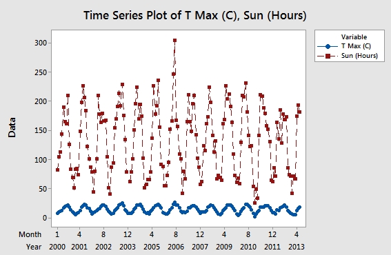
Time series plots and scatterplots can be used with a secondary axis. Here, we will use the Oxford weather station's data to plot the temperature and hours of sunlight on the same chart. Temperature will be displayed on the left y axis; Sun(Hours) will be displayed on the right axis.
As done in the previous recipe, we will use the Oxford weather station's data. See the details in the Creating a time series plot recipe. Most of the steps in this example will be similar to the time series plot instructions, except the use of the multiple time series plots instead of a single one.
Let's get started with the steps that would help us add a secondary axis to a time series plot:
- Go to the Graph menu and select Time Series Plot….
- Select the Multiple chart.
- Enter the column for mean maximum temperature and the column for hours of sunlight into the section labeled Series:.
- Follow the steps in the previous example to add the year and month on the x axis, and for the condition to display only the results from 2000 onwards, that is, from step 4 to step 9.
- The graph should appear as shown in the following screenshot:
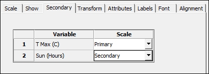
- Double-click on the y axis to edit the scale as indicated on the screenshot.
- From the Edit y axis options, choose the Secondary tab and use the dropdown to put the hours of sunlight column on the Secondary axis, as shown in the following screenshot:
Multiple charts that are overlaid are displayed on the same graph. When the scales are very different, as in this case where temperatures are in degree Celcius and sunlight hours in hours of sunlight in a month, then one response can appear disproportionate to the other. The secondary axis allows independent scaling of both axes while using the same x axis.
This can be a useful tool to display correlations in the data.
-
No Comment