
With the analysis of covariance, we are going to investigate the effect of a continuous variable alongside a categorical response. The dataset used in this example is of the average salary paid to teachers and expenditures per pupil in the U.S.. We will look for effects on pupil expenditure by state and by average salary of teachers.
The data is available at the data and story library. Copy the data in the following link into Minitab: http://lib.stat.cmu.edu/DASL/Datafiles/EducationalSpending.html.
The following steps will use Pay as a covariate in a general linear model and reduce the model by removing terms with a p-value above 0.05:
- Navigate to Stat | ANOVA | General Linear Model and select Fit General Linear Model….
- In the Responses: field, enter
Spend. - In the Factors: field, enter
Regionand in Covariates:, enterPay. - Click on the Model… button and then highlight both
RegionandPayand select the Add button next to Interactions through order:. - Click on OK in each dialog box.
- Go to the session window and check the Analysis of Variance table:
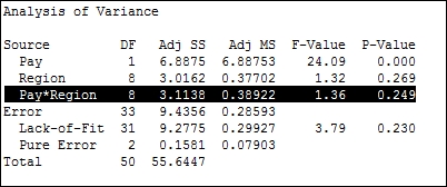
- The p-value for the interaction of
Region*Payis above our decision of 0.05. Press Ctrl + E to return to the last dialog box. Go to the Model… section and double-click on the term ofPay*Regionto remove the interaction from the Terms in the model: field. - Click on the Graph button and select the Four in one residual plots.
- Click on OK in each dialog.
We could run the same data as a one-way ANOVA without including Pay as a covariate. Just using region as the factor and Spend as the response, we will obtain a significant effect for Region on Spend. This is because the regions that pay higher wages to teachers also spend more per pupil on education. The effect of region on Pay and Spend can be visualized using boxplots. Use Pay and Spend as variables and Region as the grouping variable.
By viewing the data with a scatterplot, we can show the correlation between Pay and Spend. Using the scatterplot With Regression and Groups, we can display the relationship between Pay and Spend alongside the differences between regions.
Covariates can also include quadratic and cubic terms. These are specified in the Model section of Fit General Linear Model using the Terms through order: selection.
Four in one residual plots produce a normal probability plot, histogram of residuals, residuals versus fitted values, and residuals versus order of the data on one page. They can be generated on separate graphs by checking the boxes for each one individually.
The same study on Pay and Spend could be run from the General Regression tool. General regression and general linear model tools are very similar in approach. General regression can be used to display variance inflation factors for the terms. After running the Fit General Linear Model tool, we can use Comparisons from inside the General Linear Model menus to use tests such as Tukey's pairwise comparisons.
Minitab v17 also includes a Predict tool from the General Linear Model menu. The Predict dialog box allows a simple method to generate fitted values, confidence intervals, and prediction intervals for stated levels of factors and values of the covariates. The following screenshot shows us the setup of the dialog box. We can enter values for the predictors individually or as columns in the worksheet:

The Main Effects Plot and Interactions Plot options can be generated from the ANOVA menu or from Factorial plots within the General Linear Model submenu. The Factorials Plot option will generate graphs based on the fitted model values. Main effects and interaction plots from the ANOVA menu will generate charts based on the data means in the worksheet.
- The Analyzing a balanced design recipe
- The Using the Assistant tool to run a regression recipe in Chapter 5, Regression and Modeling the Relationship between X and Y
- The Creating a scatterplot of two variables recipe in Chapter 2, Tables and Graphs
- The Generating a paneled boxplot recipe in Chapter 2, Tables and Graphs