
Xbar-S charts are similar in use to Xbar-R. The main difference is that the variation chart uses standard deviation from the subgroups instead of the range. The choice between using Xbar-R or Xbar-S is usually made based on the number of samples in each subgroup. With smaller subgroups, the standard deviation estimated from these can be inflated. Typically, with less than nine results per subgroup, we see them inflating the standard deviation, and which increases the width of the control limits on the charts. Automotive Industry Action Group (AIAG) suggests using the Xbar-R, which is greater than or equal to nine times the Xbar-S.
Now, we will apply an Xbar-S chart to a slightly different scenario. Japan sits above several active fault lines. Because of this, minor earthquakes are felt in the region quite regularly. There may be several minor seismic events on any given day. For this example, we are going to use seismic data from the Advanced National Seismic System. All seismic events from January 1, 2013 to July 12, 2013 from the region that covers latitudes 31.128 to 45.275 and longitudes 129.799 to 145.269 are included in this dataset. This corresponds to an area that roughly encompasses Japan.
The dataset is provided for us already but we could gather more up-to-date results from the following link:
http://earthquake.usgs.gov/monitoring/anss/
To search the catalog yourself, use the following link:
http://www.ncedc.org/anss/catalog-search.html
We will look at seismic events by week that create Xbar-S charts of magnitude and depth. In the initial steps, we will use the date to generate a column that identifies the week of the year. This column is then used as the subgroup identifier.
The following steps will create an Xbar-S chart for the depth and magnitude of earthquakes. This will display the mean and standard deviation of the events by week:
- Use the Open Worksheet command from the File menu to open the
earthquake.mtwfile. - Go to the Data menu, click on Extract from Date/Time, and then click on To Text.
- Enter
Datein the Extract from Date/time column: section. - Type
Weekin the Store text column in: section. - Check the selection for Week and click on OK to create the new column.
- Navigate to Stat | Control Charts | Variable charts for Subgroups and click on Xbar-S.
- Enter
DepthandMaginto the dialog box as shown in the following screenshot andWeekinto the Subgroup sizes: field.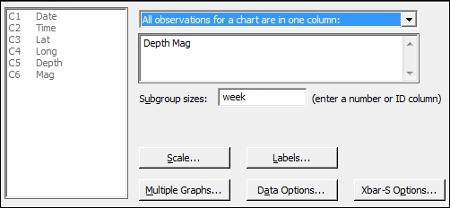
- Click on the Scale button, and select the option for Stamp.
- Enter
Datein the Stamp columns section. - Click on OK.
- Click on Xbar-S Options and then navigate to the Tests tab.
- Select all tests for special causes.
- Click on OK in each dialog box.
Steps 1 to 4 build the Week column that we use as the subgroup. The extracts from the date/time options are fantastic for quickly generating columns based on dates. Days of the week, week of the year, month, or even minutes or seconds can all be separated from the date.
Multiple columns can be entered into the control chart dialog box just as we have done here. Each column is then used to create a new Xbar-S chart. This lets us quickly create charts for several dimensions that are recorded at the same time. The use of the week column as the subgroup size will generate the control chart with mean depth and magnitude for each week.
The scale options within control charts are used to change the display on the chart scales. By default, the x axis displays the subgroup number; changing this to display the date can be more informative when identifying the results that are out of control. Options to add axes, tick marks, gridlines, and additional reference lines are also available. We can also edit the axis of the chart after we have generated it by double-clicking on the x axis.
The Xbar-S options are similar for all control charts; the tabs within Options give us control over a number of items for the chart. The following list shows us the tabs and the options found within each tab:
- Parameters: This sets the historical means and standard deviations; if using multiple columns, enter the first column mean, leave a space, and enter the second column mean
- Estimate: This allows us to specify subgroups to include or exclude in the calculations and change the method of estimating sigma
- Limits: This can be used to change where sigma limits are displayed or place on the control limits
- Tests: This allows us to choose the tests for special causes of the data and change the default values. The Using I-MR charts recipe details the options for the Tests tab.
- Stages: This allows the chart to be subdivided and will recalculate center lines and control limits for each stage
- Box Cox: This can be used to transform the data, if necessary
- Display: This has settings to choose how much of the chart to display. We can limit the chart to show only the last section of the data or split a larger dataset into separate segments. There is also an option to display the control limits and center lines for all stages of a chart in this option.
- Storage: This can be used to store parameters of the chart, such as means, standard deviations, plotted values, and test results
The control limits for the graphs that are produced vary as the subgroup sizes are not constant; this is because the number of earthquakes varies each week. In most practical applications, we may expect to collect the same number of samples or items in a subgroup and hence have flat control limits.
If we wanted to see the number of earthquakes in each week, we could use Tally from inside the Tables menu. This will display a result of counts per week. We could also store this tally back into the worksheet.
The result of this tally could be used with a c-chart to display a count of earthquake events per week.
If we wanted to import the data directly from the Advanced National Seismic System, then the following steps will obtain the data and prepare the worksheet for us:
- Follow the link to the ANSS catalog search at http://www.ncedc.org/anss/catalog-search.html.
- Enter
2013/01/01in the Start date, time: field. - Enter
2013/06/12in the End date, time: field. - Enter
3in the Min magnitude: field. - Enter
31.128in the Min latitude field and45.275in the Max latitude field. - Enter
129.799in the Min longitude field and145.269in the Max longitude filed. - Copy the data from the search results, excluding the headers, and paste it into a Minitab worksheet.
- Change the names of the columns to,
C1 Date,C2 Time,C3 Lat,C4 Long,C5 Depth,C6 Mag. The other columns,C7toC13, can then be deleted. - The
Datecolumn will have copied itself into Minitab as text; to convert this back to a date, navigate to Data | Change Data Type | Text to Date/Time. - Enter
Datein both the Change text columns: and Store date/time columns in: sections. - In the Format of text columns: section, enter
yyyy/mm/dd. - Click on OK.
- To extract the week from the
Datecolumn, navigate to Data | Date/Time | Extract to Text. - Enter
'Date'in the Extract from date/time column: section. - Enter
'Week' in the Store text column in: field. - Check the box for Week and click on OK.