GRADIENTS CAN BE very effective when you want to break away from the flatness of solid color fills. They can be used to add a sense of depth and dimensionality to your characters, backgrounds and graphics in general. Gradients can also work against you due to their ease of use, resulting in generic and often lackluster images. When in the right hands, both linear and radial gradients can contribute to a very effective and sometimes realistic design.
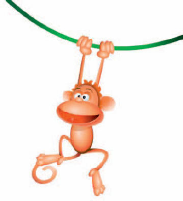
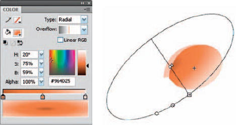
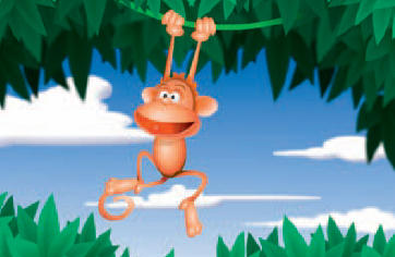
1 A simple radial gradient is used to fill most of the shapes that make up the monkey. The trick here is providing the illusion of a 3D object in a 2D environment. Four colors are used for this gradient. The critical color for this illusion is the fourth color (far right). It represents a light source coming from behind the sphere, suggesting the sphere is truly round.
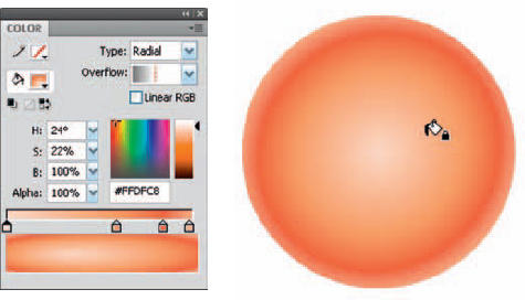
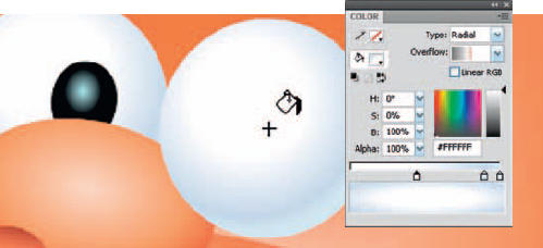
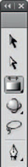
2 Edit the gradient to conform to the shape using the Gradient Transform tool ![]() . Use the handles to rotate, scale and skew the gradient so it is slightly larger than the shape. Select the center control point and drag the entire gradient and position it slightly off-center from the shape.
. Use the handles to rotate, scale and skew the gradient so it is slightly larger than the shape. Select the center control point and drag the entire gradient and position it slightly off-center from the shape.
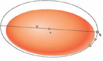
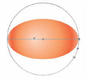
3 Click and drag the focal point tool so that the highlight is positioned between the center of the shape and its edge. By doing this you are suggesting that the light source is at more of an angle. Notice the fourth color of our gradient is showing along the bottom and right edge. This implies light wrapping around the sphere from behind.
4 To make the ear look concave, mix another radial gradient going from darkest in the center to a lighter value on the outer edge. Fill the shape with this gradient and position it off-center so that only half of the gradient is shown. Since darker colors will recede and lighter colors will appear closer to us, this otherwise flat shape now gives us the impression it is concave.
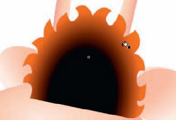
5 The hair is a shape filled with another radial gradient. Most of this shape will be hidden behind other graphics, so you only need to concern yourself with how the outer edge looks when the character is fully assembled.
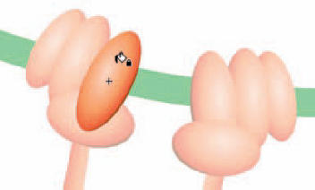
6 The hands are really not hands at all. A few strategically positioned spheres with the same radial gradient as the face and body are used to suggest hands.
7 For those classic cartoon “ping-pong” eyeballs, mix a radial gradient the same way using white and gray colors. Color theory teaches us that to show light, you must show dark. Apply this technique to the eyes by placing them in front of a darker shape. This will help add some contrast, making the eyeballs pop, thereby adding depth.

8 The nose is a combination of spheres filled with radial and linear gradients. To create the nostrils, use a linear gradient and edit it so that the darker color is above the lighter color. By themselves, the spheres are just shapes. But placed against the radial sphere, they become holes.
9 Good designs are consistent in technique. When each element is comprised of the same graphical style, the overall result will typically be consistent and fluid. Don’t deviate from your plan; choose a technique and stick with it.
Hot Tip
The Lock Fill option, available with the Paint Bucket tool, lets you apply a single gradient fill to numerous separate shapes on the same layer, as if they were all the same shape.

![]()