Each object can be monitored from vCenter Server no matter the type. You can monitor your ESXi hypervisor, single VM, specific resource pool, cluster, or even data center object here.
Based on what object you select, different metrics are available based on such item, but for all objects, you can access performance monitoring using the Monitor tab and the Performance option, as shown in the following screenshot:

For all objects, the following options are available:
- Overview: Based on the selected object, the most useful graphs are displayed. There will be different overview content for the data center object and the VM object.
- Advanced: Using this option, you can drill down to the individual components of the selected object.
Using the Advanced option, you can gain access to different component monitoring options. When you switch to the Advanced mode, you can select what view you are interested in. Based on the view, different performance counters related to such a view will be displayed. In the following screenshot, you can see the available views for the ESXi hypervisor object:

Are you looking for a specific performance counter that is not displayed? Don't worry, only preselected performance counters are displayed by default, but you have an option to select individual performance counters in each view by clicking on the Chart Options link.
Here, you can see all of the available performance counters, and you can adjust the graph based on your needs.
The following options are available:
- Chart Metrics: You can switch to the different components you are interested in.
- Select counters for this chart: Individual performance metrics are available.
- Timespan: You can either select existing a preset (Real-time, Last day/week/month/year), or you can specify a custom range.
- Chart Type: Sometimes different chart types are more useful than the default line graph.
- Select the object for this chart: You can specify individual objects here. For example, you can monitor only a single physical CPU or even a core for the ESXi hypervisor. Another example might be an individual virtual NIC (vNIC) of the VM.
An example of Chart Options for ESXi hypervisors is shown in the following screenshot:

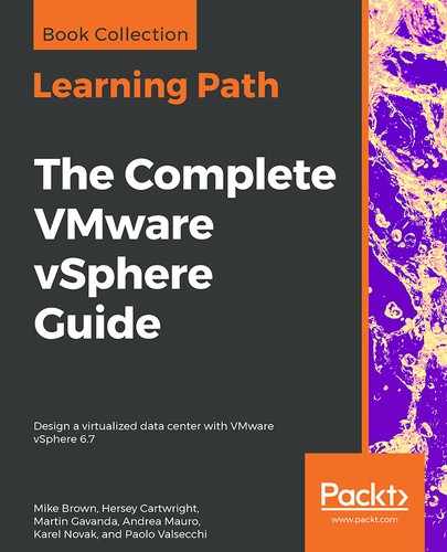
Once you define your custom chart, you have an option to either export the graph, or open the graph in a new window (indicated by two small icons in the top right-hand side of the chart), as shown in the following screenshot:
Using export, you can export the chart directly from the vCenter Server in the following formats:
- PNG
- JPG
- SVG
- CSV
Sometimes, it's also handy to open the graph in a new window for a more detailed view without being limited by the window size of the vCenter Server UI.