 Viewing reports
by Andrea Vacche, Patrik Uytterhoeven, Rihards Olups
Zabbix: Enterprise Network Monitoring Made Easy
Viewing reports
by Andrea Vacche, Patrik Uytterhoeven, Rihards Olups
Zabbix: Enterprise Network Monitoring Made Easy
- Zabbix: Enterprise Network Monitoring Made Easy
- Table of Contents
- Zabbix: Enterprise Network Monitoring Made Easy
- Zabbix: Enterprise Network Monitoring Made Easy
- Credits
- Preface
- I. Module 1
- 1. Getting Started with Zabbix
- The first steps in monitoring
- Zabbix features and architecture
- Installation
- Summary
- 2. Getting Your First Notification
- 3. Monitoring with Zabbix Agents and Basic Protocols
- 4. Monitoring SNMP Devices
- 5. Managing Hosts, Users, and Permissions
- 6. Detecting Problems with Triggers
- 7. Acting upon Monitored Conditions
- 8. Simplifying Complex Configurations with Templates
- 9. Visualizing Data with Graphs and Maps
- 10. Visualizing Data with Screens and Slideshows
- 11. Advanced Item Monitoring
- 12. Automating Configuration
- 13. Monitoring Web Pages
- 14. Monitoring Windows
- 15. High-Level Business Service Monitoring
- 16. Monitoring IPMI Devices
- 17. Monitoring Java Applications
- 18. Monitoring VMware
- 19. Using Proxies to Monitor Remote Locations
- 20. Encrypting Zabbix Traffic
- 21. Working Closely with Data
- 22. Zabbix Maintenance
- A. Troubleshooting
- B. Being Part of the Community
- 1. Getting Started with Zabbix
- II. Module 2
- 1. Zabbix Configuration
- 2. Getting Around in Zabbix
- 3. Groups, Users, and Permissions
- 4. Monitoring with Zabbix
- Introduction
- Active agents
- Passive agents
- Extending agents
- SNMP checks
- Internal checks
- Zabbix trapper
- IPMI checks
- JMX checks
- Aggregate checks
- External checks
- Database monitoring
- Checks with SSH
- Checks with Telnet
- Calculated checks
- Building web scenarios
- Monitoring web scenarios
- Some advanced monitoring tricks
- Autoinventory
- 5. Testing with Triggers in Zabbix
- 6. Working with Templates
- 7. Data Visualization and Reporting in Zabbix
- 8. Monitoring VMware and Proxies
- 9. Autodiscovery
- 10. Zabbix Maintenance and API
- C. Upgrading and Troubleshooting Zabbix
- III. Module 3
- 1. Deploying Zabbix
- 2. Distributed Monitoring
- 3. High Availability and Failover
- Understanding high availability
- Understanding the levels of IT service
- Some considerations about high availability
- Implementing high availability on a web server
- Configuring the Zabbix server for high availability
- Implementing high availability for a database
- Summary
- 4. Collecting Data
- 5. Visualizing Data
- 6. Managing Alerts
- 7. Managing Templates
- 8. Handling External Scripts
- 9. Extending Zabbix
- 10. Integrating Zabbix
- D. Bibliography
- Index
Finally, we are ready to see the results of all the work done previously. Navigate to Monitoring | IT services and you should see a report like this:
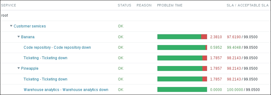
It shows the current state of each service, the calculated SLA value, and whether it meets the projected value. In this example, out of three services, only one has met the SLA level: the Warehouse analytics service. You are most likely seeing a different result.
The bar does not actually represent 100%—if you compare the value with how much of the bar is colored red, it does not seem to match. Move the mouse cursor over any of the bars to see why:
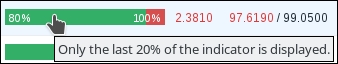
This bar only displays the last 20%—for the SLA monitoring, we don't expect anything much below 80% available, and showing a smaller part of a full bar allows us to see the impact more.
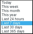
What we are looking at right now is the report for Last 7 days, as can be seen in the upper right corner. Expand the dropdown there and check the available options:
Play with the choices there and see how our random data either met or did not meet the expected SLA level. Unfortunately, at this time it is not possible to generate such a report for an arbitrary period of time—if you want to see the SLA values for a specific week two months ago, you are out of luck.
There are several other reports slightly hidden on this page. Clicking on these options will give the following results:
- Service name will open the availability report for that service
- Trigger name (if linked to the service) will open the event history for that trigger
- SLA bar will open a yearly availability graph for that service
Let's click on Banana for now—this will open the availability report.
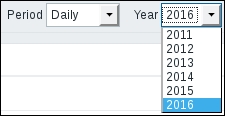
By default, it shows a weekly report for the current year. Let's switch to Yearly in the Period dropdown:
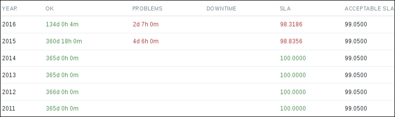
This shows a report for the last five years, and that will almost always span six calendar years—which is why we get six entries. Here and elsewhere, Zabbix SLA calculation assumes that we will get information about problems—if there is no information about any problem, Zabbix assumes that services were available for that period. In this page, we may also choose Monthly, Weekly, and Daily periods—for all of these, a year can be selected and data for all months, weeks, or days in that year will be displayed. When looking at the year list, one can observe that the years available are the same as in the yearly report—five years that span six calendar years:
Clicking on the trigger name, if a trigger is linked to the service, will show the event history for that trigger. We looked at the event view in Chapter 6, Detecting Problems with Triggers, so we won't spend more time on it here.
Now let's return to Monitoring | IT services and click on one of the bars in the PROBLEM TIME column. A yearly SLA graph is displayed:
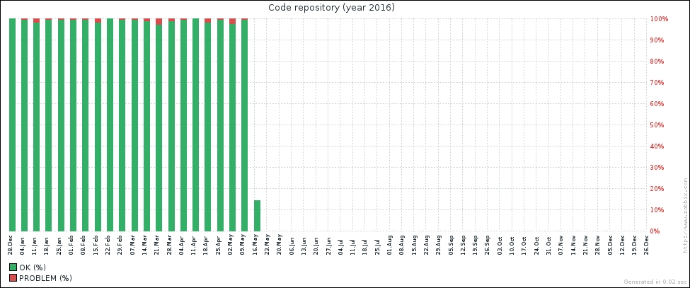
Each column represents one week. The time this service was down is displayed at the top, in red. Our service was mostly up, but we can see that there was a bit of downtime on most of the weeks.
Both for the availability reports and the yearly graph, there's nothing to configure, and the time period cannot be set to a custom time—we only have the predefined periods available here, and we cannot customize SLA graph size or other parameters. For the yearly graph, we can only see the current year.
-
No Comment