
We can distinguish between individual and combined visual elements. With individual we will refer to elements showing certain information in one container, such as a graph or a network map. While individual elements can contain information from many items and hosts, in general they cannot include other Zabbix frontend elements.
While the previous definition might sound confusing, it's quite simple—an example of an individual visual element is a graph. A graph can contain information on one or more items, but it cannot contain other Zabbix visual elements, such as other graphs. Thus a graph can be considered an individual element.
Graphs are hard to beat for capacity planning when trying to convince the management of a new database server purchase. If you can show an increase in visitors to your website and that with the current growth it will hit current limits in a couple of months, that is so much more convincing.
We already looked at the first visual element in this list: so-called simple graphs. They are somewhat special: because there is no configuration required, you don't have to create them—simple graphs are available for every item. Right? Not quite. They are only available for numeric items, as it wouldn't make much sense to graph textual items. To refresh our memory, let's look at the items in Monitoring | Latest data:
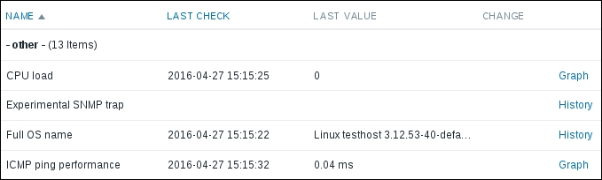
For anything other than numeric items the links on the right-hand side show History. For numeric items, we have Graph links. This depends only on how the data is stored—things such as units or value mapping do not influence the availability of graphs. If you want to refresh information on basic graph controls such as zooming, please refer to Chapter 2, Getting Your First Notification.
While no configuration is required for simple graphs, they also provide no configuration capabilities. They are easily available, but quite limited. Thus, being useful for single items, there is no way to graph several items or change the visual style. Of course, it would be a huge limitation if there was no other way, but luckily there are two additional graph types—ad hoc graphs and custom graphs.
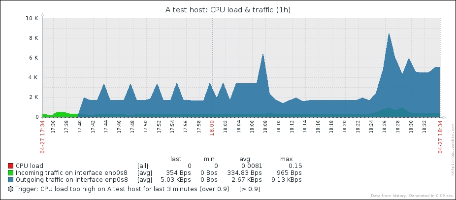
Simple graphs are easy to access, but they display a single item only. A very easy way to quickly see multiple items on a single graph exists—in Zabbix, these are called ad hoc graphs. Ad hoc graphs are accessible from the Latest data page, the same as the simple graphs. Let's view an ad hoc graph—navigate to Monitoring | Latest data and take a look at the left-hand side. Similar to many pages in the configuration section, there are checkboxes. Mark the checkboxes next to the CPU load and network traffic items for A test host:
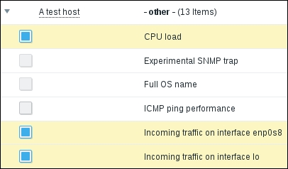
Checkboxes next to non-numeric items are disabled.
At the bottom of the page, click on the Display graph button. A graph with all selected items is displayed:
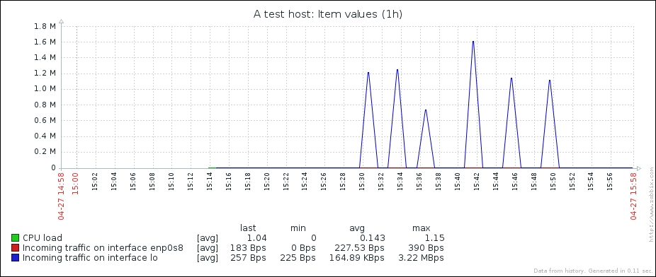
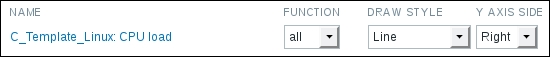
Now take a look at the top of the graph—there's a new control there, Graph type:
It allows us to quickly switch between normal and stacked graphs. Click on Stacked:
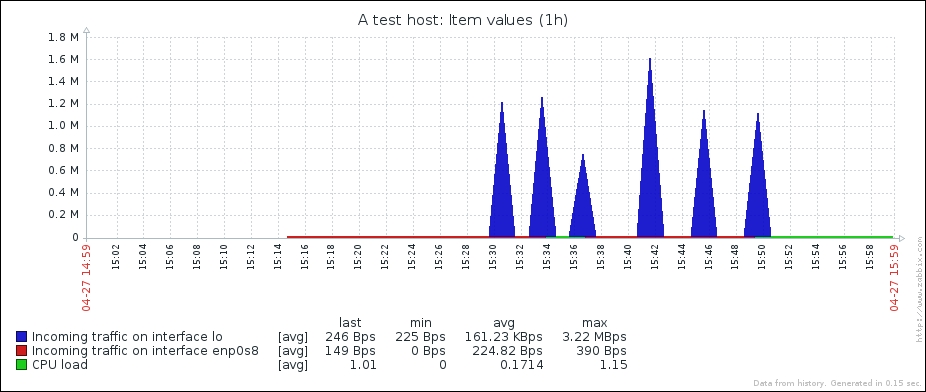
With this graph, stacked mode does not make much sense as CPU load and network traffic have quite different scales and meaning, but at least there's a quick way to switch between the modes. Return to Monitoring | Latest data and this time mark the checkboxes next to the network traffic items only. At the bottom of the list, click on Display stacked graph. An ad hoc graph will be displayed again, this time defaulting to stacked mode. Thus the button at the bottom of the Latest data page controls the initial mode, but switching the mode is easy once the graph is opened.
Unfortunately, there is no way to save an ad hoc graph as a custom graph or in your dashboard favorites at this time. If you would like to revisit a specific ad hoc graph later, you can copy its URL.
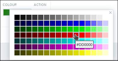
These have to be created manually, but they allow a great deal of customizability. To create a custom graph, open Configuration | Templates and click on Graphs next to C_Template_Linux, then click on the Create graph button. Let's start with a recreation of a simple graph, so enter CPU load in the Name field, then click on the Add control in the Items section. In the popup, click on CPU load in the NAME column. The item is added to the list in the graph properties. While we can change some other parameters for this item, for now let's change the color only. Color values can be entered manually, but that's not too convenient, so just click on the colored rectangle in the COLOUR column. That opens a color chooser. Pick one of the middle range red colors—notice that holding your mouse cursor over a cell for a few seconds will open a tooltip with a color value:
We might want to see what this will look like—switch over to the Preview tab. Unfortunately, the graph there doesn't help us much currently, as we chose an item from a template, which does not have any data itself.
Tip
The Zabbix color chooser provides a table to choose from the available colors, but it still is missing some colors, such as orange, for example. You can enter an RGB color code directly in hex form (for example, orange would be similar to FFAA00). To find other useful values, you can either experiment, or use an online color calculator. Or, if you are using KDE, just launch the KColorChooser application.
We already saw one simple customization option—changing the line color. Switch back to the Graph tab and note the checkboxes Show legend, Show working time, and Show triggers. We will leave those three enabled, so click on the Add button at the bottom.
Our custom graph is now saved, but where do we find it? While simple graphs are available from the Monitoring | Latest data section, custom graphs have their own section. Go to Monitoring | Graphs, select Linux servers in the Group dropdown, A test host in the Host dropdown, and in the Graph dropdown, select CPU load.
Tip
There's an interesting thing we did here, that you probably already noticed. While the item was added from a template, the graph is available for the host, with all the data correctly displayed for that host. That means an important concept, templating, works here as well. Graphs can be attached to templates in Zabbix, and afterwards are available for each host that is linked to such a template.
The custom graph we created looks very similar to the simple graph. We saw earlier that we can control the working time display for this graph—let's see what that is about. Click on the 7d control in the upper-left corner, next to the Zoom caption:
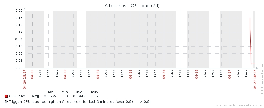
We can see that there are gray and white areas on the graph. The white area is considered working time, the gray one—non-working time.
By the way, that's the same with the simple graphs, except that you have no way to disable the working time display for them. What is considered a working time is not hardcoded—we can change that. Open Administration | General, choose Working time from the dropdown in the upper right corner.
This option uses the same syntax as When active for user media, discussed in Chapter 7, Acting upon Monitored Conditions and Item Flexible Intervals, and Chapter 3, Monitoring with Zabbix Agents and Basic Protocols. Monday-Sunday is represented by 1-7 and a 24-hour clock is used to configure time. Currently, this field reads 1-5,09:00-18:00;, which means Monday-Friday, 9 hours each day. Let's modify this somewhat to read 1-3,09:00-17:00;4-5,09:00-15:00,
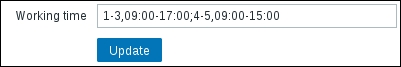
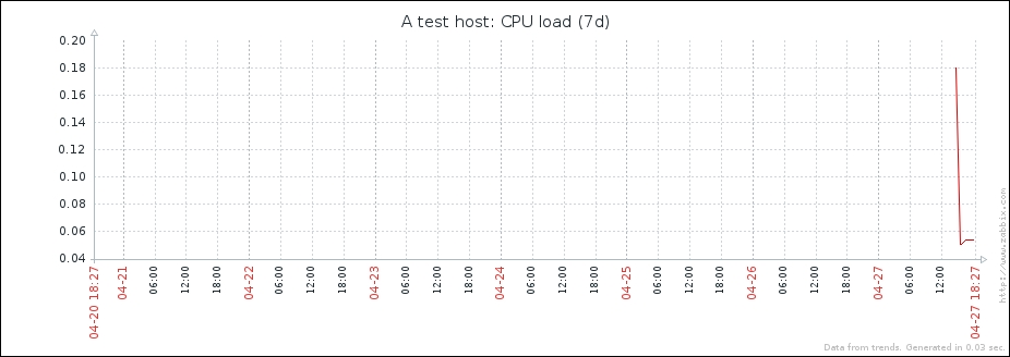
That would change to 09-17 for Monday-Wednesday, but for Thursday and Friday it's shorter hours of 09-15. Click on Update to accept the changes. Navigate back to Monitoring | Graphs, and make sure CPU load is selected in the Graph dropdown.
The gray and white areas should now show fewer hours to be worked on Thursday and Friday than on the first three weekdays.
Note that these times do not affect data gathering or alerting in any way—the only functionality that is affected by the working time period is graphs.
But what about that trigger option in the graph properties? Taking a second look at our graph, we can see both a dotted line and a legend entry, which explains that it depicts the trigger threshold. The trigger line is displayed for simple expressions only.
Same as working time, the trigger line is displayed in simple graphs with no way to disable it.
There was another checkbox that could make this graph different from a simple graph—Show legend. Let's see what a graph would look like with these three options disabled. In the graph configuration, unmark Show legend, Show working time, and Show triggers, then click on Update.
Tip
When reconfiguring graphs, it is suggested to use two browser tabs or windows, keeping Monitoring | Graphs open in one, and the graph details in the Configuration section in the other. This way, you will be able to refresh the monitoring section after making configuration changes, saving a few clicks back and forth.
Open this graph in the monitoring section again:
Sometimes, all that extra information can take up too much space, especially the legend if you have lots of items on a graph. For custom graphs, we may hide it. Re-enable these checkboxes in the graph configuration and save the changes by clicking on the same Update button.
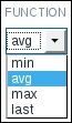
What we have now is quite similar to the simple graphs, though there's one notable difference when the displayed period is longer—simple graphs show three different lines, with the area between them filled, while our graph has single line only (the difference is easier to spot when the displayed period approaches 3 days). Can we duplicate that behavior? Go to Configuration | Templates and click on Graphs next to C_Template_Linux, then click on CPU load in the NAME column to open the editing form. Take a closer look at, FUNCTION dropdown in the Items section:
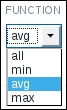
Currently, we have avg selected, which simply draws average values. The other choices are quite obvious, min and max, except the one that looks suspicious, all. Select all, then click on Update. Again, open Monitoring | Graphs, and make sure CPU load is selected in the Graph dropdown:
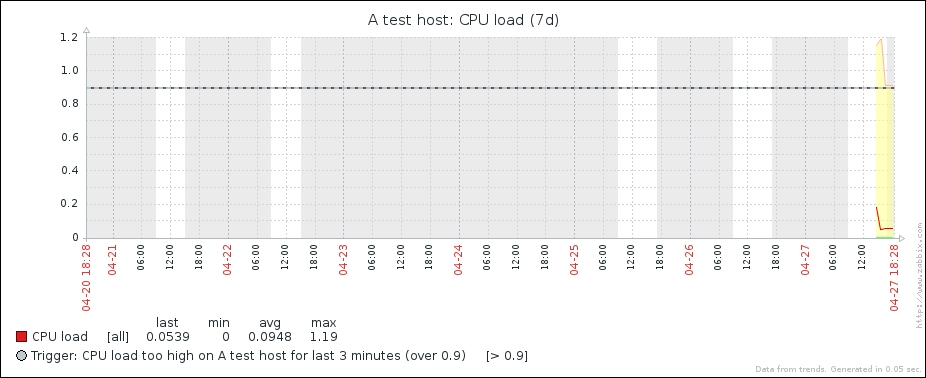
The graph now has three lines, representing minimum, maximum, and average values for each point in time, although in this example the lower line is always at zero.
The default is average, as showing three lines with the colored area when there are many items on a graph would surely make the graph unreadable. On the other hand, even when average is chosen, the graph legend shows minimum and maximum values from the raw data, used to calculate the average line. That can result in a situation where the line does not go above 1, but the legend says that the maximum is 5. In such a case, almost always the raw values could be seen by zooming in on the area which has them, but such a situation can still be confusing.
We have now faithfully replicated a simple graph (well, the simple graph uses green for average values, while we use red, which is a minor difference). While such an experience should make you appreciate the availability of simple graphs, custom graphs would be quite useless if that was all we could achieve with them. Customizations such as color, function, and working time displaying can be useful, but they are minor ones. Let's see what else can we throw at the graph. Before we improve the graph, let's add one more item. We monitored the incoming traffic, but not the outgoing traffic. Go to Configuration | Templates, click on Items next to C_Template_Linux, and click on Incoming traffic on interface eth0 in the NAME column. Click the Clone button at the bottom and change the following fields:
- Name:
Incoming traffic on interface $1 - Key:
net.if.out[enp0s8]
When done, click on the Add button at the bottom.
Now we are ready to improve our graph.
Open Configuration | Templates, select Custom templates in the Group dropdown and click on Graphs next to C_Template_Linux, then click on CPU load in the NAME column.
Click on Add in the Items section. Notice how the dropdown in the upper right corner is disabled. Moving the mouse cursor over it might display a tooltip:
We cannot choose any other host or template now. The reason is that a graph can contain either items from a single template, or from one or more hosts. If a graph has an item from a host added, then no templated items may be added to it anymore. If a graph has one or more items added from some template, additional items may only be added from the same template.
Graphs are also similar to triggers—they do not really belong to a specific host, they reference items and then are associated with hosts they reference items from. Adding an item to a graph will make that graph appear for the host to which the added item belongs. But for now, let's continue with configuring our graph on the template.
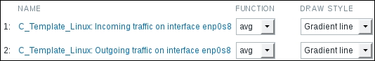
Mark the checkboxes next to Incoming traffic on interface eth0 and Outgoing traffic on interface eth0 in the NAME column, then click on Select. The items will be added to the list of graph items:
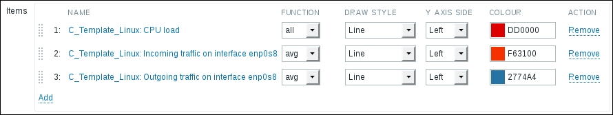
Notice how the colors were automatically assigned. When multiple items are added to a custom graph in one go, Zabbix chooses colors from a predefined list. In this case the CPU load and the incoming traffic got very similar colors. Click on the colored rectangle in the COLOR column next to the incoming traffic item and choose some shade of green.
As our graph now has more than just the CPU load, change the Name field to CPU load & traffic. While we're still in the graph editing form, select the Filled
region in the Draw style dropdown for both network traffic items, then click on Update. Check the graph in the Monitoring | Graphs section:
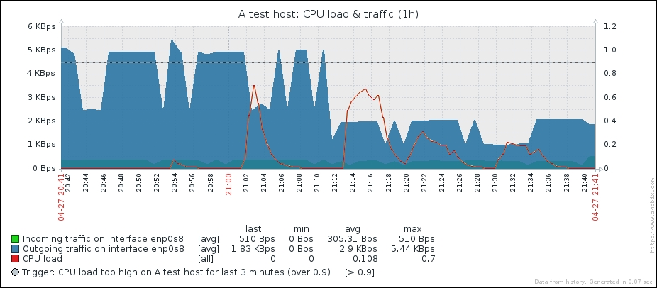
Hey, that's quite ugly. Network traffic values are much larger than system load ones, thus even the system load trigger line can be barely seen at the very bottom of the graph. The y axis labels are not clear either—they're just some "K". Let's try to fix this back in the graph configuration. For the CPU load item, change the Y AXIS SIDE dropdown to Right, then click on Update:
Take a look at Monitoring | Graphs to see what this change did:
That's way better; now each of the different scale values is mapped against an appropriate y axis. Notice how the y axis labels on the left hand side now show network traffic information, while the right-hand side is properly scaled for the CPU load. Placing things like the system load and web server connection count on a single graph would be quite useless without using two y axes, and there are lots of other things we might want to compare that have a different scale.
Notice how the filled area is slightly transparent where it overlaps with another area. This allows us to see values even if they are behind a larger area, but it's suggested to avoid placing many elements with the filled region draw style on the same graph, as the graph can become quite unreadable in that case. We'll make this graph a bit more readable in a moment, too.
In some cases, the automatic y axis scaling on the right-hand axis might seem a bit strange—it could have a slightly bigger range than needed. For example, with values ranging from 0 to 0.25 the y axis might scale to 0.9. This is caused by an attempt to match horizontal leader lines on both axes. The left side y axis is taken as a more important one, and the right-hand side is adjusted to it.
One might notice that there is no indication in the legend about the item placement on the y axis. With our graph, it is trivial to figure out that network traffic items go on the left side and CPU load on the right, but with other values that could be complicated. Unfortunately, there is no nice solution at this time. Item names could be hacked to include "L" or "R", but that would have to be synchronized to the graph configuration manually.
Getting back to our graph, the CPU load line can be seen at times when it's above the network traffic areas, but it can hardly be seen when the traffic area covers the CPU load line. We might want to place the line on top of those two areas in this case.
Back in the graph configuration, take a look at the item list. Items are placed on the Zabbix graph in the order in which they appear in the graph configuration. The first item is placed, then the second one on top of the first one, and so on. Eventually the item that is listed the first in the configuration is in the background. For us that is the CPU load item, the one we want to have on top of everything else. To achieve that, we must make sure it is listed last. Item ordering can be changed by dragging those handles to the left of them. Grab the handle next to the CPU load item and drag it to be the last entry in the list:

Items will be renumbered. Click on Update. Let's check how the graph looks now in Monitoring | Graphs:
That's better. The CPU load line is drawn on top of both network traffic areas.
Tip
Quite often, one might want to include a graph in an e-mail or use it in a document. With Zabbix graphs, usually it is not a good idea to create a screenshot—that would require manually cutting off the area that's not needed. But all graphs in Zabbix are PNG images, thus you can easily use graphs right from the frontend by right clicking and saving or copying them. There's one little trick, though—in most browsers, you have to click outside of the area that accepts dragging actions for zooming. Try the legend area, for example. This works for simple, ad hoc, and custom graphs in the same way.
Our graph is getting more and more useful, but the network traffic items cover each other. We could change their sort order, but that will not work that well when traffic patterns change. Let's edit the configuration of this graph again. This time, we'll change the draw style for both network traffic items. Set it to Gradient line:
Click on Update and check the graph in the monitoring section:
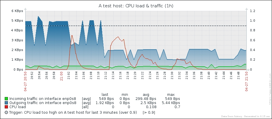
Selecting the gradient option made the area much more transparent, and now it's easy to see both traffic lines even when they would have been covering each other previously.
We have already used line, filled region, and gradient line draw styles. There are some more options available:
- Line
- Filled region
- Bold line
- Dot
- Dashed line
- Gradient line
The way the filled region and gradient line options look was visible in our tests. Let's compare the remaining options:
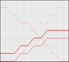
This example uses a line, bold line, dots, and a dashed line on the same graph.
Note that dot mode makes Zabbix plot the values without connecting them with lines. If there are a lot of values to be plotted, the outcome will look like a line because there will be so many dots to plot.
As you have probably noticed, the y axis scale is automatically adjusted to make all values fit nicely in the chosen range. Sometimes you might want to customize that, though. Let's prepare a quick and simple dataset for that.
Go to Configuration | Templates and click on Items next to C_Template_Linux, then click on the Create item button. Fill in these values:
- Name:
Diskspace on $1 ($2) - Key:
vfs.fs.size[/,total] - Units:
B - Update interval:
120
When you are done, click on the Add button at the bottom.
Now, click on Diskspace on / (total) in the NAME column and click on the Clone button at the bottom. Make only a single change, replace total in the Key field with used, so that the key now reads vfs.fs.size[/,used], then click on the Add button at the bottom.
Tip
Usually it is suggested to use bigger intervals for the total diskspace item—at least 1 hour, maybe more. Unfortunately, there's no way to force item polling in Zabbix, thus we would have to wait for up to an hour before we would have any data. We're just testing things, so an interval of 120 seconds or 2 minutes should allow to see the results sooner.
Click on Graphs in the navigation header above the item list and click on Create graph. In the Name field, enter Used diskspace. Click on the Add control in the Items section, then click on Diskspace on / (used) in the NAME column. In the DRAW STYLE dropdown, choose Filled region. Feel free to change the color, then click on the Add button at the bottom.
Take a look at what the graph looks like in the Monitoring | Graphs section for A test host:
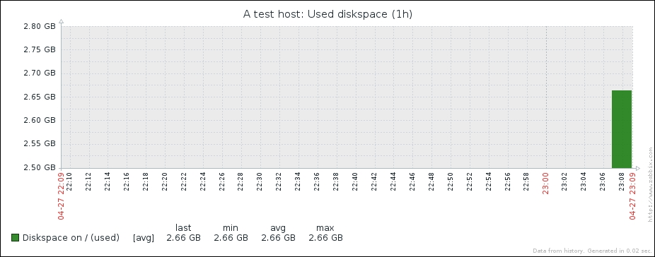
So this particular host has a bit more than two and a half gigabytes used on the root file system. But the graph is quite hard to read—it does not show how full the partition relatively is. The y axis starts a bit below our values and ends a bit above them. Regarding the desired upper range limit on the y axis, we can figure out the total disk space on root file system in Monitoring | Latest data:
So there's a total of almost 60 GB of space, which also is not reflected on the graph. Let's try to make the graph slightly more readable. In the configuration of the Used diskspace graph in the template, take a look at two options—Y axis MIN value and Y axis MAX value. They are both set to Calculated currently, but that doesn't seem to work too well for our current scenario. First, we want to make sure graph starts at zero, so change the Y axis MIN value to Fixed. This allows us to enter any arbitrary value, but a default of zero is what we want.
For the upper limit, we could calculate what 58.93 GB is in bytes and insert that value, but what if the available disk space changes? Often enough filesystems increase either by adding physical hardware, using Logical Volume Management (LVM) or other means.
Does this mean we will have to update the Zabbix configuration each time this could happen? Luckily, no. There's a nice solution for situations just like this. In the Y axis MAX value dropdown, select Item. That adds another field and a button, so click on Select. In the popup, click on Diskspace on / (total) in the NAME column. The final y axis configuration should look like this:
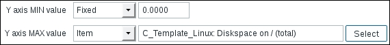
If it does, click on Update. Now is the time to check out the effect on the graph—see the Used diskspace graph in Monitoring | Graphs:
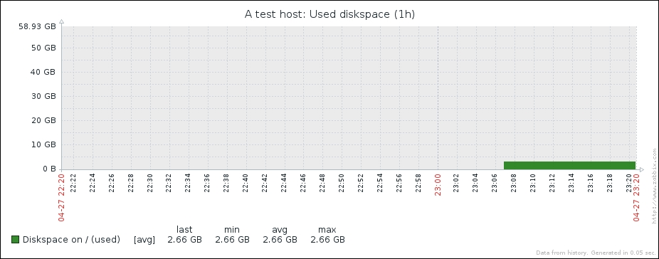
Now the graph allows to easily identify how full the disk is. Notice how we used a graph like this on the template. All hosts would have used and total diskspace items, and the graph would automatically scale to whatever amount of total diskspace that host has. This approach can also be used for used memory or any other item where you want to see the full scale of possible values. A potentially negative side-effect could appear when monitoring large values such as petabyte-size filesystems. With the y axis range spanning several petabytes, we wouldn't really see any normal changes in the data, as a single pixel on the y axis would be many gigabytes.
A percentile is the threshold below which a given percentage of values fall. For example, if we have network traffic measurements, we could calculate that 95% of values are lower than 103 Mbps, while 5% of values are higher. This allows us to filter out peaks while still having a fairly precise measurement of the bandwidth used. Actually, billing by used bandwidth most often happens by a percentile. As such, it can be useful to plot a percentile on a network traffic graph, and luckily Zabbix offers a way to do that. To see how this works, let's create a new graph. Navigate to Configuration | Templates, click on Graphs next to C_Template_Linux, then click on the Create graph button. In the Name field, enter Incoming traffic on eth0 with percentile. Click on Add in the Items section and in the popup, click on Incoming traffic on interface eth0 in the NAME column. For this item, change the color to red. In the graph properties, mark the checkbox next to Percentile line (left) and enter 95 in that field. When done, click on the Add button at the bottom. Check this graph in the monitoring section:

When the percentile line is configured, it is drawn in the graph in green color (although this is different in the dark theme). Additionally, percentile information is shown in the legend. In this example, the percentile line nicely evens out a few peaks to show average bandwidth usage. With 95% of the values being above the percentile line, only 5% of them are above 2.24 KBps.
We only used a single item on this graph. When there are multiple items on the same axis, Zabbix adds up all the values and computes the percentile based on that result. At this time there is no way to specify the percentile for individual items in the graph.
Tip
To alert on the percentile value, the trigger function percentile() can be used. To store this value as an item, see calculated items in Chapter 11, Advanced Item Monitoring.
Our previous graph that contained multiple items, network traffic and CPU load, placed the items on the y axis independently. But sometimes we might want to place them one on top of another on the same axis—stack them. Possible uses could be memory usage, where we could stack buffers, cached and other used memory types (and link the y axis maximum value to the total amount of memory), stacked network traffic over several interfaces to see total network load, or any other situation where we would want to see both total and value distribution. Let's try to create a stacked graph. Open Configuration | Templates, click on Graphs next to C_Template_Linux, then click on the Create graph button. In the Name field, enter Stacked network traffic and change the Graph type dropdown to Stacked. Click on Add in the Items section and in the popup, mark the checkboxes next to Incoming traffic on interface eth0 and Outgoing traffic on interface eth0 in the NAME column, then click on Select. When done, click on the Add button at the bottom.
Notice how we did not have a choice of draw style when using a stacked graph—all items will have the Filled region style.
If we had several active interfaces on the test machine, it might be interesting to stack incoming traffic over all the interfaces, but in this case we will see both incoming and outgoing traffic on the same interface.
Check out Monitoring | Graphs to see the new graph, make sure to select Stacked network traffic from the dropdown:
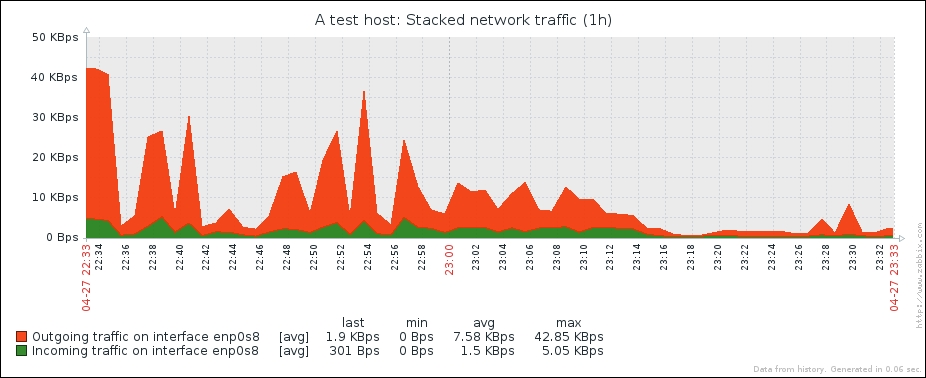
With stacked graphs we can see both the total amount (indicated by the top of the data area) and the individual amounts that items contribute to the total.
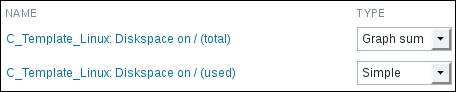
The graphs we have created so far offer a wide range of possible customizations, but sometimes we might be more interested in proportions of the values. For those situations, it is possible to create pie graphs. Go to Configuration | Templates, click on Graphs next to C_Template_Linux and click on the Create graph button. In the Name field, enter Used diskspace (pie). In the Graph type dropdown, choose Pie. Click on Add in the Items section and mark the checkboxes next to Diskspace on / (total) and Diskspace on / (used) items in the NAME column, then click on Select.
Graph item configuration is a bit different for pie graphs. Instead of a draw style, we can choose a type. We can choose between Simple and Graph sum:
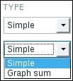
The proportion of some values can be displayed on a pie graph, but to know how large that proportion is, an item must be assigned to be the "total" of the pie graph. In our case, that would be the total diskspace. For Diskspace on / (total), set select Graph sum in the TYPE dropdown:
When done, click on the Add button at the bottom:
Back in Monitoring | Graphs, select Used diskspace (pie):
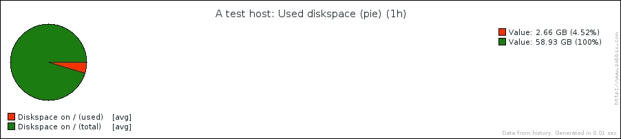
Great, it looks about right, except for the large, empty area on the right side. How can we get rid of that? Go back to the configuration of this graph. This time, width and height controls will be useful. Change the Width field to 430 and the Height field to 300 and click on Update. Let's check out whether it's any better in Monitoring | Graphs again:
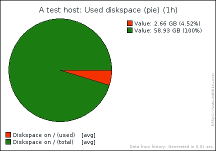
It really is better, we got rid of the huge empty area. Pie graphs could also be useful for displaying memory information—the whole pie could be split into buffers, cached, and actual used memory, laid on top of the total amount of memory. In such a case, total memory would get a type set to Graph sum, but for all other items, TYPE would be set to Simple.
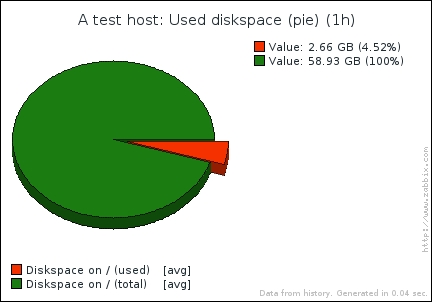
Let's try another change. Edit the Used diskspace (pie) graph again. Select Exploded in the Graph type dropdown and mark the checkbox next to 3D view. Save these changes and refresh the graph view in Monitoring | Graphs:
Remember the "function" we were setting for the normal graph? We changed between avg and all, and there were also min and max options available. Such a parameter is available for pie graphs as well, but it has slightly different values:
For pie graphs, all is replaced by last. While the pie graph itself doesn't have a time series, we can still select the time period for it. The function determines how the values from this period will be picked up. For example, if we are displaying a pie graph with the time period set to 1 hour and during this hour we received free diskspace values of 60, 40 and 20 GB, max, avg and min would return one of those values, respectively. If the function is set to last, no matter what the time period length, the most recent value of 20 GB will be always shown.
Tip
When monitoring a value in percentages, it would be desirable to set graph sum to a manual value of 100, similar to the y axis maximum value. Unfortunately, it is not supported at this time, thus a fake item that only receives values of "100" would have to be used. A calculated item with a formula of "100" is one easy way to do that. We will discuss calculated items in Chapter 11, Advanced Item Monitoring.
We have covered several types of data visualization, which allow quite a wide range of views. While the ability to place different things on a single graph allows us to look at data and events in more context, sometimes you might want to have a broader view of things and how they are connected. Or maybe you need something shiny to show off.
There's a functionality in Zabbix that allows one to create maps. While sometimes referred to as network maps, nothing prevents you from using these to map out anything you like. Before we start, make sure there are no active triggers for both servers—check that under Monitoring | Triggers and fix any problems you see.
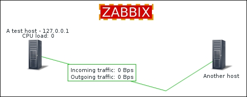
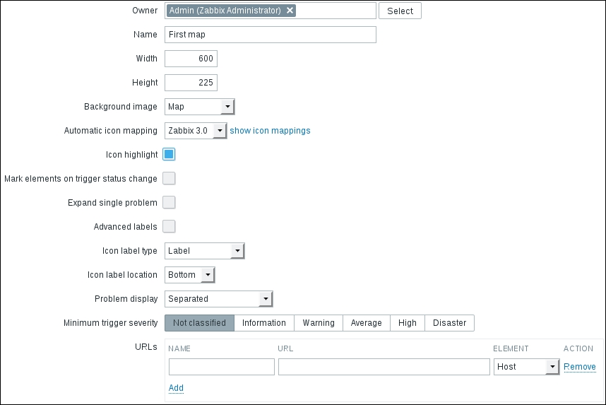
Let's try to create a simple map now—navigate to Monitoring | Maps and click on Create map. Enter "First map" in the Name field and mark the Expand single problem checkbox.
When done, click on the Add button at the bottom. Hey, was that all? Where can we actually configure the map? In the ACTIONS column, click on Constructor. Yes, now that's more of an editing interface. First we have to add something, so click on Add next to the Icon label at the top of the map. This adds an element at the upper-left corner of the map. The location isn't exactly great, though. To solve this, click and drag the icon elsewhere, somewhere around the cell at 50x50:
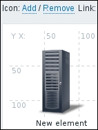
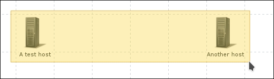
The map still doesn't look too useful, so what to do with it now? Simply click once on the element we just added—this opens up the element properties form. Notice how the element itself is highlighted as well now. By default, an added map element is an image, which does not show anything regarding the monitored systems. For a simple start, we'll use hosts, so choose Host in the Type dropdown—notice how this changes the form slightly. Enter "A test host" in the Label text area, then type "test" in the Host field and click on A test host in the dropdown. The default icon is Server_(96)—let's reduce that a bit. Select Server_(64) in the Default dropdown in the Icons section. The properties should look like this:
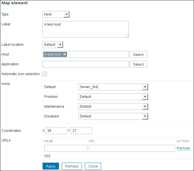
For a simple host that should be enough, so click on Apply, then Close to remove the property popup. The map is regenerated to display the changes we made:

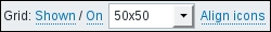
A map with a single element isn't that exciting, so click on Add next to the Icon label again, then drag the new element around the cell at 450x50. Click it once and change its properties. Start by choosing Host in the Type dropdown, then enter Another host for the Label and start typing "another" in the Host field. In the dropdown, choose Another host. Change the default icon to Server_(64), then click on Apply. Notice how the elements are not aligned to the grid anymore—we changed the icon size and that resulted in them being a bit off the centers of the grid cells. This is because of the alignment happening by the icon center, but icon positioning—the upper left corner of the icon. As we changed the icon size, its upper left corner was fixed, while the center changed as it was not aligned anymore. We can drag the icons a little distance and the icons will snap to the grid, or we can click on the Align icons control at the top. Click on Align icons now. Also notice other Grid controls above the map—clicking on Shown will hide the grid (and change that label to Hidden). Clicking on On will stop icons from being aligned to the grid when we move them (and change that label to Off).
A map is not saved automatically—to do that, click on the Update button in the upper-right corner. The popup that appears can be quite confusing—it is not asking whether we want to save the map. Actually, as the message says, the map is already saved at that point. Clicking on OK would return to the list of the maps, clicking on Cancel would keep the map editing form open. Usually it does not matter much whether you click on OK or Cancel here.
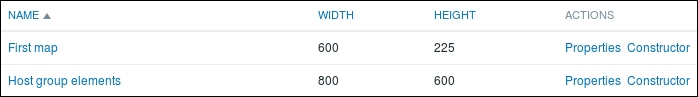
Now is a good time to check what the map looks like, so go to Monitoring | Maps and click on First map in the NAME column. It should look quite nice, with the grid guidance lines removed, except for the large white area, like we had with the pie graph. That calls for a fix, so click on All maps above the map itself and click on Properties next to First map. Enter "600" in the Width field and "225" in the Height field, then click on Update. Click on Constructor in the ACTIONS column next to the First map again.
Both displaying and aligning to the grid are controllable separately—we can have grid displayed, but no automatic alignment to it, or no grid displayed, but still used for alignment:
By default, a grid of 50x50 pixels is used, and there are predefined rectangular grids of 20, 40, 50, 75 and 100 available. These sizes are hardcoded and can not be customized:
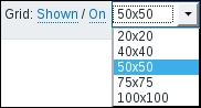
For our map, change the grid size to 75x75 and with alignment to grid enabled, position the icons so that they are at the opposing ends of the map, one cell away from the borders. Click on the Update button to save the changes.
Go to Monitoring | Maps and click on First map in the NAME column:
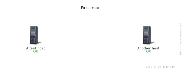
That looks much better, and we verified that we can easily change map dimensions in case we need to add more elements to the map.
What else does this display provide besides a nice view? Click on the Another host icon:
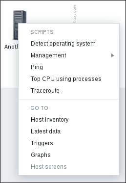
Here we have access to some global scripts, including the default ones and a couple we configured in Chapter 7, Acting upon Monitored Conditions. There are also quick links to the host inventory, discussed in Chapter 5, Managing Hosts, Users, and Permissions, and to the latest data, trigger, and graph pages for this host. When we use these links, the corresponding view would be filtered to show information about the host we clicked on initially. The last link in this section, Host screens, is disabled currently. We will discuss host (or templated) screens in Chapter 10, Visualizing Data with Screens and Slideshows.
We talked about using maps to see how things are connected. Before we explore that further, let's create a basic testing infrastructure—we will create a set of three items and three triggers that will denote network availability. To have something easy to control, we will check whether some files exist, and then just create and remove those files as needed. On both "A test host" and "Another host" execute the following:
$ touch /tmp/severity{1,2,3}
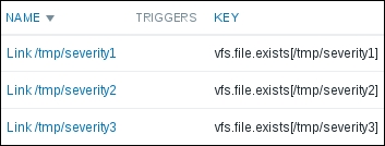
In the frontend, navigate to Configuration | Templates and click on Items next to C_Template_Linux, then click on Create item button. Enter "Link $1" in the Name field and vfs.file.exists[/tmp/severity1] in the Key field, then click on the Add button at the bottom. Now clone this item (by clicking on it, then clicking on the Clone button) and create two more, changing the trailing number for the filename to "2" and "3" accordingly.
Verify that you have those three items set up correctly:
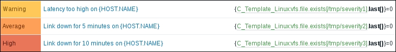
And now for the triggers—in the navigation bar click on Triggers and click on the Create trigger button. Enter "Latency too high on {HOST.NAME}" in the Name field and {C_Template_Linux:vfs.file.exists[/tmp/severity1].last()}=0 in the Expression field. Select Warning in the Severity section, then click on the Add button at the bottom. Same as with items, clone this trigger twice and change the severity number in the Expression field. As for the names and severities, let's use these:
- Second trigger for the severity2 file: Name "Link down for 5 minutes on {HOST.NAME}" and severity Average
- Third trigger for the severity3 file: Name "Link down for 10 minutes on {HOST.NAME}" and severity High
The final three triggers should look like this:
Tip
While cloning items and triggers brings over all their detail, cloning a map only includes map properties—actual map contents with icons, labels, and other information are not cloned. A relatively easy way to duplicate a map would be exporting it to XML, changing the map name in the XML file and then importing it back. We discuss XML export and import functionality in Chapter 21, Working Closely with Data.
We now have our testing environment in place. Zabbix allows us to connect map elements with lines called links—let's see what functionality we can get from the map links. Go to Monitoring | Maps and click on All maps above the displayed map and then click on Constructor in the ACTIONS column next to First map.
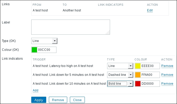
The triplet of items and triggers we created before can be used as network link problem indicators now. You can add links in maps connecting two elements. Additionally, it is possible to change connector properties depending on the trigger state. Let's say you have a network link between two server rooms. You want the displayed link on the network map to change appearance depending on the connection state like this:
- No problems: Green line
- High latency: Yellow line
- Connection problems for 5 minutes: Orange, dashed line
- Connection problems for 10 minutes: Red, bold line
The good news is, Zabbix supports such a configuration. We will use our three items and triggers to simulate each of these states. Let's try to add a link—click on Add next to the Link label at the top of the map. Now that didn't work. A popup informs us that Two elements should be selected. How can we do that?
Click once on A test host, then hold down Ctrl and click on Another host. This selects both hosts. The property popup changed as well to show properties that can be mass-changed for both elements in one go. Apple system users might have to hold down Command instead.
Another way to select multiple elements is to drag a rectangle around them in the map configuration area:
Whichever way you used to select both hosts, now click on Add next to the Link label again. The map will now show the new link between both hosts, which by default is green. Notice how at the bottom of the property editor the Links section has appeared:

This is where we can edit the properties of the link itself—click on Edit in the ACTION column.
Let's define conditions and their effect on the link. Click on Add in the Link indicators section. In the resulting popup, select Linux servers in the Group field and A test host in the Host dropdown, then mark the checkboxes next to those three triggers we just created, then click on Select:
Now we have to configure what effect these triggers will have when they will be active. For the high latency trigger, change the color to yellow in the color picker. For the 5 minute connection loss trigger, we might want to configure an orange dashed line. Select Dashed line in the TYPE dropdown for it, then choose orange in the color picker. Or maybe not. The color picker is a bit limited, and there is no orange. But luckily, the hex RGB input field allows us to specify any color. Enter FFAA00 there for the second trigger. For the 10-minute connection loss trigger, select Bold line in the TYPE dropdown and leave the color as red.
The final link configuration should look similar to this:
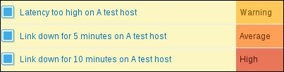
When you are done, click on Apply in the connector area, then close the map element properties and click on the Update button above the map and click on OK in the popup. Click on First map in the NAME column. Everything looks fine, both hosts show OK, and the link is green. Execute on "A test host":
$ rm /tmp/severity2
We just broke our connection to the remote datacenter for 5 minutes. Check the map again. You might have to wait for up to 30 seconds for the changes to show:
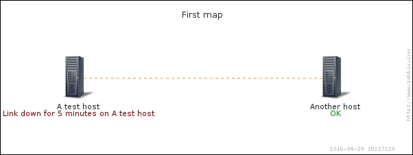
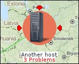
That's great, in a way. The link is shown as being down and one host has the active trigger listed. Notice how the label text is close to the map edge. With a slightly longer trigger or hostname it would be cut off. When creating maps, keep in mind the possibility of trigger names being long. Alternatively, trigger name expanding can be disabled. Let's check what this would look like—click on All maps and click on Properties next to First map. In the properties, clear the Expand single problem checkbox, click on Update, and then click on First map in the NAME column:
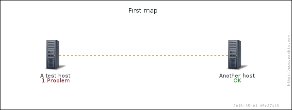
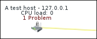
Instead of the full trigger name, just 1 Problem is shown. Even though showing the trigger name is more user friendly, it doesn't work well when long trigger names are cut at the map border or overlap with other elements or their labels.
Our network was down for 5 minutes previously. By now, some more time has passed, so let's see what happens when our link has been down for 10 minutes. On "A test host", execute the following:
$ rm /tmp/severity3
Wait for 30 seconds and, check the map again:

To attract more attention from an operator, the line is now red and bold. As opposed to a host having a single problem and the ability to show either the trigger name or the string 1 Problem, when there are multiple triggers active, the problem count is always listed. Now, let's say our latency trigger checks a longer period of time, and it fires only now. On "A test host", execute the following:
$ rm /tmp/severity1
Wait for 30 seconds, then refresh the map. We should now see a yellow line not. Actually, the bold red line is still there, even though it has correctly spotted that there are three problems active now. Why so? The thing is, the order in which triggers fire does not matter—trigger severity determines which style takes precedence. We carefully set three different severities for our triggers, so there's no ambiguity when triggers fire. What happens if you add multiple triggers as status indicators that have the same severity but different styles and they all fire? Well, don't. While you can technically create such a situation, that would make no sense. If you have multiple triggers of the same severity, just use identical styles for them. Let's fix the connection, while still having a high latency:
$ touch /tmp/severity{2,3}
Only one problem should be left, and the link between the elements should be yellow finally—higher severity triggers are not overriding the one that provides the yellow color anymore.
Feel free to experiment with removing and adding test files; the link should always be styled like specified for the attached active trigger with the highest severity.
There's no practical limit on the amount of status indicators, so you can easily add more levels of visual difference.
We used triggers from one of the hosts that are connected with the link, but there is no requirement for the associated trigger to be on a host that's connected to the link—it could even not be on the map at all. If you decided to draw a link between two hosts, the trigger could come from a completely different host. In that case both elements would show status as "OK", but the link would change its properties.
Our map currently has one link only. To access Link properties, we may select one of the elements this link is connecting, and a link section will appear at the bottom of the element properties popup. In a more complicated map, it might be hard to select the correct link if an element has lots of links. Luckily, the Zabbix map editing interface follows a couple of rules that make it easier:
- If only one element is selected, all links from it are displayed
- If more than one element is selected, only links between any two of the selected elements are displayed
A few examples to illustrate these rules:
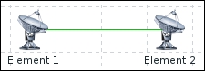
Selecting one or both elements will show one link:
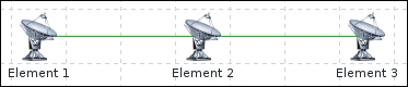
- Selecting Element 1 will show the link between Element 1 and Element 2
- Selecting Element 3 will show the link between Element 2 and Element 3
- Selecting Element 2 will show both links
- Selecting Element 2 and either Element 1 or Element 3 will show the link between the selected elements
- Selecting Element 1 and Element 3 will show no links at all
- Selecting all three elements will show both links
Most importantly, even if we had 20 links going out of Element 2, we could select a specific one by selecting Element 2 and the element at the other end of that link.
Links in Zabbix are simply straight lines from the center of one element to the center of another. What if there's another element between two connected elements? Well, the link will just go under the "obstructing" element. There is no built-in way to "route" a link in some other way, but there's a hackish workaround. We may upload a transparent PNG image to be used as a custom icon (we discuss uploading additional images later in this chapter), then use it to route the link:
Note that we would have to configure link indicators, if used, on all such links—otherwise, some segments would change their color and style according to the trigger state, some would not.
This approach could be also used to have a link that starts as a single line out of some system, and only splits in to multiple lines later. That could reduce clutter in some maps.
Another issue could be that in some maps there are lots and lots of links. Displaying them could result in a map that is hard to read. Here, a trick could be to have the link default color as the map background color, only making such links show up when there's some problem with the help of link indicators.
Let's find out some other things that can add nice touches to the map configuration.
Map elements that we have used so far had their name hardcoded in the label, and the status was added to them automatically. We can automatically use the name from the host properties and display some additional information. In Monitoring | Maps, click on All maps if a map is displayed, then click on the First map in the NAME column.
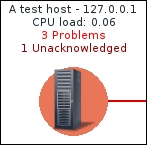
Click on the A test host icon. In the Label field, enter "{HOST.NAME} - {HOST.IP}" and select Top in the Label location dropdown. Click on Apply:
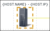
Strange... the value we entered is not resolved, the actual macros are shown. By default, macros are not resolved in map configuration for performance reasons. Take a look at the top bar above the map; there's an Expand macros control that by default is set to Off:
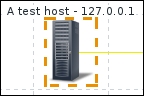
Click on it to toggle it to On and observe the label we changed earlier. It should show the hostname and IP address now:
The macros for the hostname and IP address are useful when either could change and we would not want to check every map and then manually update those values. Additionally, when a larger amount of hosts is added to a map, we could do a mass update on them and enter "{HOST.NAME}" instead of setting the name individually for each of them.
Notice how we could also change the label position. By default, whatever is set in the map properties is used, but that can be overridden for individual elements.
There are more macros that work in element labels, and the Zabbix manual has a full list of those. Of special interest might be the ability to show the actual data from items; let's try that one out. In the label for A test host, add another line that says "{A test host:system.cpu.load.last()}" and observe the label:
Tip
There is no helper like in triggers—we always have to enter the macro data manually.
If the label does not show the CPU load value but an *UNKNOWN* string, there might be a typo in the hostname or item key. It could also be displayed if there's no data to show for that item with the chosen function. If it shows the entered macro but not the value, there might be a typo in the syntax or trigger function name. Note that the hostname, item key, and function name all are case sensitive. Attempting to apply a numeric function such as avg() to a string or text item will also show the entered macro.
Real-time monitoring data is now shown for this host. The syntax is pretty much the same as in the triggers, except that map labels support only a subset of trigger functions, and even for the supported functions only a subset of parameters is supported. We may only use the trigger functions last(), min(), max(), and avg(). In the parameters, only a time period may be used, specified either in seconds, or in the user friendly format. For example, both avg(300) and avg(5m) would work in map labels.
It's not very clear to an observer what that value is, though. An improvement would be prefixing that line with "CPU load:", which would make the label much more clear:
This way, as much information as needed (or as much as fits) can be added to a map element—multiple lines are supported. One might notice the hardcoded hostname here. When updating a larger amount of map elements, that can be cumbersome, but luckily we can use a macro here again—change that line to read "CPU load: {{HOST.HOST}:system.cpu.load.last()}". Actual functionality in the map should not change, as this element should now pick up the hostname from the macro. Notice the nested use here.
What could element labels display? CPU load, memory or disk usage, number of connected users to a wireless access point—whatever is useful enough to see right away in a map.
We can also see that this host still has one problem, caused by our simulated latency trigger. Execute on "A test host":
$ touch /tmp/severity1
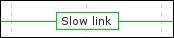
As mentioned before, we can also put labels on links. Back in the constructor of the First map, click on the A test host icon. Click on Edit in the Links section to open the link properties, then enter "Slow link" in the Label area, and click on Apply in the link properties. Observe the change in the map:
On the links, the label is always a rectangular box that has the same color as the link itself. It is centered on the link—there is no way to specify offset.
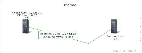
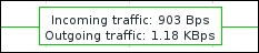
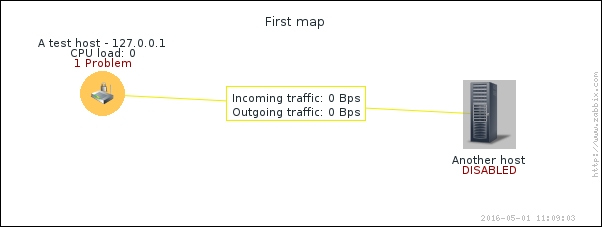
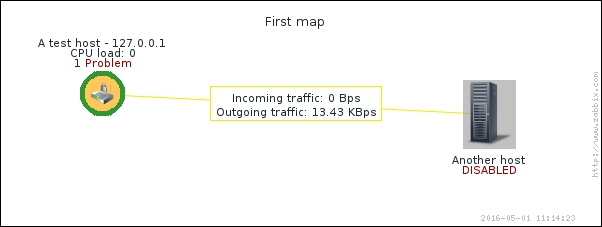
Having hardcoded text can be useful, but showing monitoring data, like we did for a host, would be even better. Luckily, that is possible, and we could display network traffic data on this link. Change the link label to the following:
Incoming traffic: {A test host:net.if.in[eth0].last()}
Outgoing traffic: {A test host:net.if.out[eth0].last()}
We are mixing here both freeform text (you could label some link "Slow link", for example), and macros (in this case, referring to specific traffic items). Click on Apply for the link properties. This might also be a good moment to save the changes by clicking on Update in the upper right corner:
Both macros we used and multiline layout work nicely.
For a full list of supported macros in map element labels, see the Zabbix manual.
Having the problem count listed in the label is useful, but it's not that easy to see from a distance on a wall-mounted display. We also might want to have a slightly nicer looking map that would make problems stand out more for our users. Zabbix offers two methods to achieve this:
- Custom icons
- Icon highlighting
In the First map constructor, click on A test host. In the Icons section, choose a different icon in the Problem dropdown—for the testing purposes, we'll go with the Crypto-router_(24) icon, but any could be used. Click on Apply, then Update for the map. Additionally, run on "A test host":
$ rm /tmp/severity1
After some 30 seconds check the map in the monitoring view—status icons are not displayed in the configuration section:
As soon as a problem appeared on a host, the icon was automatically changed. In the configuration, there were two additional states that could have their own icons – when a host is disabled and when it is in maintenance. Of course, a server should not turn into a router or some other unexpected device. The usual approach is to have a normal icon and then an icon that has a red cross over it, or maybe a small colored circle next to it to denote the status.
Manually specifying different icons is fine, but doing that on a larger scale could be cumbersome. Another feature to identify problematic elements is called icon highlighting. As opposed to selecting icons per state, here a generic highlighting is used. This is a map-level option, there is no way to customize it per map element. Let's test it. In the list of all the maps, click on Properties next to First map and mark the checkbox Icon highlight. This setting determines whether map elements receive additional visualization depending on their status. Click on Update, then open Configuration | Hosts. Click on Enabled next to Another host to toggle its status and acknowledge the popup to disable this host. Check the map in the monitoring view:
Both hosts now have some sort of background. What does this mean?
- The round background denotes the trigger status. If any trigger is not in the OK state, the trigger with the highest priority determines the color of the circle
- The square background denotes the host status. Disabled hosts receive gray highlighting. Hosts that are in maintenance receive an orange background
Click on A test host, then click on Triggers. In the trigger list, click on No in the ACK column, enter some message and click on Acknowledge. Check the map in the monitoring view again:
The colored circle now has a thick, green border. This border denotes the acknowledgment status—if it's there, the problem is acknowledged.
Zabbix default icons currently are not well centered. This is most obvious when icon highlighting is used—notice how Another host is misaligned because of that shadow. For this icon, it's even more obvious in the problem highlighting. In the constructor of the First map, click on A test host and choose Default in the Problem dropdown in the Icons section. Click on Apply and then on Update for the map, then check the map in the monitoring section view:

In such a configuration, another icon set might have to be used for a more eye-pleasing look.
To return things to normal state, open Configuration | Hosts, click on Disabled next to Another host and confirm the popup, then execute on "A test host":
$ touch /tmp/severity1
Hosts are not the only element type we could add to the map. In the constructor for the First map, click on Another host and expand the Type dropdown in the element properties. We won't use additional types right now, but let's look at what's available:

- Host: We already covered what a host is. A host displays information on all associated triggers.
- Map: You can actually insert a link to another map. It will have an icon like all elements, and clicking it would offer a menu to open that map. This allows us to create interesting drilldown configurations. We could have a world map, then linked in continental maps, followed by country-level maps, city-level maps, data center-level maps, rack-level maps, system-level maps, and at the other end we could actually expand to have a map with different planets and galaxies! Well, we got carried away. Of course, each level would have an appropriate map or schematic set as a background image.
- Trigger: This works very similar to a host, except only information about a single trigger is included. This way you can place a single trigger on the map that is not affected by other triggers on the host. In our nested maps scenario we could use triggers in the last display, placing a core router schematic in the background and adding individual triggers for specific ports.
- Host group: This works like a host, except information about all hosts in a group is gathered. In the simple mode, a single icon is displayed to represent all hosts in the selected group. This can be handy for a higher-level overview, but it's especially nice in the preceding nested scenario in which we could group all hosts by continent, country, and city, thus placing some icons on an upper-level map. For example, we could have per country host group elements placed on the global map, if we have enough room, that is. A host group element on a map can also display all hosts individually—we will cover that functionality a bit later.
- Image: This allows us to place an image on the map. The image could be something visual only, such as the location of a conditioner in a server room, but it could also have an URL assigned; thus, you can link to arbitrary objects.
Talking about URLs, take a look at the bottom of the element properties popup:
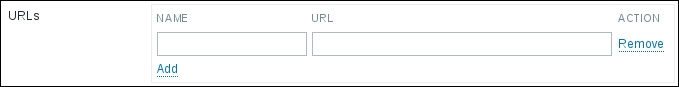
Here, multiple URLs can be added and each can have a name. When a map is viewed in the monitoring section, clicking on an element will include the URL names in the menu. They could provide quick access to a web management page for a switch or a UPS device, or a page in an internal wiki, describing troubleshooting steps with this specific device. Additionally, the following macros are supported in the URL field:
{TRIGGER.ID}{HOST.ID}{HOSTGROUP.ID}{MAP.ID}
This allows us to add links that lead to a Zabbix frontend section, while specifying the ID of the entity we clicked on in the opened URL.
Map elements "host", "host group", and "map" aggregate the information about all the relevant problems. Often that will be exactly what is needed, but Zabbix maps also allow filtering the displayed problems. The available conditions are as follows:
- Acknowledgment status: This can be set for the whole map
- Trigger severity: This can be set for the whole map
- Application: This can be set for individual hosts
In the map properties, the Problem display dropdown controls what and how problems are displayed based on their acknowledgment status. This is a configuration-time only option and cannot be changed in the monitoring section. The available choices are as follows:
- All
- Separated
- Unacknowledged only
The All option is what we have selected currently and the acknowledgment status will not affect the problem displaying there. The Separated option would show two lines—one, displaying the total amount of problems and another displaying the amount of unacknowledged problems:
Notice the total and unacknowledged lines having different colors. The option Unacknowledged only, as one might expect, shows only the problems that are not acknowledged at this time.
Another way to filter the information that is displayed on a map is by trigger severity. In the map properties, the Minimum trigger severity option allows us to choose the severity to filter on:
If we choose High, like in the preceding screenshot, opening the map in the monitoring section would ignore anything but the two highest levels of severity. By default, Not classified is selected and that shows all problems. Even better, when we are looking at a map in the monitoring section, in the upper right corner we may change the severity, no matter which level is selected in the map configuration:
Yet another way to filter what is shown on a map is by application (which are just groups of items) on the host level. When editing a map element that is showing host data, there is an Application field:
Choosing an application here will only take into account triggers that reference items from this application. This is a freeform field—if entering the application name manually, make sure that it matches the application used in the items exactly. Only one application may be specified here. This is a configuration-time only option and can not be changed in the monitoring section.
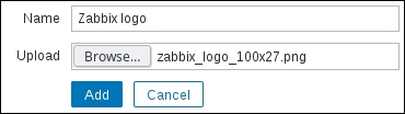
Zabbix comes with icons to be used in the maps. Quite often one will want to use icons from another source, and it is possible to do so by uploading them to Zabbix first. To upload an image to be used as an icon, navigate to Administration | General and choose Images in the dropdown. Click on the Create icon button and choose a name for your new icon, then select an image file—preferably not too large:
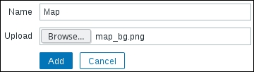
Click on Add. Somewhere in the following images, the one we just uploaded should appear. In addition to custom icons, we can also upload background images to be used in maps. In the Type dropdown, switch to Background and click on the Create background button. Note that this dropdown, different from all the other pages, is located on the left hand side in 3.0.0. Again, enter a name for the background and choose an image—preferably, one sized 600x225 as that was the size of our map. Smaller images will leave empty space at the edges and larger images will be cut:
Click on Add. As Zabbix comes with no background images by default, the one we added should be the only one displayed now. With the images uploaded, let's try to use them in our map. Go to Monitoring | Maps and click on All maps if a map is shown. Click on Constructor next to First map and click on Add next to the Icon label, then click on the newly added icon. In the Icons section, change the Default dropdown to display whatever name you chose for the uploaded icon, then click on Apply. Position this new icon wherever it would look best (remember about the ability to disable snapping to the grid). You might want to clear out the Label field, too. Remember to click on Apply to see the changes on the map:
When you are satisfied with the image placement, click on Update in the upper right corner to save the map. This time we might click on OK in the popup to return to the list of the maps. Let's set up the background now—click on Properties next to First map. In the configuration form, the Background image dropdown has No image selected currently. The background we uploaded should be available there—select it:
Click on Update, then click on Constructor next to First map again. The editing interface should display the background image we chose and it should be possible to position the images to match the background now:
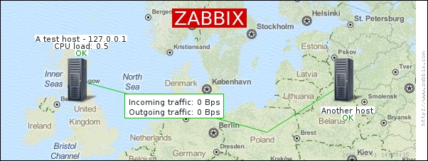
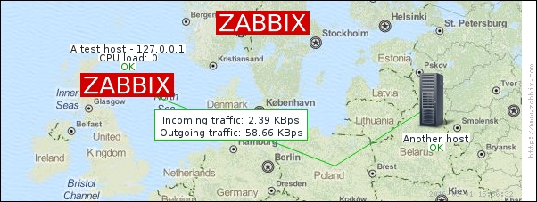
Map image courtesy of MapQuest and OpenStreetMap
Uploading a large amount of images can be little fun. A very easy way to automate that using XML import will be discussed in Chapter 21, Working Closely with Data, and we will also cover the possibility to use the Zabbix API for such tasks.
Here's an example of what a larger geographical map might look like:
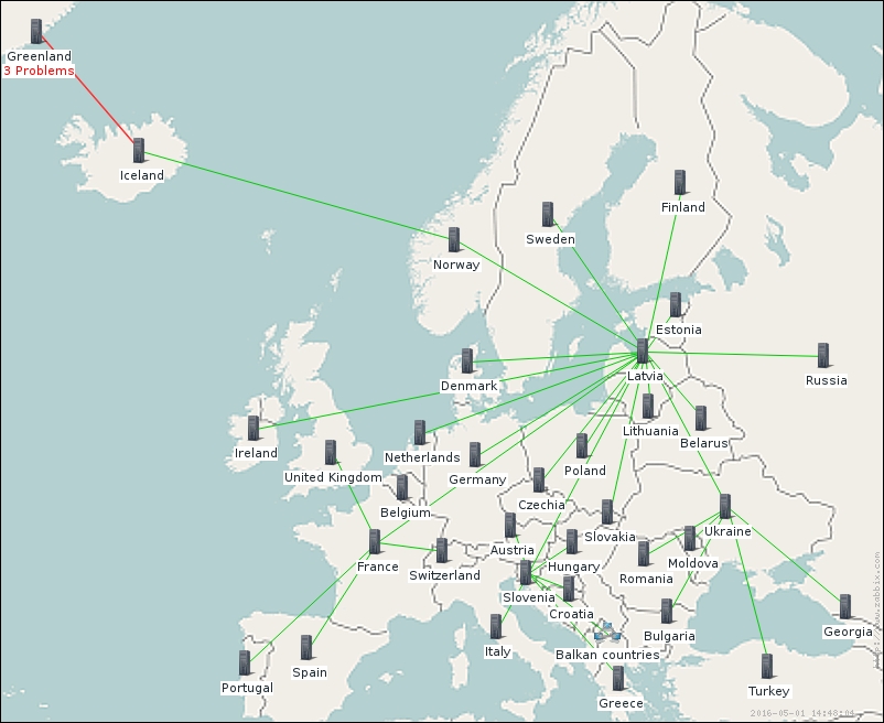
Map image courtesy of Wikimedia and OpenStreetMap:
A geographical map is used as a background here, and different elements are interconnected.
The images we used for the elements so far were either static, or changed depending on the host and trigger status. Zabbix can also automatically choose the correct icon based on host inventory contents. This functionality is called icon mapping. Before we can benefit from it, we must configure an icon map. Navigate to Administration | General and choose Icon mapping in the dropdown, then click on the Create icon map button in the upper right corner. The icon map entries allow us to specify a regular expression, and an inventory field to match this expression against and an icon to be used if a match is found. All the entries are matched in sequential order, and the first one that matches determines which the icon will be used. If no match is found, the fallback icon, specified in the Default dropdown, will be used.
Let's try this out. Enter "Zabbix 3.0" in the Name field. In the Inventory field dropdown, choose Software application A and in the Expression field enter "^3.0".
In Chapter 5, Managing Hosts, Users, and Permissions, we set the agent version item on "A test host" to populate the "Software application A" field. Let's check whether that is still the case. Go to Configuration | Hosts and click on Items next to A test host. In the item list, click on the Zabbix agent version (Zabbix 3.0) in the NAME column. The Populates host inventory field option is set to -None-. How so? In Chapter 8, Simplifying Complex Configuration with Templates, this item was changed to be controlled by the template, but it was copied from "Another host", which did not have the inventory option set. When we linked our new template to "A test host", this option was overwritten. The last collected value was left in the inventory field, thus currently "A test host" has the agent version number in that inventory field, but "Another host" does not. To make this item populate the inventory for both hosts, click on C_Template_Linux next to Parent items and choose Software application A in the Populates host inventory field dropdown. When done, click on Update.
We populated the Software application A field automatically with the Zabbix agent version, and in the icon map we are now checking whether it begins with "3.0". In the ICON dropdown for the first line, choose an icon—in this example, the Zabbix logo that was uploaded earlier is used. For the Default dropdown, select a different icon—here we are using Hub_(48):
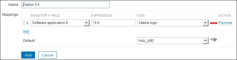
We have only used one check here. If we wanted to match other inventory fields, we'd click on the Add control in the Mappings section. Individual entries could be reordered by grabbing the handle to the left of them and dragging them to the desired position, same as the custom graph items in the graph configuration. Remember that the first match would determine the icon used.
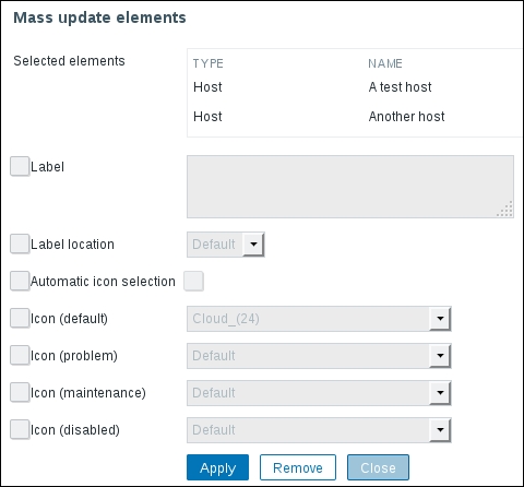
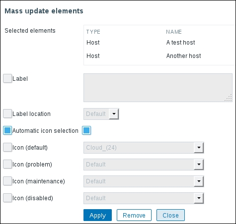
When done, click on the Add button at the bottom. Now navigate to Monitoring | Maps and if a map is shown, click on All maps. Click on Properties next to First map and in the Automatic icon mapping dropdown, choose the icon mapping we just created—it should be the only choice besides the <manual> entry. Click on the Update button at the bottom. If we check this map in the monitoring view now, we would see no difference, actually. To see why, let's go to the list of maps and click on Constructor next to First map. In the map editing view, click on A test host. The Automatic icon selection is not enabled. If we add a new element to this map, the automatic icon selection would be enabled for it because the map now has an icon map assigned. The existing elements keep their configuration when the icon map is assigned to the map—those elements were added when there was no icon map assigned. Holding down Ctrl, click on Another host. In the mass update form, first mark the checkbox to the left of Automatic icon selection, then—to the right. The first checkbox instructs Zabbix to overwrite this option for all selected elements, the second checkbox specifies that the option should be enabled for those elements:
Click on Apply and notice how both hosts change their icon to the default one from the icon map properties. This seems incorrect, at least "A test host" had the 3.0 version number in that field the reason is performance related again—in the configuration, icon mapping does not apply and the default icon is always used. Make sure to save our changes by clicking on Update, then open this map in the monitoring view:
Here, A test host got the icon that was supposed to be used for Zabbix agent 3.0 (assuming you have Zabbix agent 3.0 on that host). Another host did not match that check and got the default icon, because the item has not yet updated the inventory field. A bit later, once the agent version item has received the data for "Another host", it should change the icon, too.
Icon mapping could be used to display different icons depending on the operating system the host is running. For network devices, we could show a generic device icon with a vendor logo in one corner, if we base icon mapping on the sysDescr OID. For a UPS device, the icon could change based on the device state—one icon when it's charging, one when it's discharging, and another when it tells to change the battery.
While working with this map we have discussed quite a few global map options already, but some we have not mentioned yet. Let's review the remaining ones. They are global in the sense that they affect the whole map (but not all maps). Go to the list of maps, then click on Properties next to First map:
Skipping the options we already know about, the remaining ones are as follows:
- Owner: This is the user who created the map and has control over it. We will discuss it in more detail later in this chapter.
- Mark elements on trigger status change: This will mark elements that have recently changed their state. By default, the elements will be marked for 30 minutes and we discussed the possibility to customize this in Chapter 6, Detecting Problems with Triggers. The elements are marked by adding three small triangles on all the sides of an element, except where the label is located:
- Icon label type: This sets whatever is used for labels. By default it's set to Label, like we used. Other options are IP address, Element name, Status only, and Nothing, all of which are self-explanatory. If a host has multiple interfaces, we cannot choose which IP address should be displayed—same as with the
{HOST.IP}macro, Zabbix automatically picks an IP address, starting with the agent interface. Some of these only make sense for some element types—for example, IP address only makes sense for host elements. Just above this, Advanced labels allow us to set the label type for each element type separately: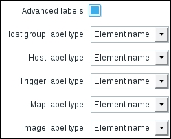
- Icon label location: This allows us to specify the default label location. For all elements that use the default location, this option will control where the label goes.
When we discussed the available map elements earlier, it was mentioned that we can automatically show all hosts in a Host group. To see how that works, navigate to the map list and click on Create map. Enter "Host group elements" in the Name field, then click on the Add button at the bottom. Now click on Constructor next to Host group elements map and click on Add next to the Icon label. Click on the new element to open its properties and select Host group in the Type dropdown. In the Host group field, start typing "linux" and click on Linux servers in the dropdown. In the Show option, select Host group elements. That results in several additional options appearing, but for now, we won't change them. One last thing—change the Label to "{HOST.NAME}":
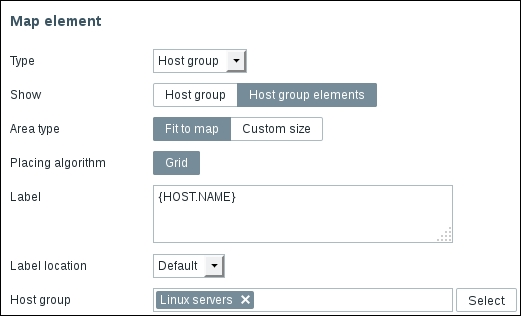
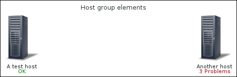
When done, click on Apply. Notice how the element was positioned in the middle of the map and the rest of the map area was shaded. This indicates that the host group element will utilize all of the map area. Click on Update in the upper right corner to save this map and then check it out in the monitoring view. All hosts (in our case—two) from the selected Host group are positioned near the top of the map:
Let's try some changes now. Return to the constructor of this map and click on the icon that represents our Host group. In the properties, switch Area type to Custom size and for the Area size fields, change Width to 400 and Height to 550. In the Label field, add CPU load {{HOST.HOST}:system.cpu.load.last()}:
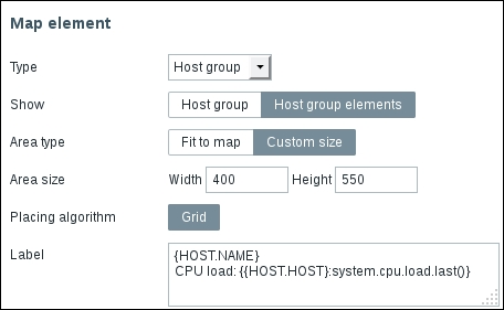
When done, click on Apply. The grayed out area shrunk and got a selection border. Drag it to the bottom-right corner by grabbing the icon. That does not seem to work that well—the center of the area snaps to the grid and we are prevented from positioning it nicely. Disable snapping to the grid by clicking on next to the Grid label above the map and try positioning the area again—it should work better now. Click on Update to save the map and check the map in the monitoring view:

The hosts are now positioned in a column that is denoted with a gray border—that's our Host group area. The macros we used in the label are applied to each element and in this case each host has its CPU load displayed below the icon. The nested macro syntax that automatically picked item values from the host it is added to is even of more use now. If hosts are added to the Host group or removed from it, this map would automatically update to reflect that. The placement algorithm might not work perfectly in all cases, though—it might be a good idea to test how well the expected amount of hosts fits in the chosen area.
The ability to use a specific area only allows the placement of other elements to the left in this map—maybe some switches, routers, or firewalls that are relevant for the servers, displayed on the right-hand side.
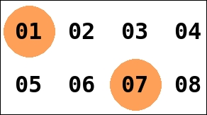
When looking at a map from a large distance, small label text might be hard to read. We can zoom in using the browser functionality, but that would make the icons large—and if the systems that we display on some map are all the same, there would be no need to use a visual icon at all. What we could try, though, is displaying a large number for each system. Zabbix maps do not allow changing font size, but we could work around this limitation by generating images that are just numbers and using them as icons in the map. One way to do so would be using the ImageMagick suite. To generate numbers from 01 to 50, we could run a script such as this on Linux:
for imagenum in {01..50}; do
    convert -font DejaVu-Sans-Mono-Bold -gravity center -size 52x24 -background transparent -pointsize 32 label:"$imagenum"     "$imagenum".png
done
It loops from 01 to 50 and runs the convert utility, generating an image with a number, using DejaVu font. We are prefixing single-digit numbers with a zero—using 01 instead of just 1, for example. If you do not want the leading zero, just replace 01 with 1. Later we would upload these images as icons and use them in our maps, and a smaller version of our map could look like this:
If we have lots of systems and there is no way to fit them all in one map, we could have a map for a subset of systems and then automatically loop through all the maps on some wall-mounted display—we will discuss later in this chapter a way to do that using the built-in slideshow feature in Zabbix.
You should be able to create good-looking and functional maps now. Before you start working on a larger map, it is recommended that you plan it out—doing large-scale changes later in the process can be time consuming.
Creating a large amount of complicated maps manually is not feasible—we will cover several options for generating them in an automated fashion in Chapter 21, Working Closely with Data.
When creating the maps, we ignored the very first field—Owner. The map ownership concept is new in Zabbix 3.0. In previous versions, only administrators were able to create maps. Now any user may create a map and even share it with other users. Another change is that maps are by default created in Private mode—they are not visible for other users. The maps we created are not visible to our monitoring and advanced users, covered in Chapter 5, Managing Hosts, Users, and Permissions. Let's share our maps.
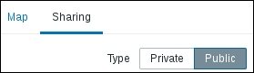
In another browser, log in as "monitoring_user" and visit Monitoring | Maps. Notice how no maps are available currently. Back in the first browser, where we are logged in as the "Admin" user, go to the list of maps. Click on Properties next to First map and switch to the Sharing tab. In the Type selection, switch to Public and click on Update:
Refresh the map list as the "monitoring_user"—First map appears in the list. The ACTIONS column is empty, as this user may not perform any changes to the map currently. Setting a map to public makes it visible to all users—this is the same how network maps operated before Zabbix 3.0.
Back in the first browser, let's go to the Sharing tab in the properties of First map again. This time, click on Add in the List of user shares section and click on monitoring_user in the popup. Make sure PERMISSIONS are set to Read-write. When a map is public, adding read-only permission is possible, but it makes no difference, so let's switch the Type back to Private. We had another user—click on Add in the List of user shares section again and this time click on advanced_user. For this user, set PERMISSIONS to Read-only:
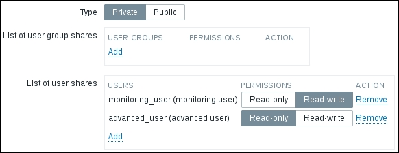
When done, click on Update. Refresh the map list as "monitoring_user" and notice how the ACTIONS column now contains the Properties and Constructor links. Check out the Sharing tab in Properties—this user now can see the existing sharing configuration and share this map with other users both in Read-only and in Read-write mode. Note that the normal users may only share with user groups they are in themselves, and with users from those groups. Switch back to the Map tab and check the Owner field:
Even though this user has Read-write permissions, they cannot change the ownership—only super admin and admin users may do that.
Let's log in as "advanced_user" in the second browser now and check the map list:
We only shared one map with this user, and only in Read-only mode—how come they can see both maps and also have write permissions on them? Sharing only affects Zabbix users, not admins or super admins. Super admins, as always, have full control over everything. Zabbix admins can see and edit all maps as long as they have write permission on all the objects, included in those maps. And if we share a map in Read-write mode with a Zabbix user that does not have permission to see at least one object, included in that map, the user would not even see the map. It is not possible to use map sharing as a way around the permission model in Zabbix—which is: the user must have permission to see all the included objects to see the map. If we include aggregating objects such as hosts, host groups, or even sub-maps, the user must have permission to see all of the objects down to the last trigger in the last sub-map to even see the top level map.
Probably the biggest benefit from the sharing functionality would be the ability for users to create their own maps and share them with other users—something that was not possible before.