
Swiss
Functional, neutral, and asymmetric
The Brief
Create a poster inspired by the “Swiss” or International Typographic Style
Trim Size
Tabloid/A3
Learning Points
Using the Polar Grid tool
Using the Live Paint tool in Illustrator
Working with “neutral” sans serif type
Tools
Illustrator
Fonts Used
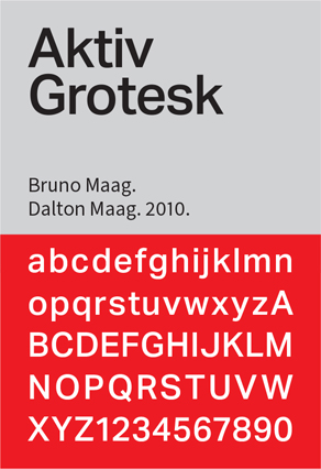
Aktiv Grotesque
Inspiration
For modernist reworkings of concert posters check out swissted.com
Kimberly Elam’s study of the Brockmann’s geometry is available on Behance: www.behance.net/gallery/9862277/Mueller-Brockmanns-Beethoven-Poster-Geometric-Analysis
After the chaos and uncertainty of the Second World War, many designers sought a neutral approach that favored the rational over the subjective. And who better to take on this herculean task of bringing order to the 20th century than our old friends, the Swiss?
The International Typographic Style, aka the Swiss Style, popular in the 1950s and ’60s, emphasized readability and objectivity with asymmetric layouts, sans serif typefaces, a ragged alignment, and the use of grid systems. The most famous practitioners of the Swiss style were Armin Hofmann and Emil Ruder of the Basel School of Design, and the grandfather of grid-based design: Josef Müller-Brockmann of the Zurich School of Arts and Crafts.
Have you ever had a design professor tell you “don’t be afraid of white space?” You have the Swiss to thank. But the great thing about this style is that, if you have the font Helvetica on your computer, you’re halfway there.
This project is an homage to the famous 1955 Beethoven concert poster by Josef Müller-Brockmann. The design is deceptively simple. If Müller-Brockmann were designing this poster today, we’d bet he would use Illustrator’s Polar Grid tool, combined with the Live Paint Bucket.
We started with an 11 × 17 (tabloid) art board and created a 11 × 17 grid. With the Polar Grid tool and holding Option/Alt, we clicked at the intersection of 3 grid squares in and 5 grid squares up from the bottom. Because we wanted a specific grid, it was easier to specify it numerically: 34 inches, 75 concentric dividers, and 32 radial dividers.
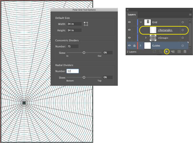
With the Polar Grid tool create a radial grid of 75 concentric rings and 32 radial dividers, centered on the intersection of column 3 and row 13. A layer clipping mask hides the portion of the grid that spills over onto the pasteboard.

So how did we come up with these numbers? The center of the circle will be knocked out — that represents 12 concentric dividers. Thereafter, the rings radiating from the center start at a width of 1, doubling every time: 2, 4, 8, 16, 32. That’s a total of 75. The radial dividers are the spokes that move toward the center of the circle; each quarter circle will have eight spokes. Because much of the grid falls on the pasteboard, we added a clipping mask around the bleed size of the poster. This removes the visual clutter of seeing so much content spill out onto the pasteboard.
Beneath the grid, on its own layer is a rectangle of off-white (C3 M9 Y7 K4), which functions as the background color.
The radial grid is divided into two subgroups, the radial dividers above and the concentric dividers below. To keep things straight, we named them.
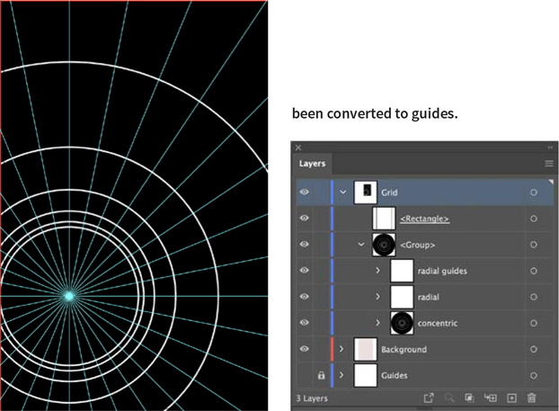
The center rings deleted. Thereafter, the width of the rings doubles as they move outward from the center. The rings are filled with black and stroked with white.
A copy of the radial dividers sublayer has been converted to guides.
Set the stroke of the radial dividers to None. Copy them and paste them in front and convert the copy to guides (Cmd/Ctrl+5). With the Group Selection tool, delete the first 12 concentric dividers, making space in the center of the circle for the text. Next, modify the rings so that they double in width as they move away from the center of the circle. Add a white stroke to the remaining concentric dividers and fill everything with black.
Make the radial grid into a Live Paint Group and apply None to the sections you want to remove. To neutralize the white strokes from the remaining black segments, set the blending mode to Multiply to blend the Grid layer with the Background layer below. Once the segments are identified and filled, change their color to magenta.
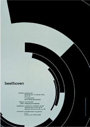
The original 1955 poster by Josef Müller Brockmann
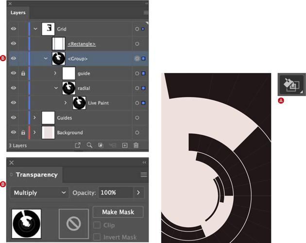
Using the Live Paint Bucket (A), fill the unwanted segments of the radial grid with None to reveal the color of the Background layer beneath.
The blending mode of the group is set to Multiply (B), neutralizing the white strokes that separate the segments.
Adding the type
We chose Aktiv Grotesk, because it’s a close match to Akzidenz Grotesk, a typeface associated with the work of Joseph Müller-Brockmann. Everything is in lowercase, because in a rational world why would you need upper- and lowercase? Aside from the band name, everything is the same size and the same weight; hierarchy comes from use of space and alignment. The text is chunked into meaningful bits of information with consistent spacing between them; the text in the left column is right aligned, and the text in the right column is left aligned.

The type is arranged flush right and flush left around a central axis that comes down from the edge of the top segment.