
Illustrate a Lyric with Type
Give a typographic voice to a favorite song lyric or quote
The Brief
Choose a song lyric or poem that you love and interpret it with type
Trim Size
Tabloid/A3
Learning Points
Creating effects with the Appearance panel in Illustrator
Choosing and combining type
Tools
Illustrator
Fonts Used
Rosewood, Poplar, Bodoni Poster, French Clarendon Ornamented, League Gothic, Blackoak, Adobe Wood Type Ornaments
Inspiration
If you love music and you love type, what better way to combine the two than by interpreting a favorite lyric with typography? This kind of endeavor is a mainstay of crafty websites like Etsy. It’s also just a lot of fun. Our chosen lyric is from “Reasons to Be Cheerful, Part 3” by Ian Dury and the Blockheads from 1979. We love the song. But don’t take our word for it. In his book 31 Songs, Nick Hornby writes, “The more I listen to “Reasons To Be Cheerful,’ the more it sounds like the best kind of national anthem, one capable of inspiring pride in those of us who spend too much time feeling embarrassed by our country.”
Choose the type
Ian Dury was famous for combining rock and roll and punk with the bawdy humor of Victorian music hall, and we wanted the poster to have a Victorian aesthetic — part circus poster, part music hall poster. The lyrics of “Reasons to Be Cheerful” are essentially a list of things to celebrate. As such it’s a great pick-me-up, and the rhythm of Dury’s delivery makes you see the words like a poster or advertising broadside.
What we’re after then is a mash up of a punk/new wave singer-songwriter and a Victorian poster. Makes perfect sense to us. On such Victorian posters, lists took precedence over structured sentences. This was the industrial age, and there were scads of mass-produced products to sell. The hierarchy of the poster — indicated by type size, weight, color, and devices like underling — made clear which items were the most important. But — and this is the fun part, EVERYTHING WAS IMPORTANT!

Posters from the British Library Envanion Collection, a collection of 19th century ephemera formed by Henry Evans (1832–1905), a conjuror and ventriloquist, who performed under the stage name Evanion. During the course of a long career, he amassed a large collection of material relating to Victorian entertainment and everyday life.

This desire to be bigger, bolder, and louder led to a typographic arms race, with larger typefaces needed to cut through the noise. The advent of wood type allowed printers to go beyond the technical limitations of metal type, which was too heavy and too expensive for use at large sizes. Wood type also allowed the use of typefaces that weren’t necessarily readable at book sizes.
Chaotic but charming, Victorian printing was characterized by the era’s love of ornamentation and has, perhaps unfairly, acquired a reputation for careless craftsmanship. Posters of the era are characterized by extreme variations of type size and weight. The concept of white space didn’t exist. The lines are crammed onto the page, every one in a different typeface. All the text is, of course, in uppercase. Make it bigger; make it louder.
With all this in mind, we chose a selection of wood types and for good measure threw in some typographic ornaments, which for ease of scaling were converted to outlines. There are also a couple of catchwords, THE and AND, and it wouldn’t be complete without some manicules, or pointing hands.

After deleting all unused colors, convert the remainder to global colors (indicated by the triangle in the bottom-right corner of the swatch).
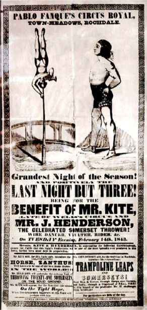
The poster for Pablo Fanque’s Circus Royal appearance at Rochdale that inspired John Lennon to write “Being for the Benefit of Mr. Kite!”
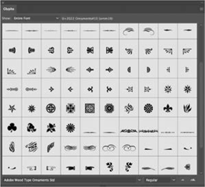
Use the Glyphs panel to find and insert ornaments from ornament sets like Adobe Wood Type Ornaments.
Formatting the text
Because each line is separate, we didn’t bother with paragraph styles, and anyway, a methodical approach seemed antithetical to the aesthetic that we were trying to channel. Each block of type was centered on the artboard with the Align panel. Fearful of white space, we wanted the type to fill as much of the page as possible, so reduced the size of the word spaces to 40%.
To create the chromatic text for Summer, we converted the type (Rosewood) to outlines and then, with it still selected, used the Shape Builder tool to change the color of the interior decoration.
For the offset and extruded drop shadows, we applied Live Effects through the Appearance panel so that the text remains live and so that the size and angle of shadow are easily editable thereafter.
Choosing colors
The two-color palette was inspired by a piece we had collected on our Pinterest board while looking for ideas. We deleted all unused colors so that we could concentrate on just those we were using and then converted both to global colors so that they could be easily edited, without having to select each item on the artboard.

Add a new fill to the text (A).
Add a new stroke. Make it the color of the background, move it beneath the fill, and adjust its weight. Apply a Transform effect to offset it from the fill above (B).
Add another fill, and move it to the bottom of the stack. Apply a Transform effect to offset multiple copies, creating the extruded drop shadow (C).
Finishing touches
Once we were happy with the type — and especially the relative sizes of the lines and the spacing between them — we added paper texture on a layer above and set its blending mode to Multiply. (When in doubt, try Multiply!) To give the impression of show-through from the reverse side of the paper, we used an earlier version of the poster, reflected it vertically, and reduced its opacity until it was barely visible. You can see it, just to the left and right of Good Golly.
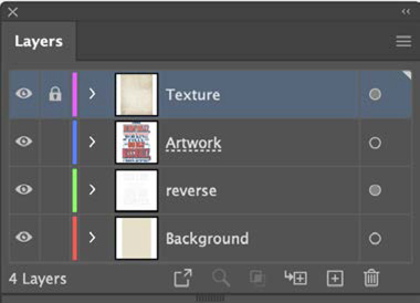
The final order of layers. The reverse layer includes a reverse impression of the poster at an opacity that is just about visible.
Astute Graphics
If you find yourself using extruded drop shadows frequently, check out the Astute Graphics plug-in suite for Illustrator. The Stylism plug-in includes a Live Block Shadow tool, which is fast, interactive, and easy to use. It also allows you to directly manipulate effects like Drop Shadow, Feather, Blur, Inner and Outer Glow, Offset Paths, and Free Distort. Their website (astutegraphics.com) features many helpful videos for how to use their products.