
Cookbook
Type in a supporting role
The Brief
Create a cookbook cover based on your own photography. Combine the imagery with type choices that help convey the book’s personality.
Trim Size
7.5 × 10 inches (190 × 254 mm)
Learning Points
Staging a front cover photo shoot
Choosing complementary type
Tools
InDesign, Photoshop, camera
Fonts Used
Lato
Inspiration
People buy fewer and fewer books of fiction each year, but interestingly, cookbooks are more popular than ever. Is that because everybody likes food, and a good, handy book for preparing it is just essential? Maybe. Or maybe the people who design cookbooks understand the power of typography.
The intention for this cover is to design something bold, clean, fresh, and colorful — to reflect the contents of the book itself. What could be more colorful than a color wheel?
Create the image
To create a color wheel of pulses, grains, spices, nuts, and vegetables, we organized the ingredients by color on a radial grid template that we whipped up in Illustrator using the Polar Grid tool and printed out on a desktop printer. For the most part we stayed within the lines, but we also didn’t want the finished result to look too neat — hence the bay leaves breaking up the geometry. The camera was placed on a tripod, on a flat plane to the subject, and we shot from above.
Initial image edits were made in Lightroom Classic: We cropped to a square aspect ratio, applied an Auto adjustment to improve the exposure and contrast, and added some Vibrance to increase the saturation of the more muted colors.
At this point, it was time to take the image into Photoshop for some additional retouching to remove grid lines, some unwanted shadows, and some spilled turmeric. While it’s possible to do basic spot removal in Lightroom Classic, it’s way quicker and easier in Photoshop. From Lightroom Classic, rather than the obvious choice of Cmd/Ctrl+E to edit the image in Photoshop, we chose Photo > Edit > Open as Smart Object in Photoshop. Although there’s currently no perfect round-trip editing solution for combining Lightroom Classic with Photoshop, opening as a Smart Object is the better option. It allows you to make further edits, if needed, to the Camera Raw image by double-clicking the Smart Object thumbnail to enter the Adobe Camera Raw plug-in, which has all the same sliders and options as Lightroom Classic. No matter which approach you take, because you can’t place a Camera Raw file in InDesign, when you’re satisfied with the image, you’ll need to save it as a Photoshop (PSD) file and place this in the InDesign document.

Capture the image in RAW format and do most of the editing in Lightroom Classic or Adobe Camera RAW (A).
Open the image as a Smart Object (B) (Photo > Edit In > Open as Smart Object in Photoshop) where it’s easier to do the minor retouching with the Spot Healing Brush on a separate layer to remove gridlines, stray elements, and unwanted shadows (C).
Add a Levels adjustment (used in conjunction with the Info panel to verify the color numbers) to force the background to white (R255, G255 B255) (D).


Choosing to Open as Smart Object in Photoshop lets you make further edits to the image in the Adobe Camera Raw plug-in.
Choose the type
In this project the typography plays a supporting role to the image, and the type is intended to be simple (not least because that’s one of the words in the book’s title), straightforward, and honest. At the same time, it should look contemporary and elegant.
Lato is a “super family” available in a range of nine weights. Designed in 2010 by Warsaw-based Łukasz Dziedzic, lato means summer in Polish. It has a massive — and we mean massive — range of glyphs and supports 100+ Latin-based languages, 50+ Cyrillic-based languages, as well as Greek, so if you’re in need of a versatile font family for multilingual publishing, it’s worthy of your consideration.
Another factor — and one you’ll appreciate in a later project when we work with some of the interior pages of the book — is that we also wanted the cover text to tie in with the type used for the interior of the book. Too often the design of a book interior and its cover expose the fact that they were created by separate designers, who seemingly never communicated with each other.
Format the type
To give the type a more informal vibe, we’ve used title case rather than uppercase. There are two weights heavier than Bold in Lato’s extensive family — Heavy and Black — but the Bold weight feels confident without being pushy. Combined with the tight leading, the contrast of the black on white is attention-grabbing from a distance.
The orange punctuation plays off the colors in the picture and helps tie the type to the image. At large sizes, punctuation can look disproportionately large, so we’ve reduced its size (55 pt compared to the 77 pt of the letters). It’s this attention to small detail that will set your work apart from that of your competitors.
With the title at such a large size, Optical automatic kerning yields a tighter, more consistently spaced, result. To cut a long story short, there are two methods of automatic kerning: Metrics, which uses the kerning values designed by the type designer, and Optical, which disregards those values in favor of adjusting the kerning based on the letter shapes. It’s a generalization, but Optical kerning tends to work better at large sizes. But don’t take this for granted: Results will vary according to your chosen typeface, its size, and your personal preference.


Preparing the front cover
Create a color wheel with spices, pulses, nuts, and vegetables.
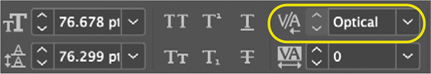
Optical kerning is typically best for big type and headings.
Speaking of optical, here’s another optical consideration: Aligning the left edges of the two lines of the title looked off to us. By turning on Optical Margin Alignment we ensured that the vertical stems of the T and the H were lined up. This is going to cause the horizontal stem of the T to push left and break the text frame, which makes some people nervous. We think it rocks!

Working with Optical Margin Alignment
Before (left) and after. Theoretically, the size should correspond to the size of your type; in practice, use the default of 12 pt unless it doesn’t look right.
Filling out the width of the second line, the subtitle is arranged on three lines, fitted to the x-height of the large type. And in case you thought we weren’t getting granular enough, let’s talk about the ellipsis (three dots). The ellipsis character (Option/Alt+;) is too tight for our liking, but full space widths between periods look too gappy, especially at large sizes. It’s fortunate then that we have thin spaces (you’ll find them on the Type > Insert White Space menu or use the keyboard shortcut Cmd+Option+Shift+M/ Ctrl+Alt+Shift+M). We think that an ellipsis built with thin spaces is the Goldilocks ellipsis. Perhaps we need to get out more.

The three lines of the subtitle are aligned between the x-height (A) and the baseline of the title (B).