
Constructivist
Reds, blacks, and bold diagonals
The Brief
Create a Constructivist-inspired propaganda poster
Trim Size
Tabloid/A3
Learning Points
Combining words of different scale
Aligning and spacing type
Applying live transformations
Tools
Illustrator
Fonts Used
Molot (dafont.com)
Inspiration
We’ve grown accustomed to seeing the old Soviet Union as stodgy, dull, and inefficient. But believe it or not, there was a time when the things going on in Russia inspired the best minds of the day! Hard to imagine, but it’s true.
Some of those great minds were artists, designers, and architects, and from that moment in Russia came the Constructivist movement, led by artists like Vladimir Tatlin and Alexander Rodchenko, and influenced by the suprematist works of El Lissitsky. Its purpose was to celebrate the power of industrial civilization while projecting a confidence in the future and belief in social progress. Bold, dynamic, and imaginative, the design of that period inspired other movements of the 20th century — everything from Bauhaus in Germany to the De Stijl movement in the Netherlands.
Some of the most influential graphic designers of the modern age, like Neville Brody and Barbara Kruger, were influenced by Constructivism. Nowadays, it’s common to see people imitate some of the elements of Constructivist typography — bold, red, and black type run at an angle, yellowed collage images, Russian-styled knock-off fonts, and so on. It’s easy to imitate, with today’s tools, but very difficult to do well. Perhaps the difficulty has something to do with that confidence in the future. Kinda hard to muster, these days, but we can try.
For this project, we chose to illustrate a quote from Rodchenko: “The Future Is Our Only Goal.”
Type choice and treatment
The font we chose is Molot by Jovanny Lemonad, available for a voluntary donation at dafont.com. It’s a very blocky sans serif that says “Russian” without resorting to corny devices like backwards Rs. In keeping with the confidence of the Constructivists, it looks solid, like nothing can knock it over.


Beat the Whites with the Red Wedge by El Lissitsky (1919)

The bold rotation of the type is key to creating a Constructivist look, but before rotating the text, it’s important to address the scaling, alignment, and spacing. To space out the type and black bars, we drew colored rectangles to use as “spacing sticks” to keep the distance between elements consistent.
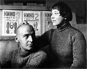
Luminaries of Constructivism, Alexander Rodchenko and Varvara Stepanova in the 1920s

Duplicate and rotate colored rectangles on a separate layer to ensure consistent spacing between elements. When you’re finished, hide the spacing layer.
Color
Red is used as a second color both for its assertiveness and its political associations. Since the time of the French Revolution (1789–1799), a red flag has predominantly been a symbol of socialism, communism, Marxism, and trade unions. When paired with black, it creates a visual combination that’s hard to beat. Color ink was expensive, so the use of just one or two colors was common.
Rotating the type
Having grouped the type elements and the black bars, you’re ready to rotate the type. We added the rotation as an effect through the Appearance panel. That way, if we want to make changes to the text, we can hide the transformation, make the changes, and then turn the transformation back on. Alternatively, you can leave the transformation on, but make the edits in Outline View mode, where the rotation will not be visible.

Rodchenko’s poster Books (Please)! In All Branches of Knowledge (1924) is one of the most referenced pieces in the history of graphic design. Top: the cover of You Could Have It So Much Better, by Scottish indie band Franz Ferdinand; Bottom: an ad on the back of a bus in San Francisco.

Applying the rotation as a Live Effect (A) makes it easy to dial in the exact amount of scaling and angle of rotation (B). If you need to make changes to the text, just temporarily hide visibility of the effect (C).
Finishing touches
The hammering workers are traced from a Soviet poster of the era.
For the texture, we moved to Photoshop. Here we created a canvas the same size as our Illustrator artboard (plus an extra quarter-inch on both dimensions for the bleed) and placed the Illustrator art as a linked graphic. We added a layer of texture above the artwork and set its blending mode to Multiply. This had a good effect on the lighter areas of the artwork, but left the solid blacks unchanged. A more aggressive approach was needed: We temporarily switched the blending mode of the texture layer back to Normal, opened the Channels panel, and Cmd/Ctrl-clicked the RGB thumbnail to load the gray values of the texture as an active selection. Returning to the Layers panel, we restored the blending mode of the texture to Multiply and added the active selection as a layer mask to the artwork layer. Double texture — with the result that it is affecting both the light and dark areas! To increase the contrast, we applied a Levels adjustment to the layer mask and moved the black point slider to the right. Finally, for more drama, we also applied a Camera Raw filter to the texture layer and added vignetting to the edges.


Place the Illustrator artwork in Photoshop as a Linked Smart Object (A). Add a paper texture to the layer above and set its blending mode set to Multiply (B). Use the gray values of the texture as a layer mask for the artwork and increase the contrast of the layer mask with a Levels adjustment (C). Apply a Camera Raw filter to the texture layer to darken the edges of the canvas with a vignette (D).