
Psychedelia
Get groovy with a ’60s rock poster
The Brief
Create a psychedelic poster for a past or imaginary concert
Trim Size
Tabloid/A3
Learning Points
Warping type
Considering readability and legibility
Choosing type and color
Tools
Illustrator, Photoshop
Fonts Used
Wes Wilson
Inspiration
Sometime around 1966, the square citizens of San Francisco found themselves baffled by the appearance of a series of bright-colored posters, featuring swirling, almost unreadable type. They appeared on lampposts around town, and just as quickly disappeared, snatched up by the strange, oddly dressed kids that had recently taken over the Haight-Ashbury district. What did it all mean? If you had to ask, you just weren’t hip to the times, man.
These posters became collectors’ items, and from ’66 to ’70, a group of brilliant artists produced hundreds of them for shows featuring everyone from the Grateful Dead to Led Zeppelin and Muddy Waters. For those who were paying attention, it was easy to discern influences as varied as Art Nouveau, particularly the Vienna Secession, underground comics, and even the color theory of German-American painter Hans Hofmann. Artists Wes Wilson, Bonnie MacClean, Victor Moscoso, Rick Griffin, and many others became famous overnight, working for local concert venues like Bill Graham’s Fillmore Auditorium and the Family Dog’s Avalon Ballroom.
Typographically, the main innovation of this movement was, oddly, to make the type difficult to read. This might have been done to limit the audience to those hip to the scene — if you weren’t interested in taking the time to decipher the poster, then you were too square to appreciate the music — or it might have been due to artists experimenting with combining type and image into a single element. But the effect was to make the poster itself a work of art — as iconic, as memorable, as important as the music it advertised. Poster design has never been the same since.
Color palette
For our poster we wanted a color palette of vibrating colors. We chose colors with similar color values or brightness. This was a combination of “winging it” and checking the color numbers in the Color Picker using the HSB color mode to make sure the B value was similar for all three colors.

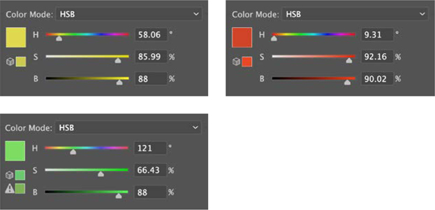
You can use the HSB color mode to check that the values (Brightness) of your colors are similar to create a vibrating effect.
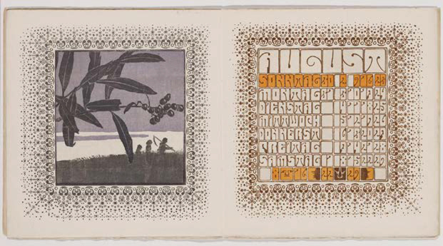
The Ver Sacrum calendar of 1903 with lettering by Alfred Roller
Choose the type
The psychedelic poster designers of the ’60s drew inspiration from the Art Nouveau movement of the late 19th and early 20th century, especially in their lettering. The typeface we’re using — Wes Wilson — is a tribute to the lettering of Wes Wilson, which in turn is a tribute to the lettering of Alfred Roller, which appeared in the Ver Sacrum calendar of 1903. Ver Sacrum (“Sacred Spring” in Latin) was the magazine of the Vienna Secession published from 1898 to 1903. The letter shapes are rounded rectangles with minimal negative space, which means they can inhabit a space from edge to edge, and also that they are very malleable, which is a good thing considering the amount of warping we subjected them to.
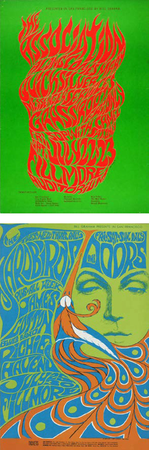
Posters by Wes Wilson (top) and Bonnie MacClean
Imagery
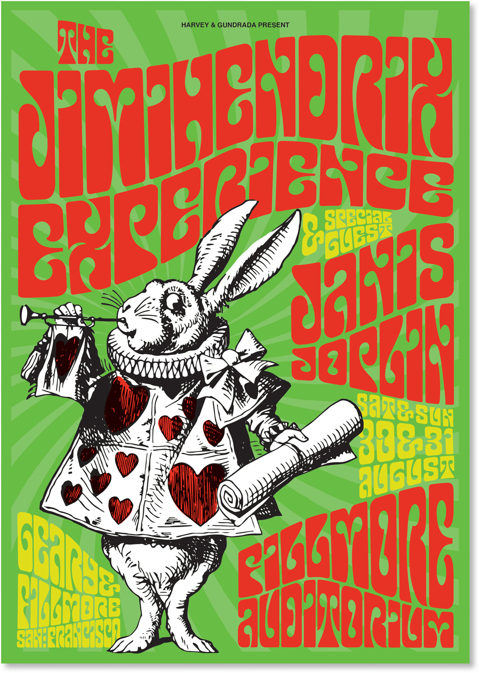
Originally we had chosen a stylized portrait of Jimi Hendrix, but realized that our tribute to this style would end up looking like everybody else’s tribute to this style. Ultimately, we went instead with a drawing by John Tenniel from Alice in Wonderland. Lewis Carroll’s children’s story from 1865 is itself something of a trip and has been namechecked by several bands of the era, most famously Jefferson Airplane (who incidentally appeared on an earlier draft of the poster, but were dropped because their name was too long. That’s one of the benefits of a fictitious gig poster!).
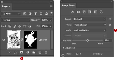
In Photoshop, prepare the rabbit with a layer mask to hide the background shading (A).
Place in Illustrator and vectorize with Image Trace (B).
The image was prepped in Photoshop to remove the shading around the rabbit before being vectorized with Image Trace in Illustrator and colorized by applying a fill to selected segments of the traced result.
We created background swirl in the same way as in the “Music Festival Poster: Curate your dream lineup” project and then offset it so that it radiated outward from the rabbit’s head.
Warp the type
We set the type, tightly leaded, and used the Mesh tool to bend it to our will. Because we’re pros, we aced it the first time.
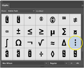
Word spaces are filled with this “vertical elllipsis” bullet character.
That is a lie. After about 104 takes, we were satisfied with the result. Here are some things we learned along the way: Go as far as you can with the type before you resort to the warping. Get the scale, the leading, and the letter spacing how you want it. Position it on the artboard roughly where you want it. To make the type as dense as possible, we used the Justification dialog on the Paragraph panel to set the Auto Leading value to a shockingly low 82%. If this were conventional “readable” type, the Type Police would have come knocking, but we’re not so much concerned with readability as with legibility. The type is legible by being impactful and distinctive, and it communicates mood through the codes of its genre.
In terms of blocking out the areas for the type, a pencil sketch is invaluable. We realized this after about take 65, by which time we were regarding our near misses as de facto sketches.
When the type blocks are in place, choose Object > Envelope Distort > Make with Mesh (Cmd+Option+M/Ctrl+Alt+M). Start out with just one row and one column. Each of the four anchor points has two Bézier control handles, and you can do a lot of warping with just these. As required, add rows by clicking on the left or right edge, or add columns by clicking the top or bottom edge of the mesh. Click inside the mesh to create rows and columns simultaneously. (You can Option/Alt-click to delete a row or column if you have too many.)
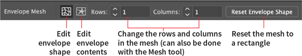
If things go wrong, you can click Reset Envelope Shape. We found this preferable to trying to rescue a warp that had gone awry with counter warping. If things go really wrong, you can choose Object > Envelope Distort > Release.
Note that there are no word spaces. Looking at Wes Wilson’s work, he used a bullet (like a vertical ellipsis) to fill the gap of a word space. The final version of our poster required only one space (between San and Francisco), but we made sure to use the bullet there — Option/Alt+8 or insert it from the Glyphs panel.
If you need to make edits to the text, toggle back and forth between selecting the envelope shape and the envelope contents. It’s reassuring to know that the text is still editable, but practically speaking you’d rather not be making edits at this stage.
As always, keep your work organized on named layers, locking and unlocking them as necessary. And remember what the dormouse said: “Feed your head.”

How it all breaks down on the Layers panel