
ASCII Art
Get cryptic with an Old Master
The Brief
Turn an Old Master into random text
Trim Size
US Letter/A4
Learning Points
Embracing the random
Working with fully justified text
Tools
InDesign
Fonts Used
Courier
Inspiration & Resources
rumkin.com/tools/cipher/vigenere.php
Here’s a fun project that broadly comes under the category of Word Art, converting an image into a series of random characters. ASCII art has been around for a long time, and there are several websites that allow you to convert an image into ASCII art. I (Nigel) tried them all, but none gave me what I wanted — the ability to take the converted result and manipulate it in InDesign. So I had to come up with my own technique.
This technique works best on portraits, and it helps if it’s a well-known image so that the viewer’s brain can fill in the missing information — and there will be a lot of missing information. I used Vermeer’s Girl with a Pearl Earring.
For a text, I wanted something meaningful, but obscure. What could be more meaningful that one of the greatest works of art criticism ever written: the first chapter of John Berger’s book, Ways of Seeing? But because I felt this would work best if people weren’t trying to read the image (and because I didn’t want to be accused of copyright infringement), I encrypted the text.
Encryption sounds complicated, and it is. But happily, there are websites that make generating encrypted text easy: I used rumkin.com/tools/cipher/vigenere.php. Paste in a text and choose a passphrase, and the website will generate a ciphertext: a long string of text that can be converted back into readable text by someone with the passphrase. (Psst: the passphrase is Ways of Seeing, in case you’d like to decrypt this image and read a great book!)
Within seconds, I had generated a handy string of text that I could use to generate the text-based portrait.
I pasted the text directly into InDesign in a frame over the image. I wanted the text to knockout and reveal the image beneath in its character shapes. Here’s the trick: Add a separate black frame behind the text. Select the text frame, and on the Effects panel, reduce the text opacity to 0. Group the text frame (with the now invisible text) with black frame behind and select Knockout Group. This will cut text-shaped holes through which you can see the image below.


Set the text opacity to 0% (A).
Group the text frame with a filled text frame behind. Choose Knockout Group (B).
I then needed to make a few changes to the text. I turned off hyphenation and set the justification to Full Justify so that each line is the same length.

I chose a monospaced typeface, Courier, so that the letters stack up on top of each other, functioning like halftone dots. To build density I reduced the word spacing to a barely discernible 20%, and to fill out the frame vertically, I chose Object > Text Frame Options (Cmd/Ctrl+B) to set the vertical justification of the text frame to full justify.
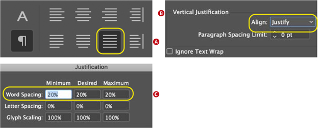
To make the text function like halftone dots: Full justify horizontally (A) and vertically (B) and reduce the space between the words (C).