
Pulp
Saucy and sensationalist
The Brief
Create a pulp fiction paperback cover
Trim Size
5.5 × 8.5 inches (140 × 216)
Learning Points
Combining Illustrator and Photoshop
Warping type
Choosing type and color
Tools
Illustrator, Photoshop
Fonts Used
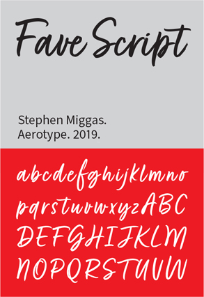
Fave Script, Balboa Extra Condensed
Inspiration
lithub.com/all-your-favorite-songs-reimagined-as-vintage-book-covers-youre-welcome
If you’re reading this chapter in order, you could be excused for concluding that the history of design and typography is going downhill. We started with beautiful, detailed ornamentation in the late 19th century, watched type become more and more streamlined and simplified, and by the latter half of the 20th century, we’re just slapping garish type over images of women in burning buildings.
You wouldn’t be wrong. But as Quentin Tarantino has shown the world, just because something was produced for all the wrong reasons doesn’t mean it isn’t high art.
One great thing about the tradition of pulp fiction covers is the return of type that is hand-drawn in the American sign-painting tradition. But you’re just as likely with these covers to see that style combined with a Deco or ’40s-style typeface, as well. Who cares, when the point is not to please an art director, but to sell cheap books to desperate, sex-mad customers?
Document setup
We like to start just about every project with a grid, and this one is no exception. Draw a rectangle the size of the artboard, positioned edge to edge with no overhang; then choose Object > Path > Split into Grid. How many rows and columns is a matter of personal preferences, but we prefer grid fields that are square, so we chose 18 rows and 12 columns (halve those numbers if that feels like too many grid squares) with a gutter of 6 points between them. Now press Cmd/Ctrl+5 to convert the selected rectangles to guides. Rename the layer Guides, and lock it. You can now turn this on and off at will.

A grid can inform the placement of elements on the artboard. Put the grid on its own locked layer, and you can show and hide it as necessary.


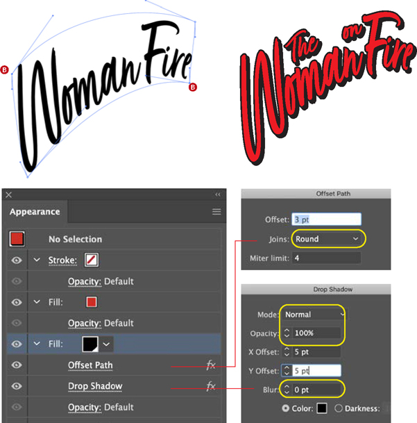
Increase the size of the initial caps and shift down (slightly) their baselines (A).
Choose Object > Envelope > Make with Warp, 1 row and 1 column. Using the Direct Selection tool on the Bézier control points, warp the type into shape (B).
Add in the prepositions. Using the Appearance panel, add two fills, red and black. Move the black fill beneath the red, offset the path (using a round join) (C), and add a hard drop shadow. Set the blending mode of the shadow to Normal, the opacity to 100%, and the blur to zero (D).

Color, contrast, and drama are heightened through the application of a Camera Raw filter (adding texture and clarity), a strong contrast curve, and an Oil Paint filter to give the figure a painted look.
Choose the type
We chose Fave, a hand-lettered script by Stephen Miggas of Aerotype. Because this is a script face and the letters need to connect, make sure you’re using Metrics, rather than Optical, kerning.
To amp up the drama, we decided to increase the size of the initial caps. Because we would need to experiment with the exact size, we made a character style and in the Advanced Character Formats set the Horizontal Scale and Vertical Scale to 120%, and applied this to the W and the F. That way, we could tweak the size by editing the character style definition. Because we didn’t yet know what absolute point size we needed, it made sense to do this as a relative amount. We also included a negative baseline shift in the character style.
To create the warp effect, make the text Woman Fire (omit the propositions for now) into a mesh (Cmd+Option+M/Ctrl+Alt+M). The more rows and columns you have in your mesh, the more flexibility, but also the more likelihood of creating ugly distortions. For that reason, we opted for just one row and one column. Now carefully adjust the Bézier control handles to warp the type into the shape you’re after. This is a fine line between creating a graceful shape that fills the space in an effective way and not distorting the type too much. If it all goes horribly wrong, which it may on your first few attempts, undo and start again, rather than try to rescue a bad shape with further distortion.
The offset shadow is achieved through the Appearance panel. First, offset the path as a Live Effect by choosing Path > Offset Path from the fx menu at the bottom of the panel. The amount of offset may vary from that shown in our example, but make sure you are using round joins; otherwise, some unpredictable path intersections may occur. Next, choose Stylize > Drop Shadow from the fx menu. Making the drop shadow the same color as the offset path will give the effect of an extruded shadow. Again, amounts may vary, but what you’ll need to make sure is that the blending mode is Normal and Blur is set to 0. The shadow should be hard rather than feathered.
The supporting text is set in Balboa Extra Condensed, with a modest amount of positive tracking. The author name is positioned at the eye level of the woman, and the very condensed nature of this typeface allows us to take up proportionally more vertical space with the author name. We also like its slightly vintage feel and the fact that, despite being so tall, the letters are also somewhat rounded, which complements the script we’ve used for the title. The corny tagline, She was too hot, is in Fave Condensed, a complementary font to the Fave Script. And if we’re getting granular, the three dots of the ellipsis are separated with thin spaces (available on the Type > Insert White Space Character menu), which are then tracked slightly tighter.
Prepare the figure
The model comes from Adobe Stock. In Photoshop, we threw several filters at her to amp up the drama. Let’s not let subtlety spoil our fun here.
It’s not every day one gets to use the Flame filter in Photoshop, an amazing algorithm for making fire. With the Pen tool draw some simple paths on the canvas; then apply the filter. Careful though, you may find yourself falling down the rabbit hole of experimenting with the myriad flame options. We saved the flames as a PSD file, placed the file in Illustrator, and applied the Multiply blending mode. Deciding that we needed more, we duplicated the layer and then adjusted the scaling and opacity of the copy.

How it all breaks down on the Layers panel
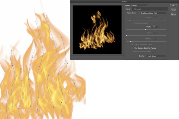
For the flames, in Photoshop create a canvas the same size as the book cover. With the Pen tool, draw several wavy paths. With the paths selected, choose Filter > Render > Flame.
Experiment with the different options, and when you have a result you like, save it as a Photoshop (PSD) file and place it in Illustrator.
Add the texture
To finish things up we added a layer of texture with warm hues at the top of the layer stack and set its blending mode to Multiply. As well as the texture we also liked the way the color interacted with the layers below.