Neighborhood Alphabet
We’re going on a type hunt!
The Brief
Create an alphabet of your neighborhood or favorite place
Trim Size
Tabloid/A3
Learning Points
Photographing type
Working with Photoshop masks
Designing with a layout grid
Tools
Lightroom, Photoshop, InDesign, Camera
Inspiration
Why point a camera at an iconic landmark? Do we really need another photo of the Golden Gate Bridge or the Eiffel Tower? If you really want to capture the essence of a place, its true idiosyncrasies, to represent it the way the locals experience it, you need to start with the typography.
The first photographic alphabet I (Nigel) created was a love letter to a place I was about to leave, San Francisco; the next was a love letter to the place where I arrived, Brighton. Walking each city day by day, I photographed every interesting piece of type I encountered, and stitched these photos together into alphabets. I found that they made excellent posters to commemorate the places the way I remember them. Both were bonding experiences that reaffirmed and established my connection to these places.
The rules of the game were simple: The letters had to be from independent stores, so no generic national or international chains. It had to be a place for which I had some affinity, or relationship with, even if, in some cases, that was fairly tenuous, and, of course, it had to be a good-looking letter. Also, where possible, I wanted to choose the initial letter of the establishment. Even in a city with an abundance of typographic treats, it can be challenging to acquire all the necessary letters. There will be duplicates of common letters, while X and J are in short supply.
These are, of course, just the rules I made up; feel free to adopt and adapt as necessary.
Photographing the letters
Photos of letters can be captured on an aimless meander or while you’re going about your daily business, but there will come a point when you’ll need to scout your targets. Because you will often be photographing letters from a distance, it helps to have a zoom lens. Don’t limit yourself to daytime shots; some letters will look better when illuminated at night, although this likely will involve putting your camera on a tripod.
Keep in mind that what you’re capturing is raw material, not a final composition. Frame the images loosely so that you have wiggle room for cropping and for fixing perspective distortion.
Tilting the lens at an angle will cause perspective distortion. You can embrace this, but if you want to fix it, the Upright corrections in Lightroom Classic or the equivalent Transform in Adobe Camera Raw can do a near-miraculous job of straightening out the horizontal and vertical planes of your images.
For some letters it was necessary to clone out adjacent letters in Photoshop. Set the Clone Stamp tool to sample Current & Below, and add the cloning non-destructively to a layer above the image layer. While you’re at it, you can also clone out any dirt or blemishes that are distracting.

Fixing perspective distortion in Lightroom Classic: Start by trying the Auto Upright correction. If that doesn’t work, use a Guided correction.

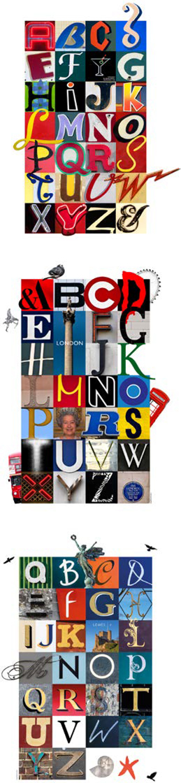
Other alphabets from the series. From top: San Francisco Mission District, London, Lewes.
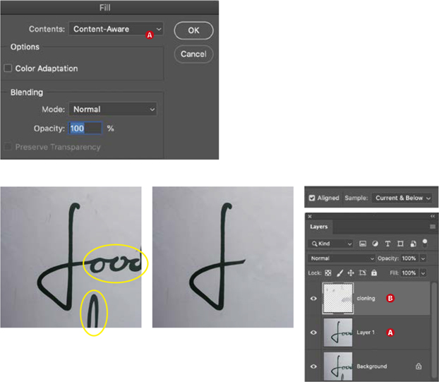
To remove unwanted letters, use both Content-Aware Fill and cloning.
On a duplicate layer, make a rough selection around the area you want to replace, and choose Edit > Fill (Shift+Delete) and, for Contents, choose Content-Aware (A).
To remove the adjacent letters, especially when they are touching, switch to the Clone tool, and apply the cloning to a separate layer above the image layer (B).
I soon found that the layout was more playful, and less static, if some of the letters broke out of their grid squares and interacted with their neighbors. This involved some further prep in Photoshop: Mask the letter shapes, and copy them to a new layer. Hide the visibility of the top layer, and save the file in Photoshop (PSD) format.
In InDesign, I placed the image and then copied it and pasted it in place, giving me two copies, one exactly above the other. With the top copy selected, I chose Object > Object Layer Options, turned on the visibility of the top layer, and turned off the Background layer. Back in the layout, I adjusted the size of the picture frame to reveal the masked portion of the letter.

Isolate the letter shape with a pen path and convert this to a vector mask (A).
Clone out any adjacent letters, and if necessary, extend non-busy parts of the background to remove distractions (B).
Improve contrast and saturation with adjustment layers that are clipped to the cut-out layer (C).
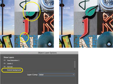
Having prepared the image in Photoshop, in InDesign, copy the image (in this case the J) and paste in place. Move this copy above its neighbors in the stacking order.
In Object Layer Options, make sure only the cut-out layer is visible. Increase the size of the picture frame as necessary to reveal the whole letter.
By adjusting the stacking order and adjusting the size of the picture frame, I could make the cut-out portions of the letter overlap their adjacent letters.
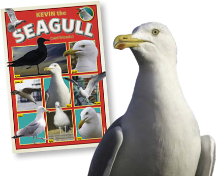
Don’t forget that not everyone is obsessed with type — sad but true! To give your poster that something extra, you’ll need some non-typographical embellishments, to keep the civilians from losing interest. For Brighton, I added a seagull; these clever and ubiquitous birds, from which the football team have taken their nickname, are an icon of the city.
Back and forth
Working out how the letters fit with their neighbors is a process of trial and error. It helps to create additional layers for alternate versions of those letters for which you have duplicates.
My 4 × 7 grid (see the project “Create an Environmental Alphabet: Find letters in everything”) gives me two extra slots, which I can use for punctuation or logograms like the ampersand and for doubling the size of the “title” letter, in this case the I for the i360 observation tower.
For those with no connection to the place that your neighborhood type poster represents, your alphabet will be a collection of interesting letters, but for those who know the place, it will also be a brainteaser. They will puzzle over each letter; some will be obvious, some strangely familiar, others will perplex them. Be sure to include a key at a barely readable size (I used Myriad Pro 10 pt), so that they can either confirm their answers — or put an end to their frustration.
One thing I didn’t consider when I first made this poster and others like it was how much they are a snapshot in time. Businesses come and go, and it’s a reflection of the economic uncertainty of our times and the difficulty of sustaining independent high street businesses that several of the stores represented are no longer with us.

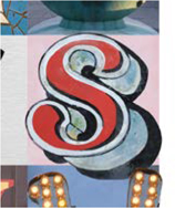
The letter in context with its surrounding letters
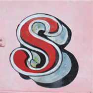
The surrounding letters cloned out and the extruded shadows “rebuilt”

An isolated version of the letter is a copied to a separate layer
Use Object Layer Options in InDesign to allow the letter to interact with others. Move a copy of the image with just the isolated layer visible to a layer above.