
Theater Poster
Working with diagonals
The Brief
Create a National Theatre–style poster using predominantly type
Trim Size
Tabloid/A3
Learning Points
Working on a diagonal grid
Employing hierarchy through Based On paragraph styles
Using object styles
Tools
InDesign
Fonts Used
Helvetica Neue Bold
Inspiration
Gary Hustwit’s 2007 documentary Helvetica
London’s National Theatre has a rich design heritage. Since the early 1960s its in-house designers have produced hundreds of posters to promote its many productions. Setting the bar high was the theatre’s first graphic designer, Ken Briggs, whose work between 1963–1974 has had a huge influence on the theatre’s design aesthetic to this day. His posters featured bold Helvetica (not least because Letraset offered it in a range of sizes), which was often rotated. We thought it would be fun to create an homage to this look, using 45° diagonals and a simple, but striking, color palette of red, black, white, and gray.
Create the diagonal grid
To get us started we needed a grid — a framework on which to hang our blocks of text and a way to keep the spacing between those blocks of text consistent. While InDesign has many grid-friendly tools, it doesn’t have a diagonal grid as such. But that doesn’t mean that you can’t create your own. InDesign’s document baseline grid — the one that you set up in Grids Preferences — cannot be rotated, but a custom baseline grid, applied on a frame-by-frame basis, can be rotated.
We overlapped two rectangles, one rotated at 45° and the other at −45°, and made them large enough to bleed off all four edges of the page. In Text Frame Options (Cmd/Ctrl+B) we turned on the custom baseline grid and set its increment at 20 points. The frontmost rectangle should have no fill, allowing the gridlines of the rectangle beneath, which is filled with black, to show through. So that we didn’t disturb our overlapping grid rectangles, we moved them to their own (locked) layer.

Posters designed by Ken Briggs for London’s National Theatre


The diagonal grid is made of two overlapping text frames, at 45° and −45°(A), which cover the page and spill over onto the pasteboard. Both frames have a custom baseline grid (B). The frames are on a locked layer (C).
Note that the background color is a four-color black (C50 M50 Y50 K100) so that it appears solid, rather than as a dark gray.
Add the text
We typed the text and created three sizes of type as hierarchical paragraph styles, using the Based On property. Big is the parent, Medium is based on Big, and Small is based on Medium. If you create your styles this way, when you change the parent style, the offspring also change. This makes for efficient global editing — something that’s always beneficial, but especially so here because it saves you getting a crook in your neck from directly editing rotated text.
To rotate the text frames at 45° increments, hold the Shift key while using the Selection tool. Move to the corner of the selected frame so that the rotate handles appear.

Working with short bursts of type can be challenging when you’re still figuring out what size you want the type to be. You make the type bigger, and it falls out of the frame; you have to break your flow to resize the frame. It’s a lot of wasted energy. To avoid this, we put each chunk of type in its own text frame and set the text frames to Auto-Size. For the Auto-Sizing option we chose Height and Width, with the sizing taking place from the top-left corner. This ensured that as we experimented with the type size, the frame grew or shrank, and all the while it fit snugly around the type. To put it another way, these settings made the type behave like Point Type in Illustrator. We selected the No Line Breaks box to avoid the text frame becoming too narrow.
We also turned on the custom baseline grid for each of the text frames — but you can also leave it turned off if your prefer and just move the frames into place, guided by the visual guides on the grid layer.
So that we could work as efficiently as possible we captured these last two formats — the auto-sizing and the custom baseline grid — as an object style and applied it to all of the text frames. Unfortunately, what we couldn’t do was incorporate the angle of rotation into the object style definition. While the size and position of text frames can be included in object styles, the angle of rotation cannot, at least at the time of writing, and has to be done on a frame-by-frame basis.


For short bursts of unthreaded text (i.e., where one frame is not linked to another as part of a longer story) Auto-Size text frames can save you from having to repeatedly resize the frame to fix overset text.
The different frames of type should “snap” into place like pieces of a jigsaw. We know that’s a lot of grid lines to look at, but keep in mind that you can always press W to toggle to Preview screen mode if you tire of seeing them (note that if you’re using the Type tool, first press the Escape key, then W).
In keeping with this style, we applied tight letter spacing to the type. While this could be achieved by applying negative tracking, we prefer to do it through the Letter Spacing options in the Justification dialog. That way we can, if necessary, use tracking to make more localized letter spacing adjustments.
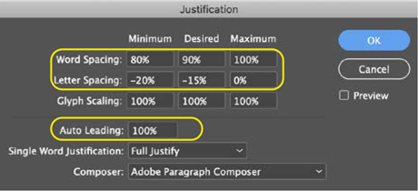
Incorporate the tight letter spacing and leading as part of the paragraph style definitions.
If you’re a fan of Helvetica (we are, but it is has its detractors), you’ll find that when tightly letter spaced and tightly leaded, as here, the letters fit together in a way that feels like it was meant to be. To position the type composition, group the text frames and use the Align panel to center the group horizontally and vertical on the page, adjusting where necessary for optical alignment.

Helvetica looks great with tight letter spacing and tight leading. Somehow the letters fit together like pieces of a puzzle.