
Typeface Design
A chat with the creator of Barlow
The Brief
Create a type specimen page for a favorite typeface
Trim Size
US Letter/A4
Learning Points
Considering letter forms
Combining weight, width, and scale
Tools
Illustrator
Fonts Used
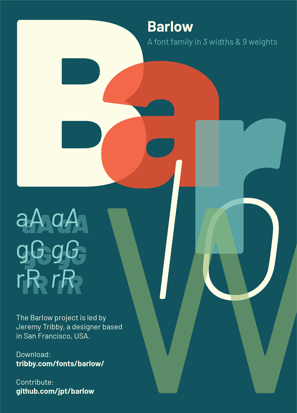
Barlow
Inspiration
behance.net/gallery/80918269/United-States-Postal-Inspection-Service
nan.xyz
Jeremy Tribby is a type designer and the creator of Barlow, a popular open source font. Barlow is inspired by the DIN (Deutsches Institut für Normung) style fonts originally used for road signage in Germany. It has three widths, nine weights, and a full italic and glyph set. It’s an incredibly versatile, clean, and easy-to-use font that works great in many different contexts. Hugh sat down for a chat with Jeremy and revisited the project.
Hugh: Let’s start with your choice to go open source on this project. Can you talk about that?
Jeremy: Open source software is part of a public commons. When I think about highway signs and the kinds of designs that inspired Barlow, it’s all civic work; it comes from the public. So it made sense for Barlow to be, in a way, a font that I could contribute to that commons, because all the DIN families I knew of at the time were proprietary. Barlow is a community project. It’s free to download, and if you want to help expand the family, you can contribute on GitHub. You can even modify it and make your own font family. The OFL (Open Font License) is pretty permissive.
H: Did you go to school to study typography?
J: I dropped out of UC Berkeley — I was an art student! But I think that is something kind of important that does inform my design practice, which is that I’m trained as an artist.
I think working on Barlow was probably the first time I undertook a massive digital project. So there was a lot of learning around how vector art works, how to use the software, how to use those curves on the screen. I had made fonts before, but I’m definitely self-taught as both a designer and programmer.
H: What was it about DIN fonts that you liked?
J: I started thinking about DIN fonts while doing some brand work for a startup. We must have looked at a dozen variations of DIN and other condensed, titling Gothics. I wasn’t really thinking of designing one myself, but so much of my design practice is research; I started looking into the origins of DIN fonts out of curiosity. I figured I might find an open source family to examine, but there weren’t any good options at the time. I got in touch with a Portuguese designer named Paulo Silva, who provided me with a photo of the original DIN grid. He had worked on a project called OpenDinSchriftenEngshrift — a faithful digital reproduction of a single, bold, condensed DIN style originally used by Prussian Railways.
I also came across the work done by Don Meeker and James Montalbano on Clearview, which was designed to replace Highway Gothic for road signage in the US. They worked on Clearview with the help of researchers at Penn State. On a highway you have to account for things like distance and reflection and overglow [haloing] — it’s not optimized for screens, more for a consistent 3:2 ratio, vertically, of black to white. That’s what you see in the original DIN grid too.

The modern DINs — whether they are revivals like FF DIN or more inventive like DIN Next — use the same grid, but stylistically they’re less brutal than DIN itself. I appreciate the design challenge of bringing a point of view to a rigid grid like DIN. At some point the scale just tipped from research project into design project.
H: How did you get started? What tools did you use?
J: I started with a FontForge project, OpenDinSchriftenEngshrift, just looking at the font on the grid: those 3 × 7 building blocks that make up the condensed family. It’s a lot like a pixel font in that way. Barlow started with a sketching on paper before moving to Glyphs for Mac. When working with fonts in the UFO (Unified Font Object) format, I tend to hop around between Glyphs and RoboFont a bit because there are so many great plugins and extensions for each app. The UFO spec wouldn’t be around without Just Van Rossum, a type designer whose brother invented Python [a coding language that helps you automate tasks], so there’s a lot of potential for scripting away some aspects of the production work, and even enhancing the creative work. I wrote a number of tools in Python during the project that I keep along with the Barlow source files on GitHub.
H: What letters did you start with?
J: Lowercase a and s were the first letters. I think the first letters that you typically start with in a font are the uppercase O and H and the lowercase n and o, because you can infer a lot about the rest of the font from those characters. There are exceptions, but just for the stem width and figuring out how the white space relates to everything, you do those first. But with the a and the s, those letters are kind of related in a lot of geometric fonts. Like if you flip the a over, usually that little curve at the top relates to the curve of the s.
What is a DIN font?
DIN stands for “Deutsches Institut für Normung” (German Institute for Standardization), a standards body that in the 1920s and ’30s issued a series of typefaces for use on public signage and railroads. (They are sometimes called “Autobahn” typefaces, since you see them on the German expressways.) They are beloved by many type designers for their grid-based regularity and rationality — the simplicity and lack of adornment or flourishes makes them wonderful for design projects that require clarity and directness.
The most popular of these DIN faces, which you are still likely to encounter today, is DIN 1451. There is a medium (Mittelschrift), a condensed (Engschrift), and an extended version (Breitschrift) that is less common.
In addition to Barlow, there are number of revivals of DIN fonts issued by digital type foundries over the years. FF DIN, created in the 1990s by German designer Erik Spiekermann, is very popular, but we also recommend DIN Next.
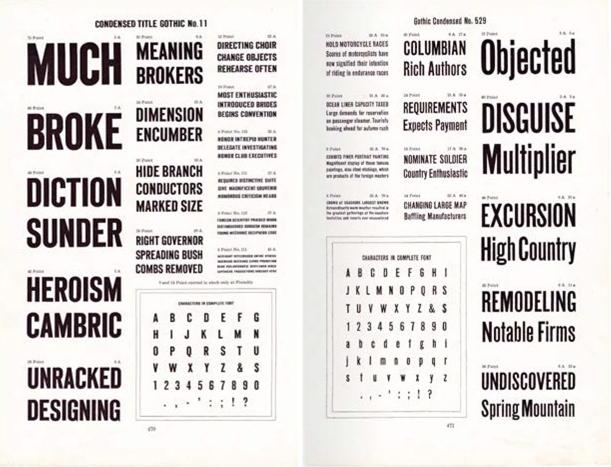
Jeremy is influenced by the fonts collected in the Specimen Book and Catalogue from the American Type Founders Company. You can view and download pages from Internet Archive: archive.org/details/1923AmericanTypeFoundersSpecimenBookCatalogue/mode/2up
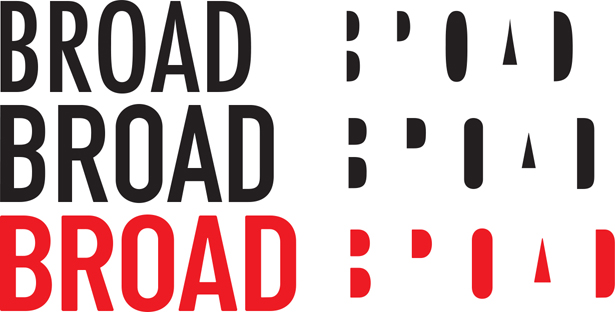
Comparing Futura Bold Condensed (top) with DIN 1451 (center) and Barlow Condensed Semibold. All at 65 pt.
H: What elements are unique to your font?
J: After so much time has passed, “what’s unique” often feels more like “what’s wrong.” I have a fondness for the interior rounding, though, which you only see at huge sizes. That was an element inspired by Ultramagnetic, which is a much more rounded DIN variant from You Work For Them.
I’m sure some people hate the g in Barlow, because it’s unique, and when there’s one letter that’s unique in a typeface, some people like it for that reason, but I think more often people don’t like it.

Jeremy Tribby
H: How long did it take you?
J: It depends on when I started, exactly! I think it was two years on and off of production work.
H: What are some of your influences?
J: I love the typefaces in the 1923 American Type Founders specimen book — in part, because when you’re a student, that’s one you can afford. So I’ve been looking at those for a long time now. Alternate Gothic in particular sort of feels like DIN if it were designed for headlines in American newspapers.
H: Where have you seen it used “in the wild?”
J: When I noticed that my therapist uses it on his website, I seriously considered not mentioning it to him because he might have thought I was delusional.
I’ve seen a lot of editorial use by outlets like CNN, and Sky News. It was cool to see the morning weather report’s graphics use some numbers I drew.
NaN is an experimental type foundry run by Luke Prowse in Berlin, and he does some wild stuff like feed fonts to neural networks and see what comes out. I loved that Barlow was part of the training data for that project.
When I saw Barlow being used by the US Postal Inspector, I had mixed feelings, because I’m not big on police or surveillance. But I have to hand it to them — Barlow Semi Condensed in all caps was, at least at the start, the primary use case I had in mind for the whole type family. The mail cops really nailed it.

Left to right: Alternate Gothic No2, DIN1451, Barlow Condensed Semibold