
Beside the Sea
Evoke a place or genre with type
The Brief
Create a fun, type-inspired composition on a theme of your choosing
Trim Size
Tabloid/A3
Learning Points
Photographing type
Designing with a layout grid
Working with compound paths
Tools
Lightroom Classic, Photoshop, InDesign, Camera
Inspiration
I (Nigel) have always had a fascination with the seaside, especially the faded seaside towns of Britain, which have a melancholic romance about them. The typography of the seaside enthralls with its combination of kitsch, nostalgia, and goofiness. Signs that cheerfully announce Donuts, Ice Cream, and Toffee Apples are compelling to a child; when that child grows up to be a graphic designer, those signs are just as compelling, though more so for the colors and typographic styles than for the sugar rush.
Photographing the type
With a composition such as Beside the Sea, the result is more than the sum of its parts. Pictures of lettering, which by themselves might not be particularly engaging, become interesting when used in combination with other images. This project is more freeform than the previous project. There are no specific slots to fill; it’s just a matter of finding a variety of related images that work well in combination.
Always be on the lookout for interesting type, because a project like this will take a while to complete. This poster took several visits to different locations (and rarely were photographs the main reason of the visit). Create an ongoing Lightroom Classic or Bridge collection, and add to it whenever you collect images. If you make this a Smart Collection, all images that meet the criteria you define for membership automatically become a part of the collection.
You’ll need a good number of images to choose from, because you’ll inevitably find that some don’t work as well in combination as you might have hoped. As you grow your collection, make sure to capture close-in details as well as wide shots.
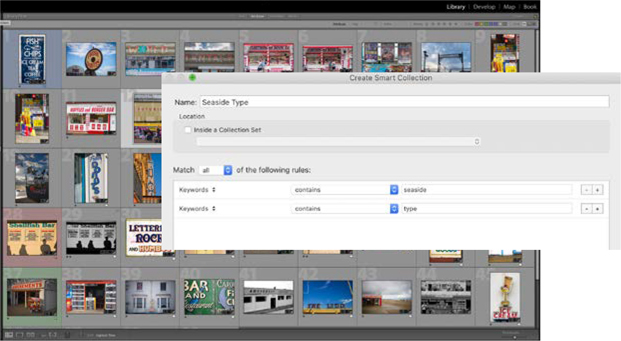
Make a Smart Collection in Lightroom Classic (or Bridge). In this case all images that are tagged with the seaside or type keyword automatically become part of the collection. Once established, Smart Collections make associations of images while you concentrate on other things. They are useful for revealing (sometimes unconscious) themes in your photographs.
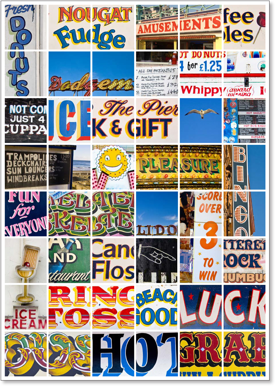
Anchor the corners of the composition with images that feel solid. This will establish a clear visual boundary within which to arrange the other images. I chose to crop in tight around many of the images, suggesting enough of the wording for the viewer to fill in the rest. For a visual breather in what might otherwise become a cluttered piece, I included images with white space — in this case the “blue” space of the sky that is prominent in some of the frames. Adjust the cropping of images as necessary and balance the composition by having the images lean in towards the center of the page. For example, if the image contains a large amount of sky or negative space, position it towards the edge of the composition, so that white space does not become trapped, but rather flows to the edge of the page.
Creating a grid
I started with a grid and filled it with empty frames. The quickest way to do this is to use InDesign’s Gridify feature: Draw a frame across your live area and, while still holding the drag, tap the Right Arrow to add columns and the Up Arrow to add rows. (If you go too far, the Left Arrow and Down Arrow will remove columns and rows, respectively.) My grid is eight columns and six rows. Set the fitting options to Fill Frame Proportionately and check the Auto-Fit option. This will allow the image to re-fit according to the new dimensions of the frame, if you resize the frame.

While there are no definitive rules to follow and a lot of trial and error is necessary, I found it helpful to include some “visual pauses” in the form of images that contain large areas of sky. The seagull is positioned top right — where the eye is most likely to fall on the poster (A). The Bingo image is positioned on the right edge, allowing the white space to flow off the edge of the page rather than become trapped (B).
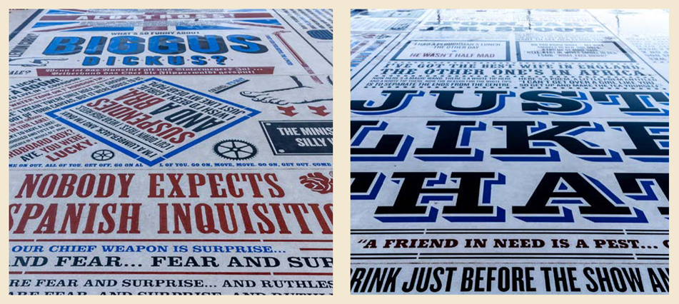
Blackpool’s Comedy Carpet is an inspirational work, for its interplay of typefaces, evocation of a genre, and sheer scale. Created by artist Gordon Young and designed in collaboration with Why Not Associates, the Comedy Carpet is a celebration of the work of more than 1,000 comedians and comedy writers. The Carpet gives typographic form to jokes, songs, and catchphrases dating from the early days of variety to the present. Sited in front of Blackpool Tower, the 2,200m2 work of art contains over 160,000 granite letters embedded into concrete. http://whynotassociates.com/environmental/the-comedy-carpet
Through a process of trial and error, delete certain frames and double the height or width of others until you have a pleasing composition. It’s like a jigsaw puzzle, except there are multiple solutions.
Working with compound paths
Where an image ranges across two grid fields, I chose to put the image into both frames. Because it is an immutable law of InDesign that you can have only one image per frame, you first need to combine multiple frames into a single frame by converting them into a compound path. To do this, select multiple frames and choose Object > Paths > Make Compound Path, or press Cmd/Ctrl+8.

Less is more, except when it’s not. Sometimes clutter might be what you’re after and visual chaos may better represent your subject.
Unlike Beside the Sea, the images for this composition, A Walk Down Mission, were all captured in about an hour. San Francisco’s Mission Street, between 16th and 24th Streets, is a vibrant cacophony of vernacular signage. Nigel walked up one side of the street and then back down the other. The result is intentionally dizzying, reflecting the overstimulation of the place itself.

Using Gridify, draw a frame and divide it into a grid. Set the frame fitting options to fill the frame proportionately. Selecting Auto-Fit will allow easier experimentation with scaling the images, although if you want to recrop the image within the frame, you’ll need to turn off Auto-Fit.

Making two (or more) frames into a compound path allows you to fill multiple frames with a single image, for a window-pane effect.