
Shaped Text
Give visual form to the words
The Brief
Experiment with different treatments for shaped text
Learning Points
Scaling and fitting type
Applying custom text wraps
Using type on a path
Tools
InDesign, Illustrator
Fonts Used
Adobe Caslon Pro
Inspiration & Resources
For more on Guillaume Apollinaire: en.wikipedia.org/wiki/Guillaume_Apollinaire
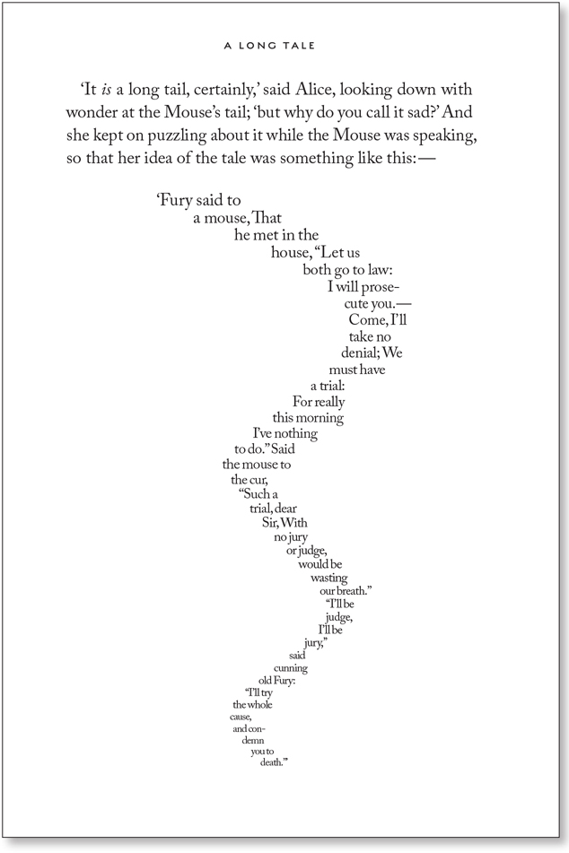
Broadly speaking, text that is arranged in such a way that it forms a thematically related image is referred to as concrete poetry. One of the most well-known examples is the “Mouse’s Tail” from the Lewis Carroll’s Alice in Wonderland. It’s part of the chapter “A Long Tale,” which is introduced by the Mouse saying, “Mine is a long and sad tale!” The text is shaped into a mouse’s tail; in some editions it is handwritten, while in others it is typeset, representing a major challenge for pre-digital typographers.
Today, thanks to InDesign you can create shaped text without breaking too much of a sweat. As a cautionary note, we’d like to point out that these techniques are very easy to do badly; they’re not difficult to do well, but just require a few extra steps.
Working with an invisible text wrap
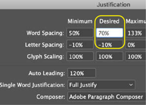
The text is in Carol Twombly’s Adobe Caslon, a revival based on William Caslon’s specimen pages between 1734 and 1770. It’s not a perfect match for the type used in the book’s first edition in 1865, but of the fonts we had available it felt like the most authentic. While keeping the text as readable as possible, the type is in the service of the pictogram and readability takes a back seat to shape. For the type to be malleable to our needs, we first adjusted the Word Spacing and Letter Spacing values. A regular word space looks disproportionately large when there are only a few words per line and makes holes in the resulting shape, so needs to be reduced. Similarly the letter spacing needs tightening up. Because the text is left aligned, i.e., not justified, only the values in the Desired column of the Justification dialog box are relevant. We’re also using Auto Leading, that default feature that pros never use. Except when they do. Because the type size diminishes as we get closer to the end of the tail, it would be a pain to have to constantly reduce the leading value on a line-by-line basis. Auto Leading ensures that the interline spacing is relative to the type size; the problem is that the default value of Auto Leading (120%) is too large, so we reduced this to 100%. Now, with less room for space, there’s more room for the letters themselves to describe the shape of the tale.
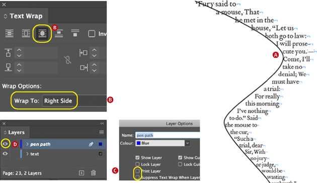
Draw a stroked pen path for the mouse’s tale (A). Apply a text wrap to the object, with the Wrap To options set to Right Side (B). Move the line to its own (hidden) layer, and set the layer options to not print and not to suppress the text wrap when the layer is hidden (C). Optionally, the layer visibility can be left on so that the pen path is visible in Normal view mode or hidden. The wrap on the right side of the text is controlled with forced line breaks.

A text wrap shapes the text. What’s unusual is that you do not apply the text wrap to the text frame, but rather to a curved pen path. Move the pen path to its own layer, and set that layer to not print. Even though the contents of the layer are non-printing and invisible in Preview View mode, InDesign honors the text wrap. Shape the right side of the text by good old-fashioned forced line breaks (Shift+Return/Enter).

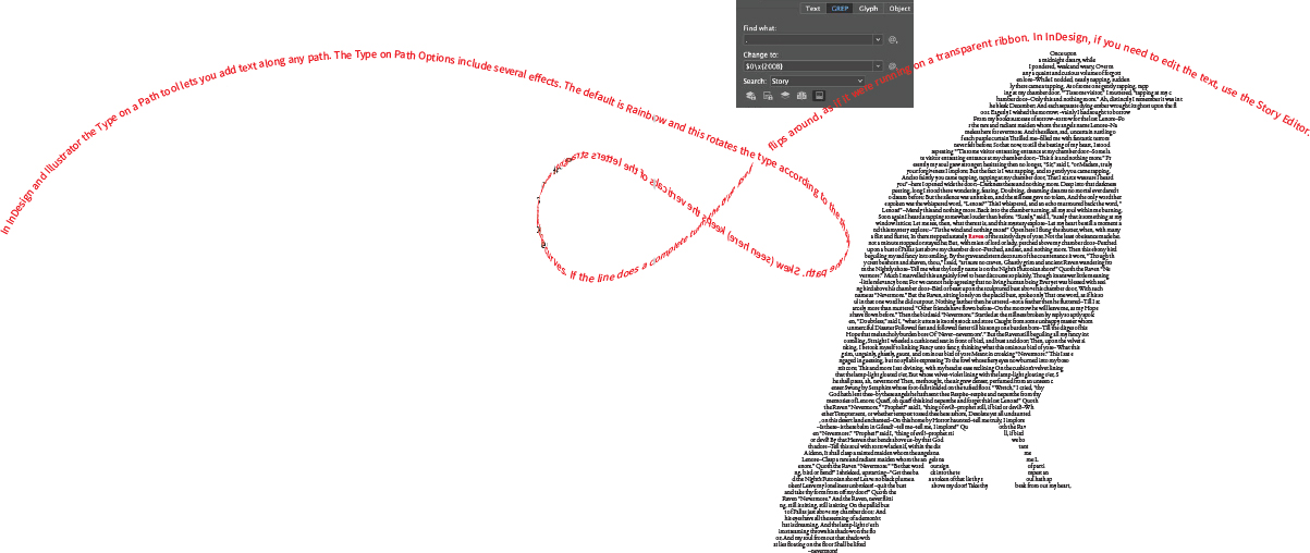
Using Type on a Path in InDesign (or Illustrator). In this example, the text runs along the path of a vector shape. The word spacing and letter spacing is reduced; any punctuation, such as commas and periods, are removed; and pauses are inserted (to avoid unsightly overlaps) with em spaces, en spaces, and thin spaces from the Type > Insert White Space menu.
Text on a path
If visual poet Guillaume Apollinaire (1880–1918) were alive today and creating his calligrammes, he’d be using the Type on Path tool in InDesign. Or perhaps he’d prefer Illustrator. He could, in a pinch, also use Photoshop, but we’d strongly recommend he keep Photoshop for his image editing and use InDesign or Illustrator instead for their superior type controls. Here are some pointers we would give him: You can chase the type along the path, by dragging the In Port marker, and you can flip the text by dragging it across the path. You can even thread the text from one path to another. It’s also worth taking a few moments to explore the Type on a Path options (double-click the Type on a Path tool), which among other things let you determine the height of the text relative to the path.
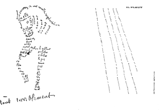
This pictogram, or concrete poetry approach, w as taken up at the start of the 20th century by Guillaume Apollinaire in his Calligrammes: Poems of Peace and War 1913–1916. “Cheval” and “Il Pleut” show how the spatial arrangement of the words plays as much of a role in the meaning of each poem as the words themselves.
Text inside a shape
Another way to shape text is to put it into a non-rectangular text frame. In a world where our tools are based on geometric shapes, it’s an occupational hazard that our layouts can sometimes look boxy. It doesn’t have to be this way. Text can go inside any vector shape. Or to put it another way, any vector shape is a potential text frame. The most common problem one encounters when creating layouts like this is bad word spacing, and if you’re working with InDesign’s defaults it won’t just be bad, it’ll be really bad! Also fighting against you is your normally well-intentioned ally, hyphenation. These are features that are in the service of traditional readability. But readability is not the primary concern here; we want readable shapes first and foremost. For this reason, use the zero-width space trick that you first encountered in the “Classic Fiction: Type that’s in your face” project. For the text that makes up the “picture” use Find/Change to add a zero-width space between every character. This will prevent lines from breaking and allow you to turn hyphenation off without the text becoming overset.

It’s not often you’ll need to put vertical text on a path, but when you do, Illustrator is your tool. This example shows vertical text on a spiral. We also modified the first few letters with the Touch Type tool to change their angle of rotation.
A Photoshop custom shape is copied and pasted into Illustrator as a compound shape and then copied and pasted into InDesign — it’s not possible to copy a vector shape directly from Photoshop to InDesign.
The text, The Raven by Edgar Allan Poe, is used to define the shape. Even though the text is virtually unreadable, using real text rather than lorem ipsum adds credibility. When creating an effect like this, white space is the enemy. For this reason, remove all indents and paragraph spacing; reduce the size of the word spacing, letter spacing, and leading, and replace em dashes with en dashes. Use Find/Change to insert a zero- width space between every character to allow the words to break freely without hyphenation.