
Interpret a List or Series
Rain later. Good.
The Brief
Create a typographic treatment for a list of items
Trim Size
Tabloid/A3
Learning Points
Using nested styles in InDesign
Choosing type
Combining type and color
Tools
InDesign
Fonts Used
Filson
Inspiration & Resources
www.bbc.co.uk/programmes/b006qfvv
Humans in general and designers in particular love to organize things into lists. In this project, we’ll take something that’s always been there, something that you may have taken for granted and interpret it as a list.
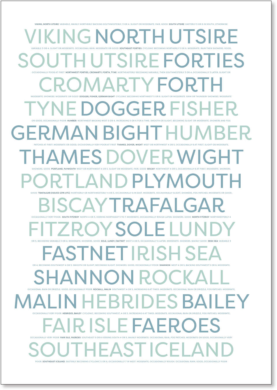
If you’re British, The Shipping Forecast needs no introduction. For those of you who aren’t, it’s a radio broadcast of weather reports for the seas around the British Isles. It started in 1867 and moved from the telegraph to the BBC in 1924. Its distinctive presentation style attracts a much wider audience than just salty maritime types, enthralling urban-dwelling land lubbers like your authors as well. Sounding like a lullaby, The Shipping Forecast carries you off to mysterious and evocatively named places. Its appeal cuts across generations, and it has been namechecked in numerous songs, movies, and books, and of course, it has inspired many a poster.
Choose the type
Like The Shipping Forecast itself, we wanted the poster to be calming, for the viewer to hear the forecast in their head when they look at the poster. We ran the names of the shipping regions together as one paragraph. The Word Spacing setting was reduced to 60%. Together with the alternating shades, this provides just enough, but not too much, distinction between the words.
The color palette is subdued. We wanted the color of the sea — not the bright turquoise of the Caribbean, but more of a monochromatic palette of desaturated blue-greens like the often misty waters that surround the British Isles. As we typically do, we opened the Color Themes panel, clicked Explore to find a theme we liked as a starting point, and tweaked it.

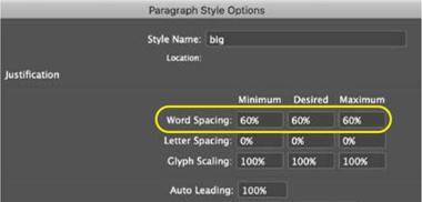
The Word Spacing is reduced (only the Desired column is relevant, but the Minimum can’t be more, and the Maximum can’t be less than this). A 100% word space would look disproportionately large at such a large type size and break the flow of the text.
There is intentionally little in the way of hierarchy; the order reflects the order in which the regions are read. The whole thing should just wash over you. There are no points to be made, no calls to action. The text is centered horizontally and vertically, framed by generous margins. The lines modulate gently, while avoiding breaking any of the regions across a line — be sure Hyphenation is turned off. Interwoven between the shipping regions is the forecast of a specific day. This is small enough that only the motivated reader will be able to read it. The leading value is calculated so that it fits exactly into the space between the regions.
The slightly eccentric typeface, Filson, is friendly enough that even when set in all caps it does not feel shouty. Being a sans serif, it is simple, but at the same time rounded and with a distinct personality. Having everything in all caps means consistency in the height, word shape, and density of the type.
Format the text
Despite the apparent simplicity of the layout, there is some complicated formatting involved. Yes, it would be possible to “wing it,” but it’s more satisfying — and we believe the result is better — if we do it right.
The first challenge is how to alternate between the two colors. This is achieved with a nested style, which applies the alternate color to every other shipping region. This would be easy if all regions were a single word, but some are two. So between each region, we inserted an End Nested Style Here character. The nested style applies no color change up to the first instance of this character and then switches to the alternate character style. Then, the nested styles are set to repeat in a loop. To speed things up, we also added a keyboard shortcut to the menu command for adding an End Nested Style Here character. It takes only a minute to do this, and it’s something you’ll be able to use in numerous other scenarios.

Two layers, two paragraph styles, and two character styles. It’s all about the distinction between big and small.
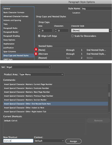
Adding the nested style: InDesign applies no formatting change through the first End Nested Style Here character (A). It applies the second color through the next End Nested Style Here character (B). Repeat these two styles to the end of the story.
Note, it’s nearly always a good idea to work with hidden characters shown (Cmd+Option+I/Ctrl+Alt+I). An End Nested Style Here character is depicted as a backslash.
The End Nested Style Here character is buried within the menus (Type > Insert Special Character > Other > End Nested Style Here). Do yourself a favor and assign it a keyboard shortcut (Edit > Keyboard Shortcuts).
The second challenge is that the large text and the small text are separate, overlapping stories. We set them up to use the same leading value and made sure that the smaller lines are perfectly centered, vertically, between the lines of the large text. This sounds simple enough, but it’s tricky without some forethought. As is often the case when calculating leading values, what can be confusing is the difference between the stated point size of the type and the actual measured height of the letterforms.
The best way to remove unpredictability, is — you guessed it — to use a grid. We used a 6 pt grid, which sounds small when you consider that the large type is 86 pt, with a leading value of 102 pt. The key is that 102 is a multiple of 6.

With our chosen font, after some experimentation, we determined that the height of the 86 pt type, measured from baseline to cap height, was 60 pt, or 10 lines. The size of the small type is 8.5 pt, but its optical height from baseline to cap height is 6 pt, one-tenth the size of the larger type.
It’s important to keep in mind that leading values are measured from baseline to baseline. With the large type aligned to the baseline grid, there is 42 points of space between the lines. That’s the leading value of 102 minus the type height of 60 pt. This meant that we had seven grid rulings between each line and that if we positioned the small type — also on a leading value of 102 and aligned to the baseline grid — on the fourth of those, there would be exactly 18 points of space above and below each of the small lines of type. It’s worth mentioning that the distance is visually consistent because the type is in all caps and so makes a block shape; there are no ascenders and no descenders to create word shapes that occupy more or less vertical space.
The first line of the small text is above the larger text, so as long as we made sure the first line was positioned on a baseline three grid rulings above the start of the large text, every subsequent line would fall into place. Because the first line of type in a text frame is offset from the top of the text frame, we also needed to change the baseline options to Cap Height, reducing the size of the gap at the top of the text frame.
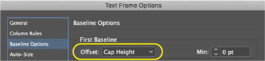
In the Baseline Options of the frame containing the small text, set Offset to Cap Height to bring the top of caps flush with the top of the frame.

It is this level of detail that separates the people who love working and playing with type from the tourists (aka normal humans). If all this makes your head hurt, you can instead opt for an up-a-bit, down-a-bit approach. You will eventually get there, but after spending what will seem like way too long to get maddeningly close but not quite there, you might wish you’d done it with a grid.