
Large Letter Postcard
Bold letters worthy of a great city
The Brief
Design a vintage travel postcard with 3D text
Trim Size
6 × 4 inches (152 × 102 mm)
Learning Points
Really cool gradients
Working with 3D options in Illustrator
Using letter forms as a clipping mask
Tools
Illustrator
Fonts Used
Jaksel, MascotMVP
Inspiration
Whenever we travel, we like to pick up postcards from the places we’ve been. We don’t actually mail them to anyone. We keep them as keepsakes and glue them into memory books. The best travel postcards are the ones you find in old thrift shops — cheerful, optimistic, absolutely convinced that their corner of the Earth is the very best corner of the Earth. Which, of course, it is.
We thought it would be fun to make our own, for the great city of Oakland, which is close to San Francisco, only more exciting. The official slogan of Oakland is “Live Life,” which we found unworthy of such a great city, so we made up our own: “Literally, not figuratively, the greatest city in the world.”
These postcards often feature three-dimensional type, tilted at a crazy angle, where the face of the type is a photo, or series of photos, of the place. This seemed like a great way to practice some warping and 3D effects in Illustrator, while brushing up on our gradients and clipping masks.
The first thing we did was draw a postcard-shaped rectangle and apply a vertical gradient. Somehow it seemed more interesting to blend three colors, so we made a three-point gradient, blending from bright orange to a green gold to a bright turquoise. (Everyone loves turquoise.)
Next we made some rays to mix up the gradient a bit. We drew a large triangle on its own layer and made copies. We gave these a medium-bright green color, and set the blending mode to Screen. Then, we made a copy of the background rectangle, placed it over top of our sun rays, and chose Object > Clipping Mask > Make. Looks good already!

Add additional color stops to the gradient (A).
Draw a large triangle and make copies (B). Fill with a bright green, set the blending mode to Screen, and adjust opacity (C).

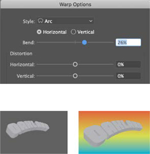
The is what the type looks like after it’s been warped. You can still edit it by selecting the effect in the Appearance panel and double-clicking.
Good working habits mean keeping a copy of the original 3D item, before the Expand Appearance command has rendered it uneditable. Drop it on the pasteboard where you’ll forget about it.
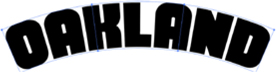
Next, we set the name of our favorite town in a big, bold, classic sans serif. We used a cool, vintage-looking font called Jaksel, as big as would fit on our postcard. We wanted our type arched, so with Object > Envelope > Make With Warp, we chose to make our type arched, using some basic settings.
We outlined that text, for ease of use going forward. Now for the fun part. The 3D options Illustrator offers are not quite as advanced as those of some of the other 3D rendering programs out there, but how many options do you really want? After you start clicking around inside the 3D options, you might find you want fewer, rather than more, options.
Neither of us is a math genius, so rather than using those numerical options, we dragged the sliders around until we got the effect we wanted. In this case, we wanted the type tipped in space, with the right edge moving away from the viewer. Take a look at the setting we used, and try something similar.
Now, we need to gain access to those tiny vector shapes in the 3D image, so we’re going to have to break it apart. But first, save a copy of the 3D version on the pasteboard, where you can return to it later if you need it.
Now select the main object and choose Object > Expand Appearance. You’ll see that your shape has vector points on every shape. (This is analogous to what happens when you outline type. You gain access to the vectors, but lose some editing options.)
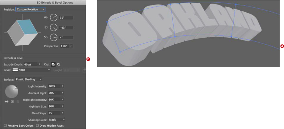
After applying the 3D effect, you can see that the original artwork is still there, but exists in a hidden state (A). The 3D effect is an appearance that can be edited by clicking that item in the Appearance panel.
These are the settings that we used (B), but you may find you have other ideas. Why not try them all? The important thing to remember is that you cannot break the machine! The Undo command is your friend.

With the Direct Selection tool, we carefully selected the face of each letter and moved them to a new layer. Click the center of the shape, rather than the edge. If that type has any color to it, it’ll work best if you change it now to white.
Locking that layer, you can select the remaining extrusion shapes below and put those on their own layer, which we named extrusion. Then, pick a color. Seemed to us that a rich plum color would play nicely with the gradient, so we applied that to all the shapes on this layer. You’re going to need three values of your color, so we made two more — one brighter, and one darker. We saved these to our Swatches panel and, so we could apply them quickly with the Eyedropper tool, put squares of the colors on our artboard.

Some of our inspiration, by anonymous designers who will never receive their due. These tourist postcards are a little corny, but communicate a lot of affection for the place, and they also tell a story about local history, a few years down the line.
With the Direct Selection tool, carefully select all of the bottom-facing panels of the extrusion and apply the brightest plum color to those. This will make it look as if light is shining up at the object.
Next, select the sides of the type that face the left edge, where a light shining from the lower right would create the deepest shadows. This may take a little bit of careful logic. Just pretend you’re a flashlight, and ask where the shadows would be. Color those bits with the darker plum shade.

Color squares on the artboard are often more convenient than finding the Swatches panel.

Adobe Fonts lets you filter your search to the style of type you’re looking for.
Now comes the fun part: adding the photo. On Adobe Stock, we found a photo of Oakland’s Lake Merritt. (We wanted a picture with some pale coloration so that it would contrast with the bright gradient.) We scaled the photo to cover the type and then placed it on the Main type layer, at the very bottom of the stacking order. (Pro tip: Press Cmd/Ctrl+X; then Cmd/Ctrl+B to put an object on the very bottom.)
Here’s where we hit a snag. We wanted to make those bold letters into a clipping mask, but when we selected the letters and the photo and chose Object > Clipping Path > Make, only the O made a mask. This is because, when we cut and pasted those letter shapes, they stopped being one big compound path. Undo the clipping mask, and with just the letters selected, choose Object > Compound Path > Make, and then re-do the clipping mask.
Almost done! For the phrase Greetings from, we wanted a script font, one that was bold and with a vintage feel. We opened the Character panel, clicked Find More in the font selector, and scrolled through the millions of fonts available. To make things easier, we filtered for just script fonts.
We chose Mascot MVP. It’s got a heavy, fluid feel — like a hand-lettered sign. One thing we objected to right away was the capital G. It looked a bit goofy in the way it wasn’t connecting to the other letters. So we selected the letter G with the Type tool, hovered a moment, and lo and behold there was an alternate glyph available — perfect!
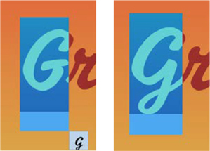
Use the Type contextual controls (or the Glyphs panel) to select alternate glyphs, if available. The alternate G connects with the r that follows in a much more fluid way.
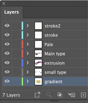
The key to a long and happy life is a well-organized Layers panel. When objects on a layer are selected, a small colored square appears on the right. Drag the square to move items from one layer to another.
We did something similar with our made-up city slogan and adjusted the sizing and leading until we were satisfied. (Just kidding. We fiddled until our eyes began to itch; then we took a break and called it a day.)
Take a look at our Layers panel to see how we organized things.
Now we have our own postcard, which looks and sounds a lot like the greatest city on Earth.