
Trifold Brochure
Design a simple brochure
The Brief
Create a trifold brochure using just two colors
Trim Size
US Letter (flat)
Learning Points
Setting up a document with folds
Organizing the flow of information
Working with a lot of text in a small space
Tools
InDesign, Photoshop
Fonts Used
Bernina Sans
Inspiration & Resources
For folding ideas and information, check out foldfactory.com.
The humble trifold brochure: It’s everywhere. Hotel lobbies, tourist centers, train stations. Any place where people gather, you’re likely to find a rack of brochures. While there are other media — websites, posters — and many alternative brochure formats with all sorts of creative folding possibilities, the trifold (also referred to as a letter fold) remains a popular way of communicating a message. It’s simple and effective: Take a letter- or A4-size piece of paper, fold it twice, and you have a portable format divided into sections, allowing the information to be presented in easily digestible chunks, and in a given order.
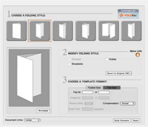
Set up the document
Ah, the great trifold debate: Set up your InDesign document as two single-sided pages with guides to indicate the folds? Or set up your document with six pages, with each page functioning as a brochure panel? Passions are stirred; rifts have been caused. Well, not really… at the end of the day, you get to the same place. We used the latter approach because it makes it easier to adjust for folding compensation, i.e., making the width of the fold-in panel slightly less than the other two so that the brochure lays flat. This might seem unnecessarily complicated for such a simple format, but it’s good to be aware of the issue and to take responsibility for addressing it. At the same time, like every successful print job, this one should begin at the end. Discuss your project and your intent with your print service provider.

Create the six-page, single-sided document; no Primary Text Frame (A).
Create a second master page, based on master page A. Make it slightly narrower to allow for folding compensation — in this case a width of 3.625 inches (B).
Deselect Allow Document Pages to Shuffle; then rearrange the six pages into two three-page spreads (C).
Apply master page B to panels 1 and 6 (the inside panels). When asked, choose “Use master page size” (D).

You’ll want to make sure you set up your document properly or the final print will be out of alignment and your yoga studio will refuse to give you free lessons for your design work.
To calculate the amount of folding compensation, we used the Folding Guide at universalprinting.com, which told us that the front panel and first inside panel should ![]() or 0.0625 inch narrower, so that they fold into the other panels. We started with a six-page document with a page size of 3.6875 inches. (If inches strike you as an arcane measurement system, unfit for purpose, remember you can toggle units by right-clicking the intersection of your rulers.)
or 0.0625 inch narrower, so that they fold into the other panels. We started with a six-page document with a page size of 3.6875 inches. (If inches strike you as an arcane measurement system, unfit for purpose, remember you can toggle units by right-clicking the intersection of your rulers.)
Next we created a second master page (B), based on the first and used the Page tool to change its width to 3.625 inch. We selected pages 1 and 6, and Option/Alt-clicked master page B to apply the master page to them. When prompted, we chose “Use the master page size.” So that’s two panels at 3.6875 plus one panel at 3.625 for a total width of 11 inches.
Now to shuffle our six pages/panels into two spreads. First, uncheck Allow Document Pages to Shuffle (don’t think too hard about the name of this menu item; it will just confuse you), then get page 2, drag it up to the right of page 1, page 3 to the right of page 2, etc., until you have two three-panel spreads.

Let’s suppose that this is a two-color print job. Practically speaking, that almost certainly means black (for the text) plus another color. If you’re going for offset, rather than digital, printing a two-color job will be more affordable, but you want to think about it more as an aesthetic choice than a budgetary constraint. Because the pictures have been selected from different sources, their style and lighting varies. One way to unify them is to convert them (or copies of them) to grayscale; this also has the added bonus of giving the brochure an understated vibe, especially when the black-and-white images are combined with a soothing cerulean blue, specifically Pantone 7459. We found this color peaceful, while at the same time strong enough to carry short passages of text and to serve as a background for white text. To extend our palette, in addition to using the color at full strength, we made tints at 75%, 50%, and 15%.
Want to be more ambitious with your brochure folds? Foldfactory.com has lots of folding ideas and information. You can use their free FoldRite Template Builder to generate an InDesign template.

Create tints of a color for consistency and so that if the parent color changes, all the tints based on it will change also.
Choose the type
We went with Bernina Sans Condensed Regular for the body text and Condensed Light for the heads. Sometimes when the hierarchy is clearly established through scale, we like to understate the heads by using a lighter, rather than heavier, weight. Bernina is modern but not too formal — like you’d want a yoga class to be — and elegant and svelte — like you’d want to be after a few months of yoga classes. And because the panel colors switch from 100% of the blue to paper, the text color switches between black and white. This means that even though we have only two colors, we can make an interesting palette that simultaneously offers variety and consistency.
For the main body of text, to save space, we used a nested style that makes the run-in head reverse out of a solid blue box. We used a couple of tricks here: Firstly, the blue box is actually an underline, made heavy enough to cover the text when its offset is shifted. Secondly, because the underline fits too tightly around the text, we added a thin space on either side of the run-in head. This small amount of space also takes on the underline and is just wide enough that the text doesn’t feel cramped. It is the use of these two thin spaces, one at the beginning and one at the end of the run-in head, which explain the delimiter we chose in the nested style definition: Apply the run-in character style through two thin spaces and then revert to the normal definition of the style.
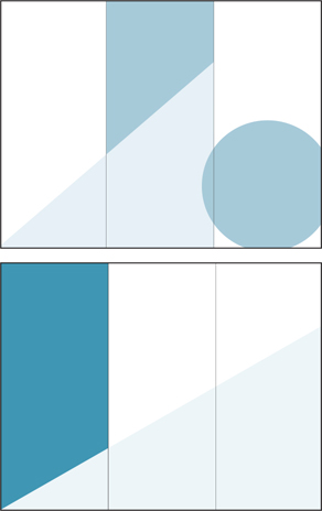
The front and back of the brochure showing just the Background layer. Overlapping shapes in tints of the second color visually connect the panels.
When colors cross the folds, the grain and weight of the paper need to be considered. Be sure to discuss your paper choice with your printer.

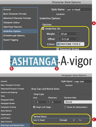
Create a character style with an underline heavy enough to cover the text. You’ll need to experiment with the offset amount (A).
Insert a thin space (Cmd+Shift+Option+M / Ctrl+Shift+Alt+M) either side of the run-in head to add some padding around the underline (B).
Create a nested style to apply the character style through two thin spaces (C).
Bulleted lists
Brochures commonly feature bulleted lists, and we wanted to use ours as opportunity for graphical interest and some further interplay with the second color. While a lotus symbol might seem a bit corny in this context, it brings up the issue of exploring the full range of glyphs available to you and incorporating an icon as your bullet character. A bulleted list also lets you apply a character style to the bullet, which in our case we used for the color.
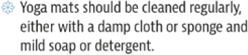
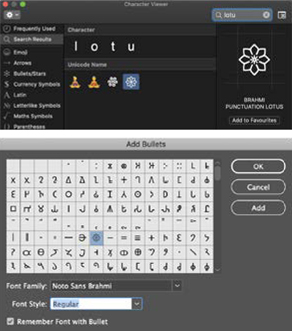
Use the Emoji & Symbols Viewer (macOS) to find a suitable bullet character (A). Add it as part of the paragraph style in Bullets and Numbering (B). In Windows, press Win+. to open the Emoji Picker.
Breaking out of the boxes
A potential pitfall of designing a paneled brochure is that the different panels end up looked segregated from each other, and you have a series of non-related vertical strips. To prevent this, we made sure to include elements that cross over to adjacent panels and so tie the design together. This is as simple as creating a background of overlapping shapes with differing tints of the second color. Every panel is connected with its neighbor.
To the same end, we made two of the three images into cutouts. Their non-rectangular shapes are more organic and create opportunities for text wraps to add more visual interest to the blocks of type. These were masked in Photoshop. Choose Select And Mask, and then choose the Quick Selection tool and click Select Subject. Because the images were shot on a white background, it’s an easy selection for Photoshop to make. You might need to use the Refine Edge Brush tool to paint over any areas of trapped white space. Choose to output the selection to a layer mask. Save the result as a PSD file and place it into InDesign.