
Dada
In favor of irrationality
The Brief
Create a Dada-inspired poster highlighting a slogan of the movement
Trim Size
Tabloid/A3
Learning Points
Working with the Touch Type tool in Illustrator
Experimenting with scale
Overprinting effects
Tools
Illustrator
Fonts Used
Birch, Clarendon Text, Rosewood Fill, Alternate Gothic No 1, Adobe Caslon Pro, Adobe Wood Type Ornaments
Inspiration & Resources
www.tate.org.uk/art/art-terms/d/dada
The early 20th century avant-garde art movement known as Dada rejected reason and logic, which it regarded as having failed to prevent the catastrophe of the First World War. If mass death was sane and orderly, these artists asked, why not embrace nonsense, irrationality, and intuition? Why play by the rules, when the rules lead to war, hunger, and authoritarianism? We have to admit, they have a point.
What’s amazing is that, in their bid to reject order and logic, they produced so much art of lasting value. Starting in Zürich, and spreading to Berlin, Paris, and New York, Dadaism inspired the visual arts, literature, poetry, art manifestos, art theory, theater, and typography — with an influence that is still being felt today. It’s almost as if there is a logical argument in favor of illogic!
In the world of design, they shattered all norms, allowing type to be blown up, rotated, flipped upside down, misprinted. Images were collaged, ripped from context, their meanings subverted. Imagine the horror of their Victorian parents! (Probably similar to the way our own parents reacted to our Black Sabbath albums.)
For this project, we chose to illustrate a quote from Tristan Tzara (1896–1963), one of the most influential members of the Dada movement: “Not the old, not the new, but the necessary.”
Type choices
The Dadaists were not concerned with choosing a typeface to convey a brand, the way designers are today. Through extreme hierarchy every page was designed to “yell” at its viewers. They would have ridiculed the idea that you should use no more than three fonts per page. They used as many different fonts as they wanted, would punctuate in unconventional ways, and dropped random letters or symbols throughout their pages. They sought to liberate typography from the grid of the letter press, printing horizontally, vertically, and diagonally on the same page. To make their angled typography, they had to use the tool the wrong way, and at its best, Dada typography is an inspiring reminder that sometimes the best results come from breaking the rules.
To keep the look of the example poster authentic, we chose typefaces designed before 1914. We imagined that our typefaces were incomplete, that certain letters were missing (or in the midst of a heated political debate had been put back in the wrong typecase) and needed to be substituted with letters from other typefaces. We’re after a chaotic look.

We also couldn’t resist the classic design trope of the pointing finger or manicule. Ours was from Adobe Wood Type Ornaments (you can find similar in Zapf Dingbats, Wingdings, or other ornaments sets). Frequently used in 19th century posters and advertisements to add emphasis, pointing finger type blocks would have been readily available in printers’ typecases of the time. Although the pointing finger began as type, we immediately turned it into outlines, which made it easier to scale.


Examples of pointing hands from different typefaces. The symbol is also called an index or manicule (from the Latin root manicula, meaning little hand). In printers’ slang it was known as a bishop’s fist, mutton-fist, or just fist. Its earliest known uses were in manuscripts from the 12th century, where it was drawn in red pen in the margin. It is the forerunner of the pointing finger cursor when you hover over a link.
Create an overprint effect
A second color could only be red for maximum impact. We thought the standard black swatch looked a bit too solid so we used a 90% gray for a slightly faded look.
The Dadaists were among the first typographers to use layering. Obviously they didn’t have a Transparency panel and Opacity slider, so we avoided the temptations of the Multiply blending mode. Instead, we set the attributes of the type to overprint and chose Overprint Preview for a more accurate view.
Adding a rectangle around the word Necessary is, of course, a rudimentary thing to do. But, the Dadaists wouldn’t have had a rectangle tool; they would have created their rectangle with rules. And with so much propagandizing to do, they would have been in a hurry. This is why we constructed our rectangle from rules of different weights that don’t quite line up.
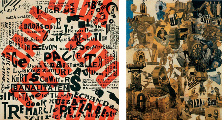
Right: Cut with the Dada Kitchen Knife through the Last Weimar Beer-Belly Cultural Epoch in Germany, Hannah Höch 1919
Theo van Doesburg’s poster for a Dada soirée (ca. 1923)

The result of setting the type attributes (you’ll find the panel under the Window menu) to Overprint Fill and turning on Overprint Preview. Before left, after right.
To mess up the evenness of the baselines, we used the Touch Type tool, which allows you to freely position — as well as scale and rotate — individual letters while retaining the editability of the type. Imagine what the Dadaists could have done with the Touch Type tool! One of the things that’s so appealing about this style is that you can’t really go wrong. Whatever you do, it looks good.
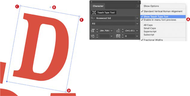
To use the Touch Type tool:
Choose Show Touch Type Tool to make it visible on the Character panel (A).
Rotate the character from the circle, top center of the bounding box (B). Using the corners, adjust the vertical scale (C), adjust the horizontal scale (D), or scale proportionally (E).

Poster for Dada Matinée (1923) by Theo van Doesburg
Adding the texture
To finish the composition, we added texture. In fact, there are two textures, one for the background and one for the type. We found them both at texturepalace.com. You can add texture as an opacity mask to each piece of type. In addition, we added an overall texture at the bottom of the layer stack.

The wood texture (A) is added as an opacity mask (B) to each type sublayer (C). The dotted line beneath the layer name indicates that an opacity mask is applied.