
Build a Chiseled Drop Cap
Go large with your initial letter
The Brief
Create a custom drop or initial cap
Trim Size
Scalable
Learning Points
Drawing precisely with Smart Guides
Editing and combining shapes with Pathfinder
Adding an isometric 3D effect using the Appearance panel
Tools
Illustrator
Inspiration
Jessica Hische’s blog Daily Drop Cap: dailydropcap.com
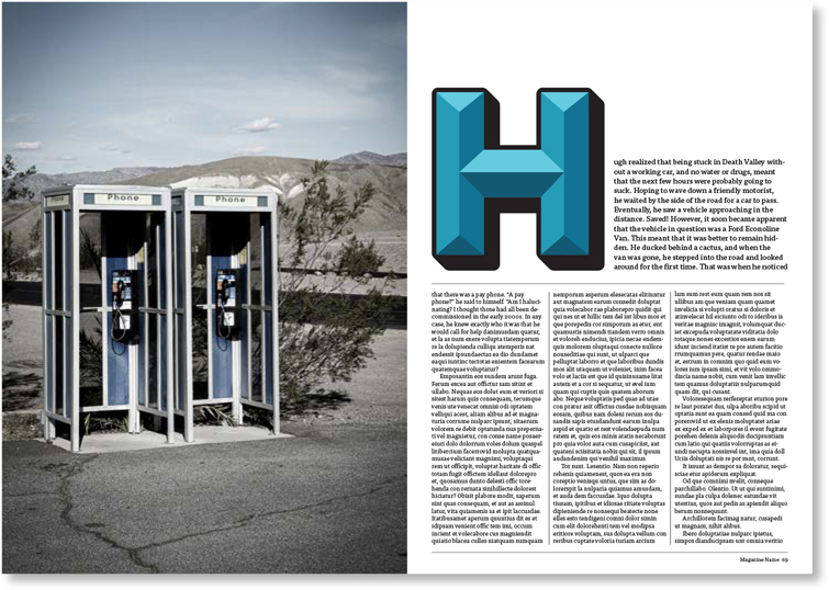
For centuries the drop cap has been used to make a reader sit up and take notice. By starting a paragraph with a big, stylized letter, you could pull the reader in and let them know that what was to follow was going to be a magical ride. For this project, we had the idea of creating style of vintage chiseled drop cap.
We started with the letter H, because Hugh felt this was the most interesting letter in the alphabet.
Draw the shapes
For precision drawing we turned on Smart Guides (View > Smart Guides or Cmd/Ctrl+U). Then we drew boxes, in the shape of an H, followed by some guidelines, which we aligned to the center point of each box. (Be sure to hover a bit until the Smart Guide label lights up.) Then we drew the additional rectangles and triangles we needed and moved shapes up and down in the stacking order as necessary, using Cmd/Ctrl+] and Cmd/Ctrl+[.
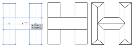
Labels light up when you have Smart Guides turned on. Press Cmd/Ctrl+U to toggle them on and off.
Choose the colors
Next comes the fun part. Hugh fancied a blue-green hue, so we chose a turquoise and then selected tints and shades of it using the Color Picker.
We created four squares on the artboard and filled them with the four tones of the color so that we could conveniently use the Eyedropper tool to select and apply the colors.

Move the circle picker straight upwards to select a tint or downwards to select a shade of your current color. Watch the B of the HSB fields and you’ll notice the percentage of brightness change.
Add the outline
For the letter to function as a drop cap, we added a heavy black outline and simple 3D effect. We made a copy of the layer, moved it below the original, selected everything on the layer, and made it hot pink to keep it distinct from the original. On the Pathfinder panel, we choose Merge, to make one simple shape for the outline (the use of a single color for all shapes makes this possible). We changed the color back to black, added a black stroke, and in the Stroke panel chose Align Stroke to Outside.

Merge the shapes of the duplicate layer using the Pathfinder Panel.

Mid-way through the project, we thought “hey, wait a minute — this chiseled H is looking kinda familiar.” That’s when we realized that the History Channel has a logo with a chiseled H. This points to a common dilemma: Sometimes we think we have an original idea, only to find out that someone else got there first.

Use the Transform effect with multiple offset copies to create an isometric 3D effect. Note that you can edit the effect by double-clicking its link in the Appearance panel.
To round the edges, we selected the shape, and with the Direct Selection tool we pulled the corner widgets inwards. Note that if you don’t see the small circles in the corners, choose View > Show Corner Widget.
Create the 3D effect
To extrude the shadow, with the black shape still selected, we went to the Appearance panel and from the fx menu at bottom left chose Distort & Transform > Transform. We added Move offset of .3 pt, and for the number of copies chose 40. The multiple offset copies gives the object an isometric perspective look.
Save the final art as an AI file and place in InDesign to use as a graphic drop cap.