
City Poster
Vintage repetition and randomness
The Brief
Create a promotional typographic poster for your favorite city
Trim Size
Tabloid/A3
Learning Points
Threading text
Using repetition and variation
Applying sequential styles
Tools
InDesign
Fonts Used
Gill Sans
Inspiration
“Johnston Sans: The Tube typeface that changed everything” bbc.co.uk/news/magazine-35916807
Ask any designer to reference London, and they’ll reach immediately for their Gill Sans typeface. That’s not just because it’s possibly the most famous humanist sans serif in the world, but because it looks just like the typeface we see everywhere on the London Underground, even though it isn’t.
The corporate typeface of London’s Underground is Edward Johnston’s 1916 “Underground Alphabet” (available as P22 Johnston Underground from the P22 type foundry). Edward Johnston had a protégé named Eric Gill, and in 1928, Gill released his own sans serif, called Gill Sans. To the untrained eye they look very similar, but as any type geek will tell you, the difference is in the tittle — that’s the dot on the i and j; in Johnston they are diamond-shaped, in Gill they are round.
One could, and some have, argued the relative aesthetic merits of the two typefaces, but while Gill was widely available and spread like wildfire throughout Britain (it was a core part of the BBC’s identity between 1997 and 2017), Johnston was a proprietary typeface, jealously guarded by London Transport, and it stayed mainly underground.
This project was suggested by the Fortune magazine cover for February 1960, which we stumbled upon in one of our design books. It immediately struck us as a great exercise for highlighting some of InDesign’s overlooked type capabilities — as well as showing off some useful type formatting tricks. The poster relies on a simple repetition of the city name, but with the colors randomized, so that the letters form a tantalizing “almost pattern” that the brain can’t help but try to decipher.
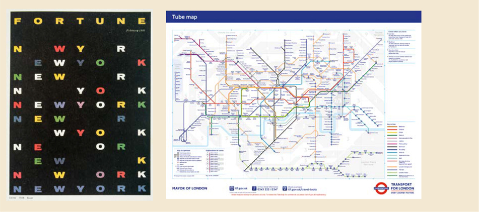
The February 1960 cover of Fortune magazine and the London Transport Tube map based on Harry Beck’s original 1931 design

Document setup
In InDesign, we divided the page into a grid of six columns by seven rows using Layout > Create Guides. To fill this grid with text frames, we used a feature called Gridify. You won’t find it on the menu; Gridify requires some nifty finger work worthy of a concert pianist (or a teenager sending a text message). Here’s how it works: With the Type tool, click and drag out a text frame. Keep holding down and press the Right/Left Arrow to add/remove columns and the Up/Down Arrow to add/remove rows, until you have a framework of threaded text frames that corresponds to your grid.

Johnston Underground vs. Gill Sans
On the pasteboard, we typed out the city name. At this point we don’t care what it looks like. Size, color, font — irrelevant. All we’re concerned about is pressing Return after each letter. That’s right, every letter is its own paragraph. We copied and pasted this a bunch of times — at least eight — and then selected all the text and copied and pasted it into the text frames. Because the frames are threaded, the text flowed to the next frame after it had filled the first and so on. We tried not to be alarmed that it looked a complete mess at this point. This part was just about getting text on the page.
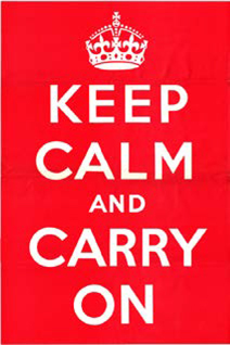
This motivational poster was produced by the British government in 1939 in preparation for war. It features hand-drawn lettering by Ernest Wallcousins, similar to Gill Sans and Johnston. You can read the fascinating story of its rediscovery in the early 21st century and subsequent commercialization here: www.iwm.org.uk/history/truth-behind-keep-calm-and-carry-on.

Divide the page into rows and columns (A).
With the Type tool draw a frame and, while drawing, divide the frame into a series of threaded frames by tapping the Right Arrow (add columns) and the Up Arrow (add rows).
The page in Normal view mode with Text Threads shown — View > Extras > Show Text Threads (B).

Create a color palette
Switching our attention to the colors, because we wanted some randomness, we needed more colors than we had letters — six in this case. This is so that when applied in sequence, the same color will not be applied to the same letter and no obvious pattern will emerge. Here’s our first “trick”: We made one of the colors exactly the same as the background so that when applied, it was effectively invisible.
We think that colors always look better when there’s a backstory to why you chose them. Like everybody else, we sometimes choose colors just because “they look cool,” but when there’s a rationale behind the color choice it feels like we’re doing it properly. In this case, the colors were sampled from the iconic London Underground map, originally designed by Harry Beck in 1931. Although the map has gone through many refreshes since (not least because additional tube lines have been added), it has remained true to the original, and the colors of the different tube lines are instantly recognizable to any Londoner.

The Keep Option causes each letter to move to the next frame (A).
The colors are incorporated into paragraph styles, which are defined as a sequence (B) so that you can apply the styles in a loop with a single click (C).
Type choice
Wanting a typeface that evokes the place, our obvious choice was Gill Sans, because of its associations with Britain in general and London in particular.
Create the first paragraph style for the type. Along with its other formats, it should include a Keep Option to start the paragraph in the next frame. This is why we pressed Return after each letter. The Keep Option ensures that each paragraph/letter moves to its own text frame. This is where things start to take shape.
Now create a series of paragraph styles, each based on the first but with a different color. You want these styles to be applied in sequence, so in the Next Style property make “2” the next style after “1,” “3” the next style after “2,” and so on. When you get to the last style, set its Next Style property to the first style in order to create a repeating loop.
With the styles ready, select all the text, right-click the first style in the sequence and choose Apply [style name], and then choose Next Style.
Each letter should now be in a different color, in its own text frame. All that remains is to vertically center each letter within its frame. Select the text frames, choose Object > Text Frame Options, and choose Center from the Vertical Justification menu. To finesse the vertical centering, in Baseline Options, change the First Baseline offset to Cap Height — although this will vary from font to font.
To offset the first row so that it functions as a title, make the letters in the first row all the same color. Delete the text frames of the second row to create some distance between the header row and the rest of the letters.

The result not random enough for you? Try a seven-column grid so that the name never stands alone on a line.