
Victorian
Embrace decorative excess
The Brief
Create a Victorian advertising card using a range of embellishments
Trim Size
US/Letter/A4
Learning Points
Adding shading and offset strokes
Adding and combining ornaments
Using stylistic alternates
Tools
Illustrator, Photoshop
Fonts Used
P22 Victorian Swash, P22 Victorian Gothic, Balford
Inspiration
In our era of minimalist design, a common piece of typographic advice is keep it simple. We’re often told in design school to limit ourselves to two or three typefaces at most, and to leave plenty of white space. “Let it breathe.” Victorian printers would beg to differ.
Let’s start with a definition. Literally, the Victorian era is defined by the reign of Queen Victoria of Britain, 1837 to 1901. More broadly it’s come to mean a cultural period in the late 1800s, from about the 1860s to the turn of the century.
One of the characteristics of Victorian typography is its, um, lack of restraint. The advertising placards, posters, and packaging of that era were created by craftsman printers, as the category of “designer” had yet to be invented, and they put to use all the ornamentation and excess they could muster. In a time when mass production and advertising were relatively new concepts, advertising needed to stand out. Bigger, louder, brighter, more detailed designs were the order of the day!
Choose the type
For this project, we wanted typefaces that were designed during the era or typefaces that consciously evoke the Victorian age.
In Illustrator we added the main type (centered, optical kerning), applied a Flag warp, and moved the baselines of the initial cap down.


The type after warping, optical kerning, and a negative baseline shift applied to the initial caps.
Create the frame
Typographic ornaments are a great way to extend your palette. To create the frame, for example, we used an ornament font that is part of the Balford family. Use the Glyphs panel to identify the ornaments you want, insert them, and then convert them to outlines so that you can scale them more easily. To get the arrangement you’re after, there will be a lot of rotating, reflecting, and scaling. When you arrive at a pleasing frame (ours is comprised of three elements), use Pathfinder > Merge to combine all into a single frame. To avoid moving the frame in error, put it on its own layer and lock the layer.


Use the Glyphs panel to explore the Balford extras ornaments font.
Decoration
Apply an offset shadow and woodcut shading through the Appearance panel. This keeps the text editable, but more practically, it makes it easier to manage small adjustments to the exact amount of offsets applied. A potential downside, especially when it comes to applying multiple pattern fills for the shading, is that using the Appearance panel in this way can be processor intensive. To maximize editing flexibility, also make sure to convert your swatches to global colors. Check out the diagram on the next page for a breakdown of how to apply effects through the Appearance panel.

There are limits to what you can do while retaining the type as editable text. So having made a copy to the pasteboard of progress so far, we chose Object > Expand Appearance and drilled down through Isolation Mode by double-clicking to the M and the E to flip the color of the fill and offset stroke for the initial letters.
Adding catchwords
Catchwords are small words, typically prepositions or articles, or possibly short phrases that are designed as and can be input as a single glyph. Typically, they evoke vintage advertising or typographic posters of the late 19th century. Some fonts that have catchwords are HWT Catchwords, Adorn Catchwords, Charcuterie Catchwords, and Adobe Wood Type Ornaments. You can explore what’s available using the Glyphs panel and insert the catchword simply by double-clicking at the point of your cursor. We hoped to find a catchword for The One And Only, but in the end had to make our own, combining type with two catchwords from the Balford font.

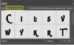
Exploring stylistic alternates
As if we didn’t already have enough flourishes, we decided to add in a few more by using some contextual alternates from the Balford font. When you select a glyph, a blue line will appear beneath it along with a row of alternate glyphs (if any exist in the font). You can also use the Glyphs panel: For Show, choose Access All Alternates to explore what’s available. We ended up using the R and the T.
Texture
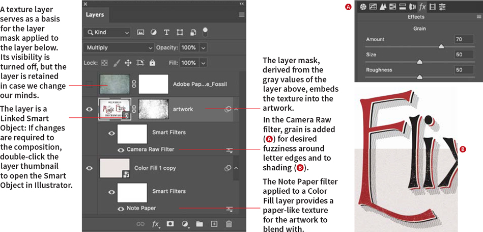
To finish the project, we roughened up the woodcut shading and added some texture: tasks that we find much easier in Photoshop. We created a new canvas at the same size as the Illustrator artboard and placed the artwork in progress as a Linked Smart Object (File > Place Linked).
As a base, we added a Color Fill layer in an ivory color and converted this to a Smart Object. For some texture, we added a Note Paper filter from the Sketch group of filters. This filter uses your foreground and background color, so before we applied it, we set these to white and off-white, respectively. We changed the blending mode of the artwork layer to Multiply to combine it with this texture.
Next, we used the Camera Raw filter to add some grain. This does two things: makes the edges of the letters slightly fuzzy, like ink spreading on paper, and makes the shading less perfect and more realistic looking.
Finally, for some aging, we added a layer of texture. We had initially intended to blend this down through the layers, but ultimately decided that we liked it better used as a layer mask on the artwork layer. To do this, with just the texture layer visible, go to the Channels panel and Cmd/Ctrl-click the RGB channel. This will activate a selection of the gray values of the layer. Now move to the artwork layer, and click Add Layer Mask. To adjust the contrast and see more of the image and less of the texture, press Cmd/Ctrl+L to bring up Levels and move the white point slider to the left. Note that because we’re working directly on the layer mask, a non-destructive adjustment layer is not an option.