
Wartime Poster
Dig deep for victory
The Brief
Create a “home front” public service poster that prominently features type
Trim Size
Tabloid/A3
Learning Points
Choosing type and color
Combining type and imagery
Warping type
Tools
Photoshop, Illustrator
Fonts Used
Buckwheat
Inspiration
Imagine if our civilization had to face a global crisis, like a world war or a pandemic, without the Internet or television. How on Earth would you get important information to the people? Here’s an idea: public service posters.
These posters, produced during the Depression and World War II, were highly visible — on the streets, in workplaces, in schools, and in other public spaces. They project a stolid yet cheery optimism and a “we can do it” approach to problem solving. The colors were strong, but often printed on cheap materials, so we know them as vintage, weathered icons of another era.
We often see parodies of these posters. When they are well done, they can be funny or inspiring. When they fail, they cast the whole project of social cohesion into doubt! The key, as always, is appropriate typography.
Choose colors
We wanted a limited color palette of bright colors, used as solid blocks. Red and blue, with white type reversing from them, have obvious patriotic connotations; we’ve chosen a chrome or sunflower yellow that has more depth than a pure yellow.
Choose the type
For the type, we chose Buckwheat, a vintage-look, condensed and rounded sans serif with slightly roughened edges. We liked how it looked set in all caps, with the word spacing reduced to 50%. We made the word Wash bigger, so that it spans the full width of the second line. Using spacing rectangles (see below) we made sure that the leading between the lines was the same as the size of the space between the words.

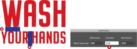
Size the two lines relative to each other. Reduce the word spacing (A) and make the leading equivalent in size (B).

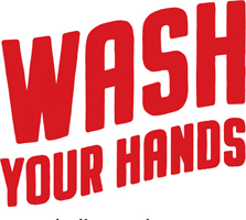
Add a stroke that is the same color as the fill to increase the weight.

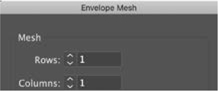
When it comes to warping the type, it can be difficult to get the result you want using one of the Illustrator Warp presets. There is also no good, non-destructive way of applying a skew to type in Illustrator. If you use the Shear tool and decide later you don’t like the result, you’re stuck with it. The Free Distort tool can be applied as a Live Effect, but its preview gives limited feedback. For this reason, we ended up grouping the two lines, and then creating a mesh warp. We wanted a relatively gentle upward slope so chose a single-column, single-row mesh. With the Direct Selection tool we selected the top- and bottom-left anchor points and nudged them down; then we selected the top-right and bottom-right anchor points and nudged them up the equivalent distance. Note that should you need to update the type, you can edit the Envelope contents; if you need to start over, you can release the mesh.
Group the lines and convert to a mesh (Object > Envelope Distort > Make with Mesh). Move the two left anchor points down, and move the two right anchor points up an equivalent distance.

Add a modest amount of skewing from the bottom left of the object to slant the type to the right.
With the type in place, we felt it needed something else — something to lift it from the page. While Illustrator’s Drop Shadow effect is disappointing for its lack of options, it works fine here. We want a hard, offset shadow rather than a semi-transparent shadow, so we set Blur to 0 and Opacity to 100. Because of the difference in the size of the two lines, we edited the envelope contents in order to apply a lesser amount of the shadow to the second line.

Add a hard shadow with 100% opacity and no blur.
Prepare the image
For the photo shoot, we prepared a sink of foam and shot the hands against a flat background so that they could be easily isolated in Photoshop.
Works Progress Administration (WPA) posters from the Library of Congress online catalog, www.loc.gov/pictures/collection/wpapos

In Photoshop, the image is converted to a Smart Object (A). A pen path is drawn around the hands and arms, and this is converted to a vector mask (B).
In the Camera Raw Filter (C), a black-and-white profile is applied and grain added for a gritty look (D).
We converted the image layer to a Smart Object and cut out the hands, somewhat roughly, with a vector mask drawn with the Pen tool. The sharp edges of the cutout better suit the scissors-and-glue aesthetic of the genre than a subtle masking. We applied the Camera Raw filter (Cmd+Shift+A/Ctrl+Shift+A) to add a high-contrast black-and-white color profile and then added grain to give the image a gritty look.
Add the texture
The texture is a paper texture downloaded from texturepalace.com. Add it to the top layer, apply the Multiply blending mode, and adjust the opacity to taste.
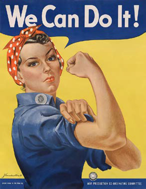
Informally known as “Rosie the Riveter,” We Can Do It! was one of a series of posters by J. Howard Miller made to boost worker morale during World War II.

The Layers panel in Illustrator. Even though the composition is a simple one, to make editing easier and less error-prone, separate the different parts onto individual named layers.