An A–Z Collection
Explore the personality of type
The Brief
Create a photo book collection pairing type with objects
Trim Size
Square format
Learning Points
Exploring the personality of typefaces and specific letters
Working with large type
Tools
InDesign (or Illustrator)
Fonts Used
Various
Inspiration
Use the Character Viewer to explore the range of styles available in your installed fonts.
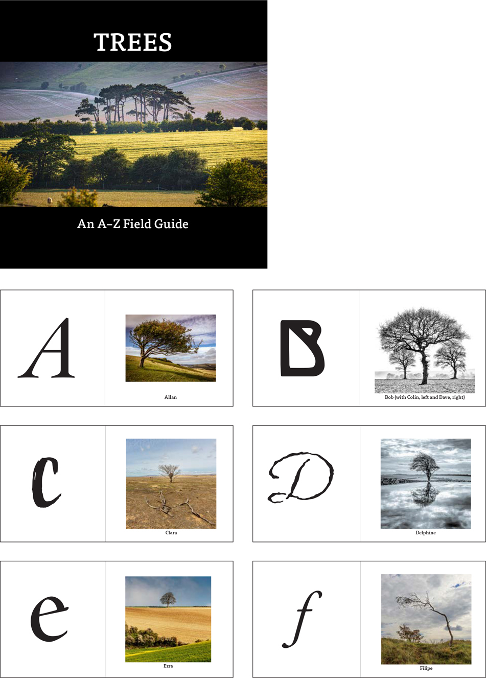
I love trees. They make great photographic subjects — resplendent in summer with their foliage and expressive in winter with their branches reaching up to the sky. And unlike people and wildlife, they stay still while I (Nigel) capture their portrait. Even though I’ve been photographing them for years, I know little about them. I can tell the difference between an oak and palm, but that’s about as far as it goes. Despite an app on my phone — I’m no good when it comes to identifying them. I just like how they look and feel reassured that they’re always there.
I realized that there were some trees that I photographed repeatedly and had started to name. I thought it would make a fun project to make a small A–Z photo book of trees — not to identify them with their common or scientific names, but just with the nicknames I’d given them, and to pair the tree with a particular typeface that shared similar attributes.
Once I had my shortlist of candidates, I used the Emoji viewer to explore the range of type styles available for each letter. On the Mac, I went to System Preferences > Keyboard and selected “Show keyboard and emoji viewers” in menu bar. Thereafter, it was accessible at the top right of my screen. For Windows users there is a free utility, BabelMap (babelstone.co.uk), that is equivalent.
I typed out the alphabet with a return after each letter and then flowed the story into a Primary Text Frame on the left pages. I then selected all the text, pumped it up to a size of 72 points as a starting point, went to Keep Options, and chose Start on Next Page. This put the letters in position. Next, because I no longer wanted the story threaded, I used the SplitStory script that comes with InDesign (on the Scripts panel, Application > Samples > JavaScript). This breaks the story into independent text frames. You can, of course, create your text frames one by one; it’ll just take a little longer.
Because I wanted each letter to fill the left side of my two-page spread, it was necessary to convert the type to outlines (Type > Create Outlines or Cmd+Shift+O/Ctrl+Shift+O), which made scaling and positioning easier. But there is a lot of back and forth in a project like this, so to be cautious, I kept a copy of each letter — editable — on a hidden layer, in case I changed my mind, which I’m prone to do.
I have anthropomorphized trees by giving them human names, and then I have done the same with typefaces by matching them up. Doing this may be strange, but it’s a great way to explore the personalities of different typefaces and to make connections between different areas of interest, be they from the natural or the built environment.
I finished this project by making it into a book, printed through an online photo book supplier — which will make a fine alphabet book, sure to confuse any visiting toddlers. However, a poster or website would be just as good.

Use the Character Viewer to explore the range of styles available in your installed fonts.