
Art Deco
Elegant geometry
The Brief
Create an Art Deco–inspired type treatment
Trim Size
Tabloid/A3
Learning Points
Choosing type
Working with gradients
Working with Photoshop layer styles
Tools
Illustrator, Photoshop
Fonts Used
Mostra Nuova
Inspiration
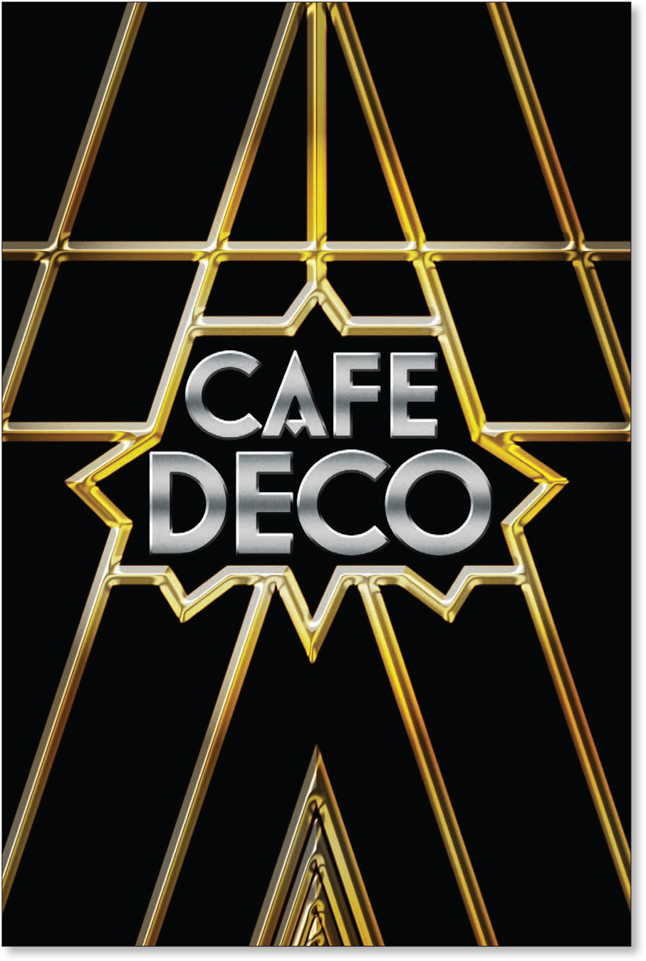
Art Deco flourished as the reigning international style from the 1920s, well into the 1940s. But was it really that big a deal? Two words in answer to that question: Chrysler Building. ’Nuff said. But you can see its influence across a wide range of design items, from letterforms and manhole covers to the Golden Gate Bridge. Its calling cards are sleek, symmetrical forms and a sense of opulence and luxury.
In its typographic contributions, Art Deco shines. The letterforms are geometric, built on perfect circles and straight lines, but the shapes always have surprising details that show the eye of a clever designer. Sure, sometimes we see that style and think “Great Gatsby.” But last we checked, that’s one of the great novels of all time. We think Art Deco fonts are great for wedding invites and anything that wants to project elegance and power.
Create the frame
Starting out in Illustrator, on a template layer, we placed an image of the entrance to New York’s Chrysler Building. On a layer above the template layer, we traced the lines of the image with the Pen tool and the Polygon tool to draw the triangles.


Convert the tracing image to a template layer, which locks the layer and dims its opacity (A).
A series of triangles and horizontal lines are drawn on a layer above (B).
Add the type
For the type, we chose Mostra Nuova, a typeface designed by Mark Simonson and inspired by Italian Art Deco. It’s available in a variety of weights and comes with a range of alternate characters that allow us to add customizations and decorative flare.
Add the inner frame
We wanted to take the frame into Photoshop to apply layer styles to create the gold effect; while it’s possible to achieve similar results in Illustrator, layer effects in Photoshop are more intuitive. But before we moved to Photoshop, we needed to prepare the artwork as shown here.

The type before (A) with auto leading and auto kerning, and after, with leading and kerning adjusted, an alternate A used, and Deco increased in size (B).
Alternates, if available, pop up below the selected character; you can also access them with the Glyphs panel (C).
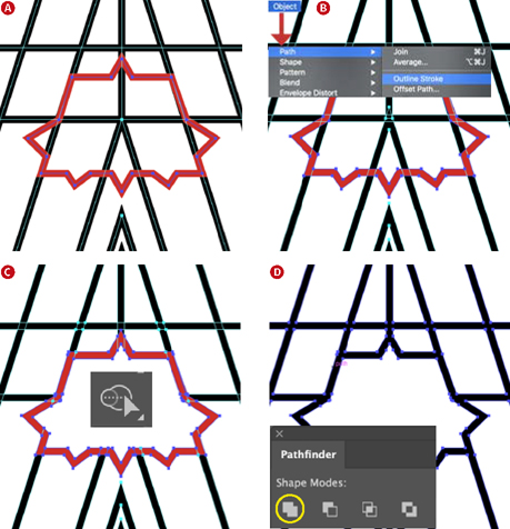
Draw the inner frame (shown in red) to enclose the type (A).
Convert the strokes to fills using Outline Stroke (B).
Subtract the interior of the inner frame using the Shape Builder tool in combination with the Option/Alt key (C).
Unite the overlapping elements as a single object using Pathfinder Add (D).
With the frame ready to go, in Photoshop, we created a canvas at the same size as the Illustrator artboard. We copied and pasted the frame and the type as separate Smart Objects so that we would work on them independently.
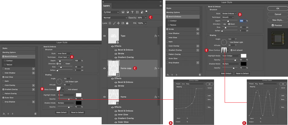
Create the shiny gold effect on the frame with a combination of layer styles. The main player is Bevel & Emboss, applied to the frame layer with the Chisel Hard technique (A) and a Cove — Deep Gloss Contour (B), which determines how the light plays across the surface of the object (B). Apply a copy of this layer with 50% opacity (C), a Stroke Emboss (D), and a Ring — Double Gloss Contour (E).

The type before (left) and after the application of Photoshop layer styles. The Bevel & Emboss (A) works in conjunction with the Stroke to give shadow and highlight to the reflected gradient that is applied as a stroke (B).
Apply a reflected gradient as a Gradient Overlay to the surface of the type (C).
Experiment with the Altitude and Angle settings that contribute to making surfaces shiny or dull.
Add layer styles
After applying layer styles to the frame in Photoshop as shown, we popped back to Illustrator to get the type. We filled the type with white and then copied and pasted the group to Photoshop as a Smart Object. Because the dimensions of the Illustrator artboard and the Photoshop canvas are the same, the Smart Object lands in exactly the right position.
It’s now time to apply layer effects to the type to create the brushed chrome look. Double-click to the right of the layer name to bring up the Layer Style Options. There are no definitive right answers here, but some solutions will definitely look better than others. The key with the Bevel & Emboss is that we are using a Stroke Emboss — and this works only if you also have a stroke applied. So even though it’s at the top of the list, bypass Bevel & Emboss for now and first create the stroke. This uses a silver gradient, with the style set to Reflected. Adjust the size and position to taste. Now return to Bevel & Emboss and set the style to Stroke Emboss and experiment with the depth, highlight and shadow, and the angle. Finally, a gradient overlay, also using a silver gradient, casts some highlight and shadow across the type so that the lighting is not flat.

An Art Deco-inspired manhole cover from Boston, MA

Before starting your project, make sure to do your research and study the artists of the time. This silkscreened poster by Weimer Pursell from 1933 shows how type was handled at the time: geometric forms, symmetrical composition, limited color, and elegance.