
Movie Poster
And the award goes to…
The Brief
Working predominantly with type, create a promotional poster for a real or imagined movie
Trim Size
24 × 36 inches (610 × 914 mm)
Learning Points
Working at large sizes
Placing images inside letter shapes
Formatting the credit text
Tools
Photoshop, Illustrator, InDesign
Fonts Used
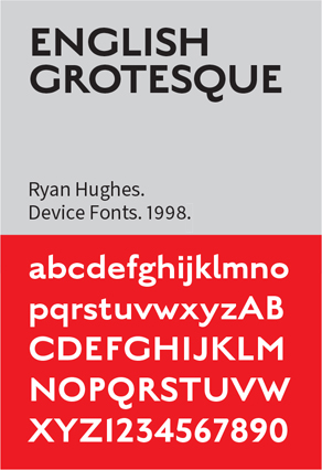
English Grotesque Black, Antique Olive Compact, Balboa Extra Condensed
Inspiration
One of our favorite films of 2020 was the First World War epic 1917. Its striking promotional poster used the simple device of putting pictures inside the numerals of the film’s title. We thought we’d try the same technique for its imaginary sequel.
We don’t have access to promotional pictures featuring the actors, but there are many images of the period that are in the public domain. They may not be of the greatest technical quality — a problem exacerbated by the physical size of the poster — but we can both embrace their graininess as authentic and fall back on a few tricks to improve them.
Type choice and treatment
This project uses all of the “Adobe Big 3,” but starts out in Illustrator, preparing the numerals. We wanted something old and bold, so ended up choosing English Grotesque Black. This is based on Caslon Sans, which, dating back to 1816, is considered the first commercially available sans serif. Grotesque in this context is the collective name for sans serif faces of the late 19th and early 20th century. These were often solid, bold designs suitable for headlines and advertisements.
We wanted the type to be simple, heavy (so that we can see more of the picture), and contemporary with the subject. While Caslon Sans predates the First World War, it — or others like it — would have been available to typesetters of the time.
A challenge of this project is working at such a large size, both in terms of image resolution and type size. We soon found that we exceeded the maximum size of 1296 points.
To circumvent this, we converted the type to outlines so that it could be scaled up further. But before we did so, we went as far as possible with editable type. We made it as big as possible and applied tight tracking and tight leading to make the horizontal and vertical space between the numbers visually equivalent. We put a copy of the type on the pasteboard as insurance and chose Type > Create Outlines (Cmd+Shift+O/Ctrl+Shift+O).
While we were happy with the shape of the 8 and 9 — because of their relatively small counters, they made perfect picture windows — the 1s were too simple and too narrow. Using 1s with a “tick” or arm would make the type block wider, giving us more surface area to fill with the images. It would also make the shape of the type block closer to the aspect ratio of the page, allowing even margins, which we felt framed the type nicely.
For these reasons we set the 1s in Antique Olive Compact. Antique is the French term for what in the English-speaking world are referred to as grotesques. Even though Antique Olive was designed in the early 1960s (by Roger Excoffon), its style suggests an earlier period. Once we had converted the numbers to outlines, we adjusted the scale of the numerals to make sure the Antique Olive and the English Grotesque were of equivalent height and weight.


Combining fonts: the 8 and 9 from English Grotesque with the 1 from Antique Olive. Adjust their scale to make them look like they belong together.
To adjust the spacing between characters, we like to use the time-honored technique of “rectangles as measuring stick.” Keep these on a separate layer that, when you’re finished, you can delete. This ensures that the horizontal space between the lines is the same as the vertical space between the characters. Note that the rounded top of the 8 will overshoot the flat top of the 1.
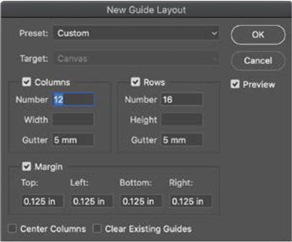
To help with placement of the numbers on the Photoshop canvas, create a layout grid. Photoshop has a sophisticated guide making tool. Choose View > New Guide Layout.
Copy the outlines to Photoshop as a Vector Smart Object
While one could make an argument for continuing the project in Illustrator, at this point we moved to Photoshop, where we find clipping masks more flexible to work with than their Illustrator equivalent, clipping paths. Create a Photoshop document at the trim size plus an extra 0.25 inch for the horizontal and vertical bleeds. Copy and paste the vector outlines as a Smart Object and position it on the canvas.
Prepare the image
The dramatic and atmospheric photo, by Ernest Brooks, shows five soldiers of the 8th Battalion, East Yorkshire Regiment, silhouetted against the sky, with sun rays bursting through dark clouds. We made a few adjustments to the image: darkening the foreground to a solid black, and some non- destructive spot healing on a separate layer to remove dust and scratches. We also extended the sky to give the image a more vertical aspect ratio. To do this, we increased the vertical size of the canvas (Image > Canvas Size), made a marquee selection of the sky above the soldiers, copied this to a new layer, and stretched it vertically. The most significant change was to add a Gradient Map adjustment layer. Because the image starts out as a silhouette, the two colors of the Gradient Map are assigned to the highlights and shadows.
We combined the layers that made up the modified image into a Smart Object and then clipped (Cmd+Option+G/Ctrl+Alt+G) this to the Vector Smart Object below. This simple but effective technique means that we see the image only in the shape of the numbers. Because we couldn’t get the cropping exactly how we wanted it with a single image, we duplicated the Smart Object and adjusted the position of the duplicate slightly so that it fit better inside the number shapes. On the top image, we added a layer mask to hide the portion that’s not needed.
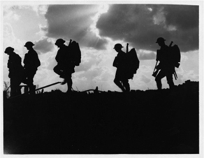
The original image, “Battle of Broodseinde” is available at commons.wikimedia.org.

Legacy Gradients
If you’re a veteran Photoshop user working with the most current version of Photoshop (2020 at the time of writing), you may be wondering where the familiar gradients are. Go to Windows > Gradients, and from the Gradients panel you can restore them.
Add the inner frame
Feeling like a huge expanse of flat color in the background was, well, a little flat, we added an inner frame and some texture. To create this we added two Color Fill layers at the bottom of the layer stack, one light gray, the other black. On the gray layer, we added a layer mask filled with black to completely hide the layer. We then switched the foreground color to white and with a rough brush — a natural edge eraser from Kyle Webster’s Megapack — painted on the layer mask to restore the light gray, leaving the edges black. Because we used a rough edge brush, we wouldn’t have been able to get a perfect frame, even if we’d wanted to — and that’s the point.
The credit text
It was now time for the third of our triumvirate: Because InDesign is by far the best place to format the credit text, we saved the poster as a Photoshop (PSD) file and placed it in InDesign. Movie credits typically use ultra condensed type, with the supporting words (edited by, music by, etc.) on a baseline that’s half the height of the credit names. The best way to handle this — especially if you’re going to be creating more than one poster — is to make the smaller pieces of type into anchored objects and to determine their position through object styles.

There are many additional brushes available; from the Brushes panel menu choose Get More Brushes.
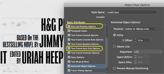
Anchor the small credit text within the text flow. Create and apply an object style to these elements that controls the height of the frame and its auto-sizing.