
Infographic
Worth a (few) thousand words
The Brief
Explain a topic or concept you know well using design rather than sentences
Trim Size
Tabloid/A3
Learning Points
Working with grids and guides
Picking a color palette using Color Themes
Creating a balanced layout
Tools
Illustrator
Fonts Used
Franklin Gothic URW, Minion Pro, and a cast of dozens!
Inspiration
There’s so much information in the world, and so much of it is conveyed through writing. More words = more typography, so we probably shouldn’t complain. But does every little thing need a Wikipedia entry? Can’t someone just show us a pretty picture and be done with it?
A good infographic cuts right to the heart of the issue. It uses images, color, design, and limited text in order to tell a complicated story within a small area. If it’s done well, it should say more in one glance than most books do in 200 pages.
Infographics are more likely to be created for screen rather than print. They are often tall and skinny allowing the user to scroll down to see more. Since this is a book, we created our infographic to fit the live area of our page, which itself is a point worth making: Before you can create the infographic, you need to know its intended format and size.
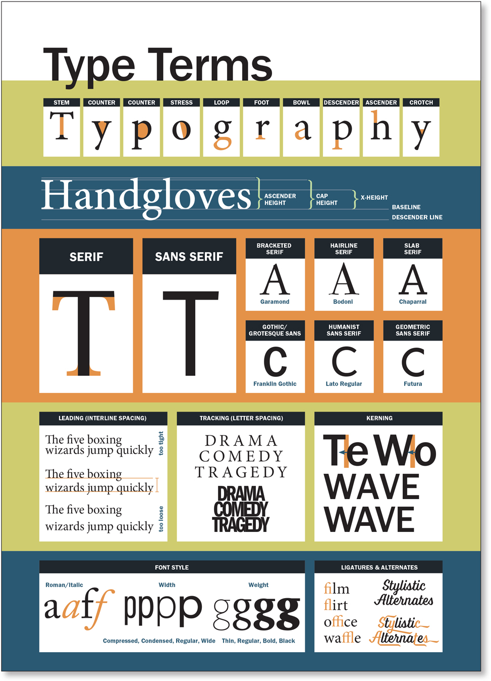
Since we’re often explaining typographic terms to people, we thought it was about time to design an infographic on the topic. Why spell out the meaning of the word “serif” when you can just show someone?
We could have built this infographic poster in InDesign, but since Hugh prefers small type to be treated as objects, rather than text inside a box, we opted for Illustrator. (Honestly, why does every piece of type need its own box? That makes no sense.)
Document setup
We started with a grid. First, we drew a large, empty box over the live area of our infographic — that is, the area that will have artwork, inside the margins. We wanted to divide that into 12 columns, and there’s an easy trick for that: Object > Path > Split Into Grid. We chose 12 columns with a gutter of .125 inches. Then we chose View > Guides > Make Guides (or Cmd/Ctrl+ 5). With this nifty grid, dividing the area into thirds or halves will be pretty easy.
We knew we wanted to break up the page into discrete areas using color, so we needed a bold color scheme. We pulled up the Color Themes panel, and pretty quickly we found four colors that were perfect for this project. We added each color to the color swatches as a global color so that if we needed to edit them later, we could.
In fact, editing the colors turned out to be necessary, since Nigel has a strong aversion to a color he calls “salmon.” We double-clicked the global salmon color in the Swatches panel and edited its CMYK values until we found a strong orange we both liked. Then, we realized the green would need to shift as well, and in the end, the only original color was a dusty blue. But that’s the whole point of the Color Theme panel: It’s the starting point, not the destination.

Because we were collaborating on this document, it was important to work in a way that was both transparent and organized. With so many parts going to make up the whole, we made sure that all individual pieces of an element were grouped (Cmd/Ctrl+G) to make moving and scaling them easier. To make edits to any part of a group thereafter, we used Isolation mode (double-click the group to drill down to its elements), or sometimes we used the old-school method of selecting the element with the Direct Selection tool.

Use Split Into Grid to convert a rectangle to rows and columns.

Double-click a group to enter Isolation mode, where you edit specific elements of a group in… isolation, without having to first ungroup the elements. When you’re done, click the Back button at the top left of the gray bar to return to normal editing mode.
We were careful to organize our layers logically, making full use of hiding or locking when they got in the way or when we wanted to be sure not to disturb them as well as the layer target or “bullseyes” for selecting all the contents of a given layer. We know that the world will continue to turn, even if you don’t use the Layers panel to organize your work. But while a tidy Layers panel might not be a panacea for all ills, it will clarify your thoughts about the content you’re working with, make editing the document way easier, and give you an all-over, feel-good glow.
What is an infographic?
Infographics purists might take issue with our calling this project an infographic, because it contains no data. But we like to think of Infographics as a broad church and regard “informational infographics” like this one as part of it.
When creating infographics, it’s usually a good idea to take every opportunity you have to replace text with icons. As you can see, we haven’t done that: When the infographic is about the building blocks of words, words inevitably feature. That said, we have tried to keep the text to a minimum.
We wanted to use the letters of the word Typography to show a few of the elements of typography — see, it’s meta! — but this word has 10 characters, not 12. This meant we were breaking the grid in our first section! (If we were better at Scrabble, we might have found a 12-letter word for this concept, but we’re out of practice.)
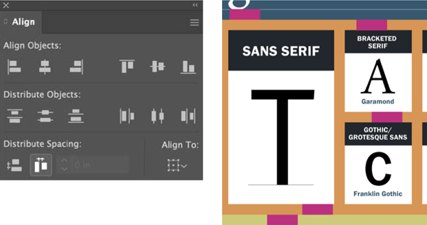
Use Distribute Spacing to ensure that the space between elements is consistent.
You can confirm this by using temporary spacing rectangles.

Setting up your color theme as global colors is essential. This way, you can edit the colors by just double-clicking them in the Swatches panel and choosing a new color. Voila! Every object with that color changes instantly, adding years to your life.
So we spaced 10 boxes evenly using the Align panel Distribute Spacing option. To ensure that the spacing around each element was consistent we started out with a document grid superimposed on our 12-column grid, but finding it too visually confusing, opted instead for the old-school method of creating spacing rectangles to which we could align elements. We made sure these were on a separate layer and in a garish color so that we knew to delete them when we were done. With all this precision spacing, it’s easy to sometimes overlook elements that may be mathematically aligned, but just don’t look right. At the end of the day, trust your eye. If something needs moving a hair to the left or right, then go for it.
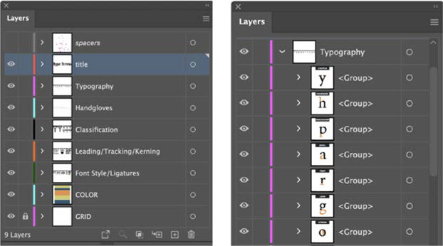
We recommend organizing your layers with religious devotion. Each section can have its own layer and give the background colors and the grid their own layers as well. To select all the items on a layer, click the bullseye on the right side of the panel. To hide or lock layers, just click the lock or eye on the left.
Note that Illustrator layers are really like Russian dolls: each layer opens to reveal layers and groups of layers within. Is there a limit? We haven’t found it yet.
We typed the word out and then broke it apart using Type > Create Outlines. Each letter was carefully centered in its box. To highlight particular sections of each letter, we used the Knife tool to surgically slice off a section of some of the letters and then selected the new shape with the Direct Selection tool and changed its color. To fill the counter shape of the letter p, we used the Direct Selection tool and Option/Alt-clicked to select that circle. We cut and pasted in place and then applied the highlight color. We did something similar with the o, but we cut the new shape in half with the Knife tool.
It’s essential for things to line up as neatly as possible (this is an infographic about typography after all), so we had to cross every t and dot every i. For this reason, we had Smart Guides turned on most of the time. This makes labels pop up and objects snap to guides. However, Smart Guides can be a little like smart kids — charming, but sometimes annoying. So we toggled the Smart Guides off and on using Cmd/Ctrl+U.
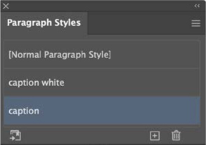
Because we needed the flexibility (and consistency) of making global edits to the captions, we used paragraph styles. It’s debatable how useful Illustrator paragraph styles really are, since you can’t create hierarchical styles using Based On the way you can in InDesign. Also, Illustrator offers other methods for global text editing, like the menu option Select > Object > All Text Objects, and the use of layers for different categories of text. That said, we used paragraph styles anyway, all the time grumbling how they weren’t as good as those in InDesign.
As we designed this, we were sure to vary the shapes and the weights of different boxes. We want things to line up, but not be so rigid and predictable that the audience completely tunes us out. So one section makes no use of columns, the next section uses quarters and sixths, the next uses thirds, and so on.
The disadvantage of a print infographic is that space is limited, and predictably we ran out of room for all the different elements we wanted to display. Other items that didn’t make the cut: fake italics vs. true italics, fake small caps vs. true small caps, word shapes and legibility, and the fact that Hugh always has to fix the kerning on his last name, thanks to the presence of an apostrophe.