
Add Flourishes to Your Type
Let your letters sprout swirls and spirals
The Brief
Edit an existing typeface by adding a flourish
Trim Size
US Letter/A4
Learning Points
Working with outlines in Illustrator
Editing and combining shapes with Pathfinder
Using the Brush tool to create art brushes
Tools
Illustrator
Fonts Used
Golden
Inspiration
We often find that even a beautifully made typeface has its limitations. It may have exquisitely formed letters, with perfect descenders and ascenders — and yet lack a certain ornamentation. Sometimes, a typeface seems perfect for a project, if only it had some options for extra flourishes. Many newer typefaces come with alternate glyphs for this very purpose, but even if your chosen typeface doesn’t, you can create your own.
One of our favorite typefaces is Golden, designed in 1890 by William Morris. It’s elegant, perfect for projects where you need a readable, serif font that also functions as a display face. Something where you want the discerning reader to notice the classic typeface you’ve chosen.
The letter Q in Golden has a beautiful swash that hangs below the baseline in a simple, elegant way. But the letter R, right next to it in the alphabet, looks plain by comparison, with a swash that sits above the baseline, looking ordinary. We decided to up the profile of the letter R so that it no longer lives the shadow of the illustrious Q. Here’s how we went about it.
Edit the existing letterforms
We started by typing the two letters in question at a large size in Illustrator. Then we dragged down a horizontal guide, to line up with the baseline of the text. We used Create Outlines (Cmd+Shift+O/Ctrl+Shift+O) to turn the letter forms into shapes that we could edit with the many drawing tools on hand.
Using the Scissors tool, we cut the long swash from the Q and then dragged it over to the R using the Direct Selection tool. (By cutting and pasting in place, we easily and quickly ungroup it from its parent shape.) Then, using the scissors to remove the short swash of the R, we got both pieces lined up as best we could. Things never fit perfectly, and you need to make minute adjustments; in this case, we had to rotate the longer swash slightly so that it lined up at the correct angle.
To see better what we were doing, we turned on the stroke and turned off the fill on both the R and the extra swash. For additional help, we also turned the color of the swash outline to red, which helped keep things separate — until eventually they are merged.
We used the Scissors tool to remove the old swash from the R and then the Pen tool to lengthen the new swash so that it can nestle into the curve of the R. Returning both shapes to fills with no outline, we were able to used Pathfinder Unite or the Shape Builder tool to combine them into a single shape.
For an additional challenge, we tried something even fancier. Starting over with just the R, we removed the old swash entirely and then drew a short spiral. We wanted to use a segment of that curve as the swash of that R, but to do so we needed to edit it a bit.


The swash was cut from the Q and pasted over top of the existing R. A secondary color was used for contrast, while the new shape is rotated, scaled slightly, and adjusted so that it fits perfectly. Then, with the old swash deleted, the new swash is merged with the main letterform using the Pathfinder panel.
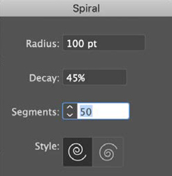
We always have to adjust the Spiral settings several times before we get the effect we want. Be prepared to rotate, flip, and edit the curve you create.

For a fancier R, draw a spiral shape (A).
Create a simple cone shape (B), and turn it into an Art Brush (C)
Apply the brush to the spiral (D).
Add a circular form to the tip, for added elegance.
We drew a simple cone shape with the pointy end capped. Turning it on its side, we dragged it to the Brushes panel to make it into an Art Brush and then applied that to the spiral shape. We opened the brush settings and adjusted them a few times until the width of the brush matched the width of the swash it was replacing. Then we expanded its appearance in order to edit the curves with the Direct Selection tool. With a few edits and an additional circle at its tip, we were able to construct a much fancier R with a long, graceful swash.
We hope William Morris would approve of our craftsmanship.