
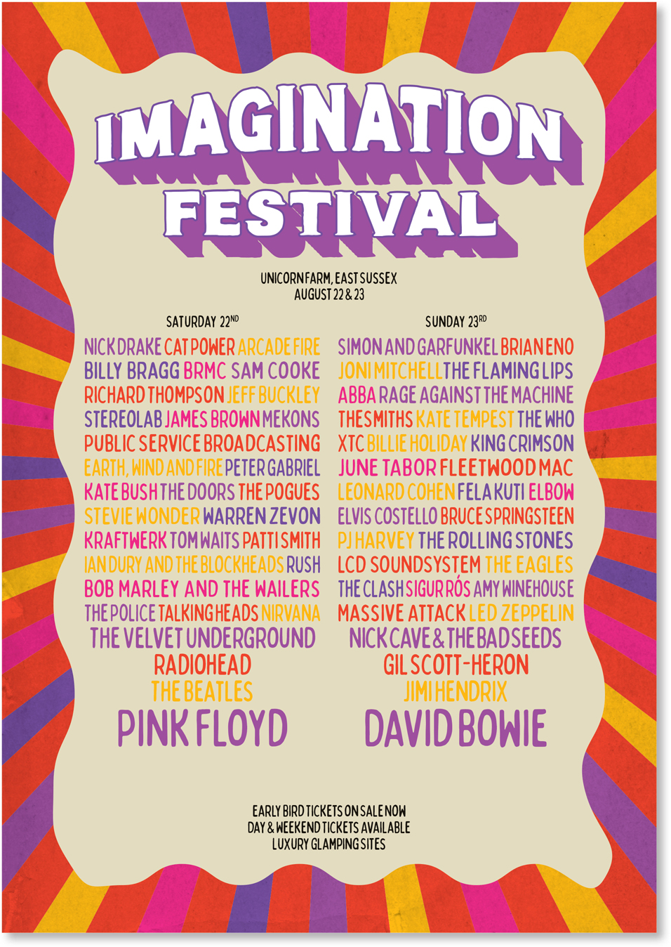
Music Festival Poster
Curate your dream lineup
The Brief
Create a promotional poster for a real or imagined music festival. Design the festival logo and come up with an interesting way to display a long list of artists’ names.
Trim Size
Tabloid/A3
Learning Points
Adjusting word spacing and letter spacing
Formatting with nested styles
Considering color and contrast
Tools
Illustrator, InDesign
Fonts Used
Lance Regular Bobby Jones Soft
Inspiration
From late May through the end of September, there’s a music festival every weekend in the UK. With so many festival posters competing for attention, we wanted to create a poster that conveys a carefree summer vibe, whilst at the same time shoehorning in all the names of the acts in a typographically exciting and sensitive way. Thankfully, there’s much precedence for artfully designed festival posters. A quick search of Pinterest will get your creative juices flowing.
Create a color palette
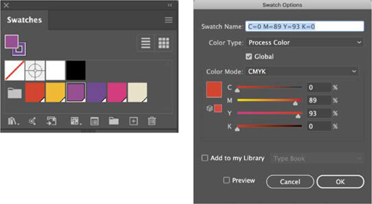
Initially, we went to our go-to source of color inspiration, Adobe Color Themes. This invaluable extension is available in InDesign, Photoshop, and Illustrator, but we started out in Illustrator. We clicked Explore to view themes created by other Creative Cloud users and then clicked Create to create a theme derived from a base color and based on a color harmony rule. It must have been one of those days, because nothing quite captured the mood we were after. So we ended up “winging it” and choosing five bright and summery colors that we instinctively felt worked together. Combining these colors into a Color Group, we saved each as a global color to make future updates easy, if required. Knowing that we wanted to use the same colors in InDesign, we added the Color Group to our Library.

Create the background
As with the “Psychedelia: Get Groovy with a ’60s rock poster” project in the “Pastiche” chapter, the background begins as a Photoshop Custom Shape (Registration Target 2). Copy and paste this into Illustrator as a compound shape and then scale it up to bleed off the artboard. Draw a rectangle over this at the same size as the artboard, select the rectangle and the registration target, and convert it to a Live Paint Object. With the Live Paint Bucket, fill the segments with colors.
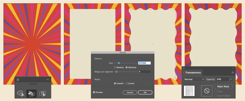
Size up the custom shape copied from Photoshop; then use the Live Paint Bucket to fill the segments.
Add an interior rectangle and apply a Zig Zag effect.
Add a layer of texture above the colored segments and reduce its opacity.
That took care of the outer frame; now for the inner frame, we drew a rectangle on top of this and applied a Zig Zag effect.
Festival logo
The simple logo is set in Lance Regular. To create the warp effect, apply an Arc Upper Warp effect with a 20% bend to Imagination. Next, using the Appearance panel, add a second fill below the white fill. To extrude the shadow, apply a Transform effect that creates multiple copies, each moved a tiny distance horizontally and vertically from the preceding copy.
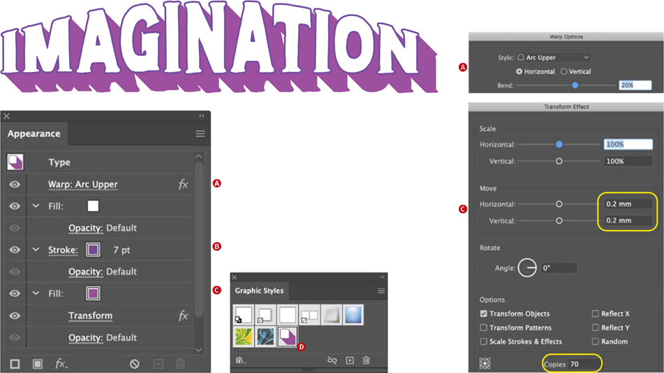
A Warp effect is added to the type (A).
The stroke is moved beneath the fill so that it is only visible on the outside of the letter shapes (B).
A second fill is transformed to create the extruded shadow (C).
The effect is saved as a graphic style (D)and applied to Festival and the warp removed.
Moving to InDesign for the type
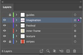
Because of InDesign’s superior text handling, once the background and masthead are finished, place your work in progress as an Illustrator (AI) file in InDesign.
With so many names to include on the poster, the challenge is to make them all fit without, if possible, breaking names across lines and without incurring inconsistent word spacing.
We created five character styles — one for each of the colors — and incorporated these into a paragraph style as nested styles.

Legacy Custom Shapes
At the time of writing, the current version of Photoshop (2020) did not display the familiar list of custom shapes, of which the target is one. If you find they are missing, go to Window > Shapes and from the Shapes panel you can restore them.
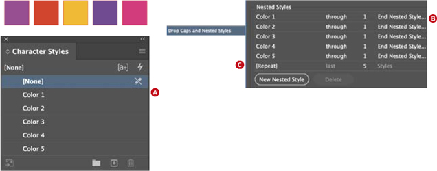
A character style is created for each of the colors (A).
These character styles are “embedded” as nested styles within the paragraph style. When the paragraph style is applied to the text, the color will change every time it encounters a delimiter — in this case, an en space (B). The five styles are set to repeat, creating a loop (C).
Flowing the text in two relatively narrow columns made it difficult to avoid bad word spacing. In a way we had painted ourselves into a corner, but wanted to persist to see what was possible. To achieve the best compromise between spacing and avoiding bad line breaks, we turned off hyphenation and switched to the Single-line Composer. While the Paragraph Composer is a default that you rarely need to change, it can be frustrating in circumstances like this where, having fine-tuned a line, the type starts moving around when you edit the text elsewhere in the paragraph.
It was now time to call on the Word Spacing, Letter Spacing, and Glyph Scaling options. The range here is much wider than would be used for magazine or book publishing. The reduced Word Spacing and Letter Spacing allows more characters per line; the Glyph Scaling sets the range between which the horizontal scaling can vary. These settings might cause some distress to type purists, but if we’re committed to a flush right edge and not breaking any of the artists’ names across a line, then something’s got to give.


Examples from the Latitude festival and the Isle of Wight festival