
Hand Lettering
Create a hand-lettered quote
The Brief
Interpret a favorite quote using custom hand lettering
Trim Size
Scalable
Learning Points
Sketching ideas
Customizing letter shapes
Tools
Pencil and paper, Illustrator, Procreate, iPad
Inspiration
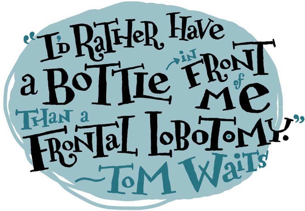
When choosing a quote to illustrate with hand-drawn typography, a lot of care needs to go into selecting the right source. You want words of wisdom from a person of impeccable integrity. That’s why we turned to a man who is perhaps the world’s wisest and most quotable musician: Tom Waits. This quote is famous, possibly apocryphal, and is fun to say out loud.
Your first decision is the size and shape you want to fit the quote into. A square? A rectangle? Triangle? Depends on the project. We chose an ellipse. We divided that ellipse into four uneven sections to help give the quote some dynamism and keep it from seeming too static or dull. A hand-drawn quotation has to feel fun, right? Otherwise, you could save time and have the computer do the work.
We broke our famous quote into three lines, as if it were poetry — which it is, in a way:
“I’d rather have
A bottle in front of me
Than a frontal lobotomy.”
This way, we knew the quote will both sound right in the reader’s ear and look good on the page. We had four sections in our circle, and we used the last, smallest section for the credit.
Choosing a type style
The funny thing about hand-drawn typography is that you start with one of the same eternal questions you have when you are setting type digitally: serif or sans serif? We decided on serifs, in part because the strokes, or feet, of the letter forms become a neat graphical device. They offer a way to guide the viewer’s eye and carve up space into an interesting composition. There’s also something comical about the formality of a serif font awkwardly drawn in an informal setting — assuming you find type funny. (We do.)
But which serifed fonts to emulate? Having spent so much time staring at typefaces, zooming in and examining the shapes, and adjusting the kerning and what not, we have a lot of those forms memorized. They end up imprinted on the mind. It’s a fun challenge to try to draw some of these forms from memory (or from reference, if necessary).
We have particular favorite letters from all the serifed typefaces we’ve loved in our lives. Caslon’s upstanding two-story a with its rounded terminal, and the adorable, slanted, almost hand-drawn lower case e of Adobe Jenson with its diagonal crossbar. Or how about the iconic uppercase W, with its overlapping double Vs, that we find in Garamond? And then there’ s Bodoni, in its many bold versions, with the elegant balance of thick and thin lines. We also love Clarendon, for its playful curlicues and heavy slab serifs.
If you’re drawing type by hand, why not combine all the things you love about serifed type into one? You can toss in elements spanning hundreds of years from the Renaissance (Jenson) to the mid-19th century (Clarendon) to make a tasty typographic salad. Imagine the musical equivalent of such a centuries-spanning mash up!

Are these emulations of typefaces intentional or unconscious? In our case, it’s the latter. We’ve stared at so much text that we sometimes draw it in our sleep.

It’s a good idea to start with a simple shape — it gives the messiness of hand-drawn type a boundary.
Try to space out your words in an interesting way. Why not try arrangements that you would never do using a digital tool?
For longer lines, count out the number of characters and spaces, so that you can find the mid-point of your line. When you’re drawing it out, if the mid-point ain’t in the mid-point, you may have a problem!
Draw the quote
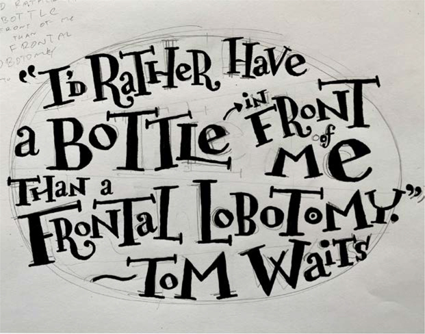
We penciled in the quote, being sure to vary the size and weight of each letter, using Hugh’s distinctive handwriting. We made use of an eraser, but we also let things fall as they did. It’s important not be too perfectionist — edits can come in the digital version. And because it seemed like more fun, we randomly mixed the uppercase and lowercase letters.
We also used a technique known to sign-makers: finding the mid-way point. For example, in the line Frontal Lobotomy, there are 18 characters, spaces and punctuation included. This means that the space between L in Lobotomy is roughly the mid-way point for that line. By marking that point in pencil, we could make sure that we were more or less on target for fitting our text in the correct amount of space.
Ink the quote in Procreate
We photographed our sketch and brought the photo into the drawing program Procreate. (There are lots of drawing apps for the iPad, and any of them would work perfectly well.)
We started by picking a brush. There are so many in Procreate, and they are all beautiful! Click the Brush icon, and there they are, organized by the type of image making you’re doing: painting, drawing, inking, etc. Under Inking, there’s a brush called Dry Ink that we have special affection for. At a small scale, its line is even and smooth, but up close, or at a large brush size, there’s a texture and tooth to it that looks great. We’ll also use this brush for our eraser so that as we erase we get the same line quality — if only real inks were so easy!
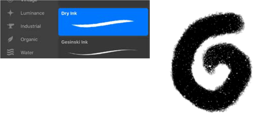
The Dry Ink brush in Procreate is smooth and precise at a small size. Enlarge the brush all the way, and you can see it has a texture and tooth that brings some of the randomness of real ink to your project. But you may find others suit you better: try them all!
When inking over a sketch, we like to keep the opacity at 100% and adjust the size up and down as we work. (You can do both using the controls to the far left of your drawing area.) We prefer a line that is wobbly and imperfect, because we want that human touch. (Pro tip: Have an extra cup of coffee before starting, in order to ensure a shaky line.)
Inking in Procreate: The black type is on its own layer so that the sketch can be turned on or off. You can scale and rotate as you go, correcting problems that might not have been clear in the sketch.

Alpha Lock in Procreate is the same as Lock Transparency in Photoshop. All the transparent pixels are locked, but the pixels with color can be changed.
Part of the point of drawing type by hand is to do things you wouldn’t ordinarily do: stack the type in odd ways, vary size and rotation, toss the baseline out the window, mix cases, mix fonts, let the descenders crash into the ascenders (gasp!). In drawing the letters, you learn a lot about type: what is the essential nature of an R? How much can you twist it and still have it read correctly? Basically, if you aren’t having fun, you’re doing it wrong.
Finally, we turned off the visibility of the pencil sketch, used the Alpha Lock on the drawing layer, and inked a new color over some of the details, just to mix it up a bit. The type felt a little loose, so we used our original ellipse shape to add a large swash of color in the background, providing some structure.
We usually like to do any final work prepping or creating the artwork on a laptop or desktop. Call us old-fashioned, but this feels like home base. Getting the artwork off the iPad and into another program is pretty easy. From the image gallery, we selected the image and then chose Share from the top menu. This offers several choices for file output: JPG, TIF, etc. We chose PSD so we could retain the layers and do any last minute edits to the file.
Pro tip: You also have an option for outputting an animated GIF or MP4. This makes a neat video with a frame for every step you made in the creation of your image, which can make a fun item to share with friends.