
Fiction Classic
Wrangle hundreds of pages like a pro
The Brief
Typeset a multi-chapter book with front matter, taking advantage of InDesign’s long document features
Trim Size
6 × 9 inches (152 × 229mm)
Learning Points
Managing text flow
Setting up hyphenation and justification
Fixing spacing problems
Tools
InDesign
Fonts Used
Tribute
Inspiration & Resources
The example public domain text — Treasure Island by Robert Louis Stevenson — is available from Project Gutenberg (gutenberg.org). Nigel chose this particular text because he also found a PDF of an 1897 edition of the book and a complete set of high-resolution public domain illustrations (on the British Library Flickr page).
Book design is where typography started. Think about it. You have an object that is essentially nothing but type: page after page after page, an endless stream of words. How can this be designed so that it looks great and is easy to use? How does the designer do their work and then become invisible, so that the author can do their work? Nowhere is this more important than a work of fiction.
Luckily, many have trodden this path before us. There are time-honored traditions and aesthetics to guide us, beautiful typefaces designed hundreds of years ago that still work great — and now, tools like InDesign to smooth it all out and make the process easy and fun.
For this project, we want to build a publication that is easy to read, easy to navigate, and — because we’ll inevitably need to make changes along the way — easy to update.
Page and margin size
The size and aspect ratio of the book are a profound design decision. If this choice is within your remit — i.e., if the page size isn’t presented as a fait accompli by the client or publisher — here are some things to consider to make sure your choice best suits the content and the reader.
A quick glance at any bookshelf confirms that the majority of books are tall (portrait) in orientation. With a continuous text flow, a primary text frame is a good choice — not essential, but it allows you to later apply a different master page to a document page and have the text continue to flow properly.
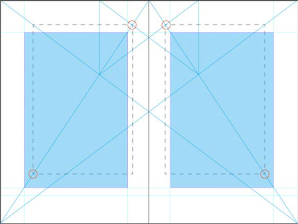
Using Jan Tschichold’s “golden canon of page construction” dividing the page into ninths to yield margin proportions 2:3:4:6 (inside:top:outside:bottom). The dotted line shows the margins suggested by the Van de Graaf canon as identified by Tschichold. The tinted cyan frames indicate our adapted type area.
We chose a page size of 6 × 9 inches — a popular size for trade paperbacks — and a page with a 2:3 aspect ratio, proportions that minds far greater than ours have long considered ideal for a book page.
To determine the size of the margins, on the master page spread, we adapted the page canon identified by Jan Tschichold (1902–1974) in his studies of medieval manuscripts. Divide the page into 9 rows and 9 columns. Assign one-ninth of the width to the inside margin, two-ninths to the outside margin, one-ninth to the top, and two-ninths to the bottom. The resulting type area has the same proportions as the page. The only problem is that the margins are so big that — to the modern eye — they look extravagant. To strike a balance, we decreased the size of the bottom and outside margins. The result allows for an extra line and a slightly wider column measure but still provides a pleasing frame around the type area and sufficient space for the reader’s fingers and thumb to hold the book. Crucially, the type area is wide enough for between 55–70 characters per line, meaning that, with the right settings, we can achieve well-justified type.

Clean up the text
Before formatting the text, remove unwanted spaces, extra returns, trailing white space, and any other unwanted characters. Use predefined GREP queries in the Find/Change dialog box. Also cross-check the document with the manuscript for any instances of text that should be italicized and apply an italic character style. Because character styles are relative, they will adjust to whatever paragraph style is later applied.
Choose the type
Following the printer’s maxim “when in doubt, set it in Caslon,” Nigel’s initial choice was Carol Twombly’s revival, Adobe Caslon Pro, not just because it’s beautiful but also because it has a wide range of OpenType features like real small caps, oldstyle numerals, and contextual alternates. But we were feeling crazy and reckless and, enticed by the thrill of the new, opted instead for Tribute, an interpretation of Renaissance type samples by Frank Heine. Tribute brims with personality (check out that lowercase g!) and has a swashbuckling swagger.
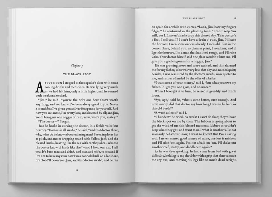
The book follows a simple format: chapter number, chapter title, first paragraph, and then body text. Repeat, repeat, repeat for 34 chapters. There are some passages to be indented, and of course the table of contents, the front matter, and the captions, but for the most part the formatting is repetitious. So we started by applying the “body” style to everything, then the Chapter Number style, which includes a Keep Option forcing the chapters to begin on a new page.


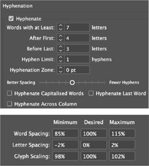
Our preferred Hyphenation and Justification settings when working with justified type
The text is soon transformed from an amorphous mass into a structured, readable document. As is often the case with such projects, it takes 5% of the time to get the content mostly in place, and the other 95% to finish the job. But finessing the details makes all the difference.
Compose the text
Our primary objective with the body text was to achieve a good type color or density — avoiding big and varying gaps between the words.
Hyphenation helps, but we changed InDesign’s default H&J (hyphenation and justification) settings, because . . . well, because they suck. Our custom settings ensure that only words with a minimum of seven characters are hyphenated, that there are no two-letter stubs, and no laddering is caused by consecutive hyphens. Plus, we don’t want to see hyphenation in the last word of a paragraph or a when a word breaks across a page or column.
Word Spaces
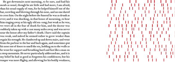
Default justification settings, no hyphenation, no Optical Margin Alignment. Note the variation in the size of word spaces (indicated by the red shapes).

Custom H&J settings combined with Optical Margin Alignment. The size of the word space is both narrower and more uniform.
Combined with the Hyphenation settings, the Justification settings reduce the permissible variation in the size of the word spacing. This is offset by a small variation in the letter spacing: just +/–2%, and a variation — just 98–102% — in the glyph scaling (the horizontal scale of the letters). Changing the proportions of letterforms can make purists twitchy, but at 12 pt (our chosen type size) this is virtually imperceptible. It’s a small price to pay for such an overall improvement.
Enabling Optical Margin Alignment in the Story panel (Type > Story) further strengthens the sharpness of the right edge, pushing punctuation and hyphens at the end of the line beyond the right edge of the frame.
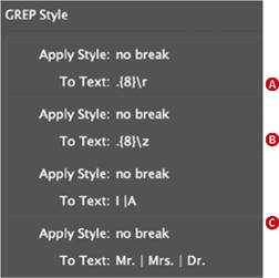
Add a GREP style to the body paragraph style to prevent words with 8 or more characters from breaking at the end of a paragraph (A) or the end of story (B).
Avoid single words — such as I, A, and salutations like Mr. Mrs, Dr. — from occurring at the end of a line (C).
To alert us to any spacing problems, we turned on the Show H&J Violations in the Composition settings of the Preferences dialog box. Keep in mind that H&J Violations does not show bad spacing, per se, but rather highlights where InDesign is unable to honor the settings you’re requesting.
Next, we added GREP styles to the body paragraph style to prevent short last lines. Our reasoning is more nuanced than simply saying “Don’t end a paragraph with a single word.” The point of zapping short last lines (or “runts”) is to avoid trapped white space between the last line of one paragraph and the first line indent of the next. If the paragraph ends with a single long word, significantly wider than the first line indent of the following paragraph, it’s not a problem. And if it ain’t a problem, don’t fix it.
We addressed widows and orphans manually with a delicate application of negative tracking to the text. Our Kerning/Tracking preference was set to 1⁄1000 em in Units & Increments. The Composition preference Custom Tracking/Kerning let us spot at a glance where tracking was applied. When fixing widows or orphans, keep in mind that the fix may lie in a paragraph that comes earlier in the text. Everything you do at this point will have a ripple effect. That can be bad, or it can be good.
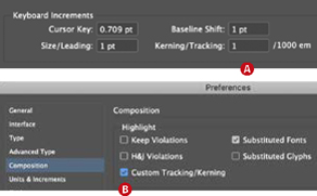
Set Preferences > Units & Increment > Kerning/Tracking to the smallest increment for finer control (A).
Turn on the Custom Tracking/Kerning composition preference to see where kerning or tracking has been applied highlighted in green (B).
With all of these measures to prevent composition problems, use a light touch. We can’t fix everything — not because we’re settling for less than excellence, but because every fix has potentially negative consequences, and we should first do no harm. For that reason, we’re less bothered by widows that straddle a facing page, choosing instead to target those that occur over a page turn.
Adding page numbers and running heads to the master page
So that the left and right page numbers mirror each other, set up your paragraph style to use Align Away from Spine as the alignment type.
For the running-header, define a text variable (Type > Text Variables > Define), tell it to grab the Chapter Title paragraph style, and then insert that variable in the running header text frame. This won’t work if some of the chapter titles are too long, because text variables don’t wrap across multiple lines. Use a character style text variable instead: Create a separate character style and, in each chapter title, manually apply it to the text you want to appear in the running head.
Styling the chapter opening pages
The chapter opening pages requires their own treatment — no running header, and a bigger top margin, to provide a visual pause between chapters. The obvious solution is a second master page, but the problem — and anyone experienced with long documents will have run into this — is that if the text reflows, you’ll end up with a chapter opening master page applied to a document page and vice versa.

The paragraph rules that move the text down (Rule Above) and “white out” the header (Rule Below) rely on large, specific Offset values.
We prefer to stick with a single master page and to incorporate both the larger margin and “no-header” into the Chapter Number paragraph style. This can be achieved through a trick using Paragraph Rules that are part of the Paragraph Style Options. We applied both a Rule Above and a Rule Below to the Chapter Number paragraph style — the first, with a Color set to None, to move the chapter number a specified distance down from the top margin; the second, with Color set to Paper, to “white out” the header. The text can now flow freely, and you don’t need to worry about what master page goes where. Just make sure the “white out” never gets set to overprint.
This leaves us with chapter opening pages that are no longer numbered. To address this, we anchored a text frame containing a page number marker. Get it right once, create an object style to capture the anchored object settings, apply the style to the object, and then copy the object to all the other chapter openers.
The benefit of this approach is that no matter how the text flows, the chapter opening pages will always look right because the formats are baked into the paragraph style.
Creating the front matter
To have the page numbering start with the first chapter, define part one as a new section. This means having two numbering styles in the document: to avoid confusion, distinguish the two by defining the numbering style of the front matter as roman numerals.
Useful Scripts
InDesign scripting legend Peter Kahrel has made his extensive online repository of scripts available for free. These are an essential resource for anyone who works on long documents in InDesign. You can find them here: creativepro.com/files/kahrel/indesignscripts.html

The Table of Contents style specifies what paragraph styles to include in the TOC and how they will be styled. Note that character styles “page number” and “dot leader” are applied to the numbers and space between the entry and the number.
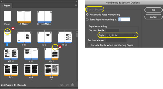
To use a second numbering style, in this case lowercase roman numerals, rightclick the page thumbnail and choose Numbering & Section Options. A triangle above a page thumbnail (A) indicates a new section. Double-clicking the triangle brings up numbering and section options.
Table of contents
To generate the TOC choose Layout > Table of Contents, and select which paragraph styles to include and what styles to apply to the entries. It takes some back and forth to get it exactly how you want it. Once the settings are correct, be sure to capture them in a TOC style. We generated a second table of contents to create the list of illustrations.
Workflow steps
The order of these steps is more or less how they are presented, but of course, in reality, nothing is ever quite so linear. No matter how methodical you are, there will always something that you miss first time around, and this means going back and forth, experimenting with different settings, finding that certain approaches don’t work, and adopting others. Stay flexible and open to new techniques, use a light touch when fixing “problems,” approach the tasks globally through the use of styles, while at the same time keeping an eagle eye out for exceptions, anomalies, and anything else that requires individual attention. If we’ve done a good job, the reader will experience the story almost effortlessly. Like the stage hands during a theatre production, we’re essential, but meant to be invisible. The words should flow off the page, into the minds of the audience, and no one will even notice us, the designers. Our job is to disappear.
To Book . . . or Not to Book
InDesign’s Book feature allows you to manage multiple chapters as a “Book” and then control the styles and page numbering across that Book. Some people love this feature. We are not those people.
We do all we can to avoid the Book feature. If you’re part of a team, with different members working simultaneously on individual chapters, and/or your pages are graphically dense, then you need the Book feature. However, if you’re working by yourself and the book’s structure is simple, why complicate things? We prefer to work with one long document; that way we can flit back and forth from the front of the book to the back with ease, and we don’t need to worry about synchronizing styles or updating page numbers. Some might say this is living dangerously: A single long document is more prone to error and you have all your proverbial eggs in one basket. To which we say, use Save As to increment the document regularly and you’ll be fine.