
Interpret a Word or Phrase
Use a twist to enhance the meaning
The Brief
Give a word or short phrase a typographic treatment that enhances its meaning
Trim Size
Tabloid/A3
Learning Points
Customizing type
Combining the Shape Builder and Live Paint
Thinking about negative space
Tools
Illustrator
Fonts Used
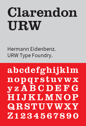
Clarendon URW
Inspiration
Word as Image, by Ji Lee: youtu.be/J59n8FsoRLE
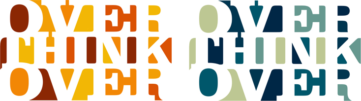
A few years ago at a type-related conference one of the speakers mused about whether they were thinking over — or over thinking — a particular design problem. While the speaker and the topic have long been forgotten, that phrase rattled around inside Nigel’s head long after. It seemed like a phrase ripe for a typographic poster.
This kind of treatment is all about the negative space, and one of the keys to making it work is the careful sizing, spacing, and positioning of the type to ensure that the trapped, negative space shapes are both interesting and not overcomplicated.
Choose the type
For our interpretation we chose Clarendon URW, partly because we love it, but also because its solid slab serifs made it easier to connect the letters. When we tightened up the spacing, horizontally and vertically, we liked the shapes that were created by the trapped areas of interior space. It would be these that we would fill with color.
Some stream of consciousness led us to Robert Indiana’s Love image (and later sculpture) from 1965. This pop art icon so effectively uses Clarendon-like lettering that Clarendon seems like the natural choice for any similar treatment. We did manage to resist tilting the Os at a jaunty angle.
Clarendon URW comes in a range of widths, making it easier to combine a five-letter word with two four-letter words and ensure that, visually, it had equal billing. Over is Extra Wide Extra Bold, and Think is Extra Narrow Extra Bold. They are both at the same point size so that their slab serifs are proportional, which made it easier to meld the shapes of the different lines. To assess how the letters overlapped, we applied a fill of None to the type.


The Extra Wide and Extra Narrow widths of Clarendon are combined (A).
The words are overlapped. The fill is set to None, with a black stroke to see how the shapes combine (B).
The automatic kerning is set to Optical for slightly tighter letter spacing; then individual letter pairs are adjusted so the serifs slightly overlap (C).
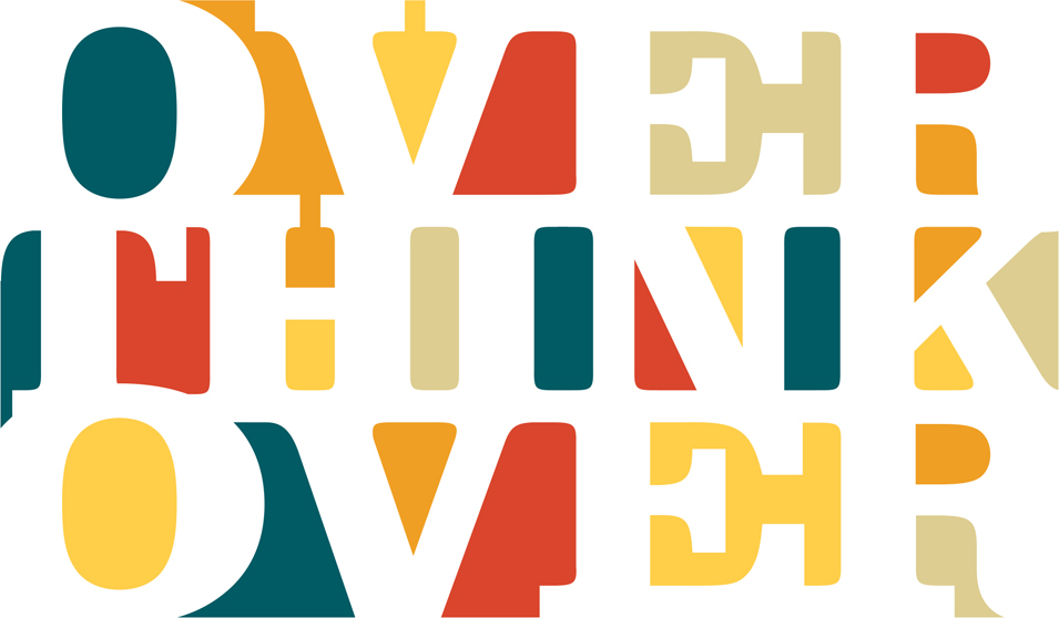
As well as overlapping the lines vertically, the letters also needed to overlap. As a starting point, we switched the automatic kerning method to Optical for an overall tightening of the letter spacing. We then kerned individual letter pairs so that their serifs ever-so-slightly overlapped. Make sure that in Preferences > Type Tracking (it’s kerning really, Illustrator gets its terms mixed up) is set to 1, for fine control. Zoom in to an enlarged view size and use the shortcut Option/Alt+Left Arrow to reduce the space between letter pairs. We aimed to make the letters touch and then go slightly beyond this to make them overlap, knowing that our goal was to fuse the letters into a single shape. It’s worth taking the time to get this just right, because the next step will go much smoother if you do.
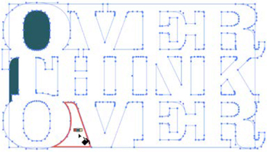
This was the end of the line for adjusting the text while it is still editable type. We took a deep breath and stepped off the precipice into the unknown and converted the type to outlines (Type > Create Outlines or Cmd+Shift+O/Ctrl+Shift+O). We also saved a copy of the type on the pasteboard. Just in case.

Start by setting the automatic kerning method to Optical; then adjust each letter pair so that there is a slight overlap.
Combine the shapes
Next, we used the Shape Builder tool to combine the overlapping shapes into a single shape. This step is immensely satisfying — like you’re converting multiple subdivided apartments into one luxurious, open-plan living area.
Along with all the combining there was also inevitably some subtracting so that we didn’t end up with awkward-looking shapes. To subtract with the Shape Builder, hold Option/Alt.
Despite our best efforts in the previous step, we had to make a few modifications to the paths using the Direct Selection tool to make sure that the shapes overlapped everywhere we wanted them to. Some minor surgery was also needed to remove a few bumps caused by extra anchor points. With the Pen tool we got in close, hovered over the offending anchor points until the minus symbol appeared, and clicked them to remove them.

Convert the type to outlines (A) and then combine the overlapping shapes into a single object with the Shape Builder tool (B). Be sure to iron out any bumps by removing extraneous anchor points with the Pen tool.
Convert to a Live Paint Group
This project is every bit as much about the spaces between the letters as it is about the letters themselves. After we closed up and defined the spaces between the letters, we wanted to apply color to them. Before we could do so, we needed to put an enclosing rectangle around the letters, so that the negative space didn’t leak out of the sides. We found this worked best if you crop tight around the letters, especially at the top.
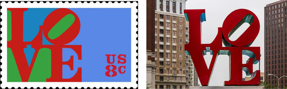
Robert Indiana’s Love has been reproduced in a variety of formats for rendering in displays around the world. Left: a US Postal Service stamp; Right: a sculpture in John F. Kennedy Plaza in Philadelphia, unofficially known as Love Park.

Enclose the letter shapes with a rectangle so that the negative shapes can be made into filled segments.
Select everything, set the stroke color to remove any stroke, and then click the artwork with the Live Paint Bucket to convert it to a Live Paint Group. This is the fun part where you get to fill the segments with color. As you hover over each segment it will become outlined with a red highlight. Click to fill the segment with the active color of your Live Paint Bucket. In theory, you can press Left Arrow/Right Arrow to cycle through the colors of your color group; we find this rarely works as smoothly as we’d like and end up selecting the colors from the Swatches panel, so keep this close at hand.
Choose a color from your color theme before you use the Live Paint Bucket. Three small swatches will appear above the cursor. You can use your Left Arrow/Right Arrow to move through the colors of your color group as you fill the segments.

When we’re in need of color inspiration, we like to explore the Color Themes made public by other Creative Cloud users.
We’d like to tell you about a compelling backstory to our choice of colors, but the reality is we were just idling browsing color themes uploaded by other Creative Cloud users and found one we liked. (Sometimes it just works that way.) It’s called Honey Pot; we clicked the three dots below the theme to add it to our Swatches. This is not to say that other colors won’t work, so experiment to find a color scheme you like.
We made the type white, reversing out of the background, so that the letter shapes recede, and the colored negative shapes come to the fore.
Also, while it hadn’t been our original intent, we found that we liked how the composition looked framed by generous page margins. With the corners not defined, the space flows freely through the letters, the letter shapes spill out onto the background, with their shapes implied rather than explicit.
Experiment with different color schemes.
Add some alternative color themes to your Swatches panel; then click the Recolor Artwork button on the Tool Options bar.
Choose from the list of Color Groups in the right panel.